Nintex Community Menu Bar

K2 Smart Form in mobile application is not responsive

  • August 23, 2018
  • 4 replies
  • 66 views

Hi All,


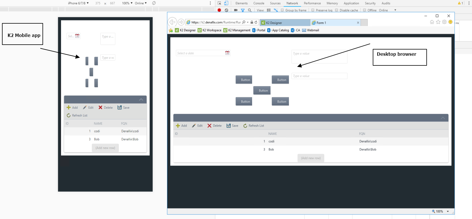
I have created one form and that form will be used in both desktop and mobile application and In form I have large tables and  that tables are not properly aligned in the mobile or you can say that tables are not responsive.

What can I do to make that table responsive in mobile and properly aligned.


Please help me asap.

4 replies

  • Author
  • August 23, 2018
sello, I am using lithium theme but still same problem is persisting.

Forum|alt.badge.img+16
  • August 23, 2018

Hi,


I'm assumed that you are getting this behavior, see attachment. It can easily reproduce witht the Chrome's emulator mode. Are there any nested table layout (table control inside another table control)?


Forum|alt.badge.img+6
  • Novice
  • August 24, 2018

Hello, It doesn't work . you will have to create a different form for mobile and arranage/design only relevant control to show properyl . 


If you want to use same as it is in desktop/mobile then wont work. its known issue.


Thanks


Forum|alt.badge.img+9
  • September 3, 2018

Seriously, attach a screenshot to show how exactly it is not working before asking for solutions. You're not helping yourself at all.