


Nintex is committed to bring latest and greatest features in all our offerings. This post describes a latest feature of adding CSS to the forms that is recently shipped out for forms in Automation Cloud which was much awaited by many of you, and we call it – Advanced Styles. I personally am a huge fan of responsive forms, one can very well create neat, simple yet elegant forms using Nintex responsive forms. But at times to match the branding guidelines of an organization or to make it more user friendly there is a need to add colorful attributes and that is what we intend to achieve with our latest feature.
CSS will help our customers in Automation Cloud in the following ways:
- Branding: Corporate customers want to align forms to their brand. With CSS, forms will give a look and feel like any other application in the organization.
- Accessibility: With CSS one can utilize granular styling options to style specific controls to differentiate them, make them more accessible and readable. It also helps in highlighting important fields in a long form.
- Easier to update and maintain: Since the same class will be used across all the forms. Any changes to the branding guidelines will no longer require user to update the individual forms. Once updated it will automatically get reflected in all forms in the organization.
- Animation: CSS will allow customers to bring in animation in the form. Depending on your business and use case this is required by many organizations. CSS itself has evolved gradually and today sky is the limit. Right from placement of controls to the buttons in the form can be animated to give a wonderful user experience.
- Saves Time: Once a CSS is defined it is easier to apply in all forms in an organization. Thus, it saves a ton of time than reapplying the changes in start form as well as task forms
- Consistency: CSS brings in a great level of consistency as the fonts and color coding will be same across all forms used in an organization.
About the Feature:
- Advanced Styles will be available under Styles Tab in form designer. Since this is a corporate level decision to use default Nintex forms or used Advanced Styles, Nintex will make advanced style option visible only if one Enable custom CSS in tenant Settings https://<tenant>.workflowcloud.com/dashboard/settings/forms
- You have two options to apply CSS
- Link to external CSS – You can add CSS that is hosted in external location. This helps in having a file under source control if it is a mandate in your organization
- CSS Editor – Custom CSS can also be applied using a code editor. The editor supports 10,000 characters and has rich IntelliSense and validation for CSS.
- Advanced Styling is supported for Automation Cloud Forms only. This also excludes the mobile app and O365 New Responsive Forms.
Usability of the feature:
Let us looks at some of the usability of this feature. CSS drastically changes the look and feel of the form let me give you an example:
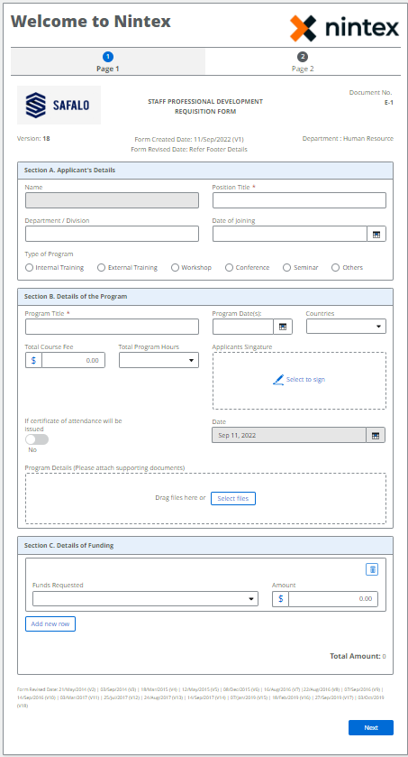
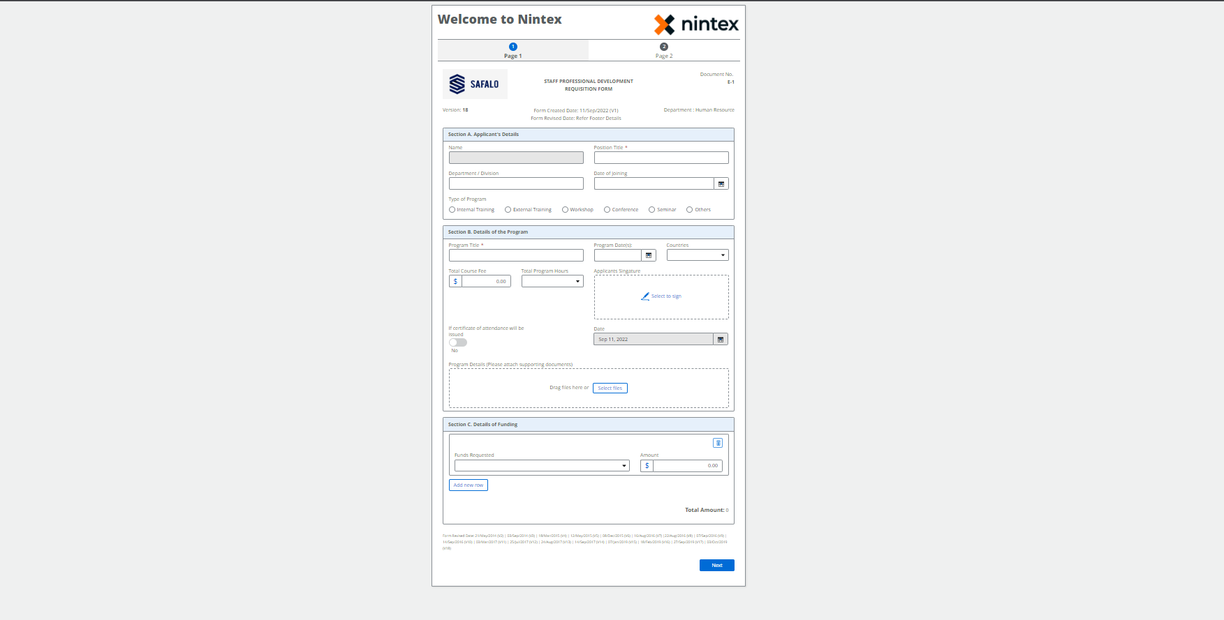
- Below is an example built on Out of the box features of Automation Cloud Form
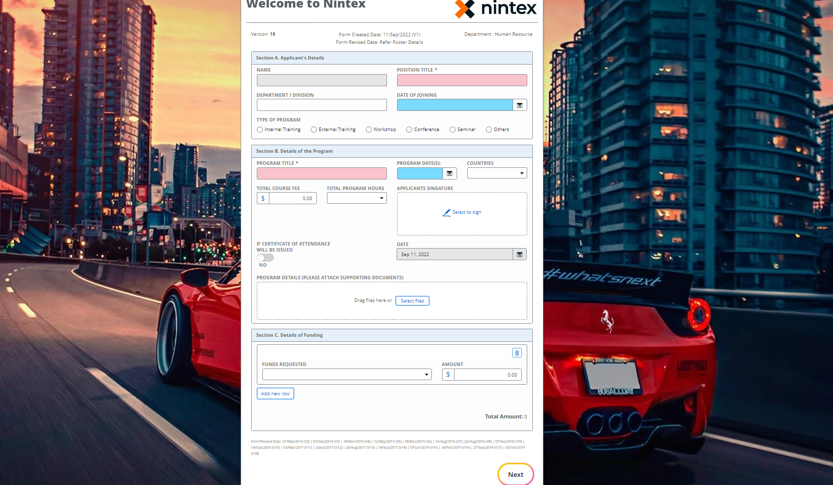
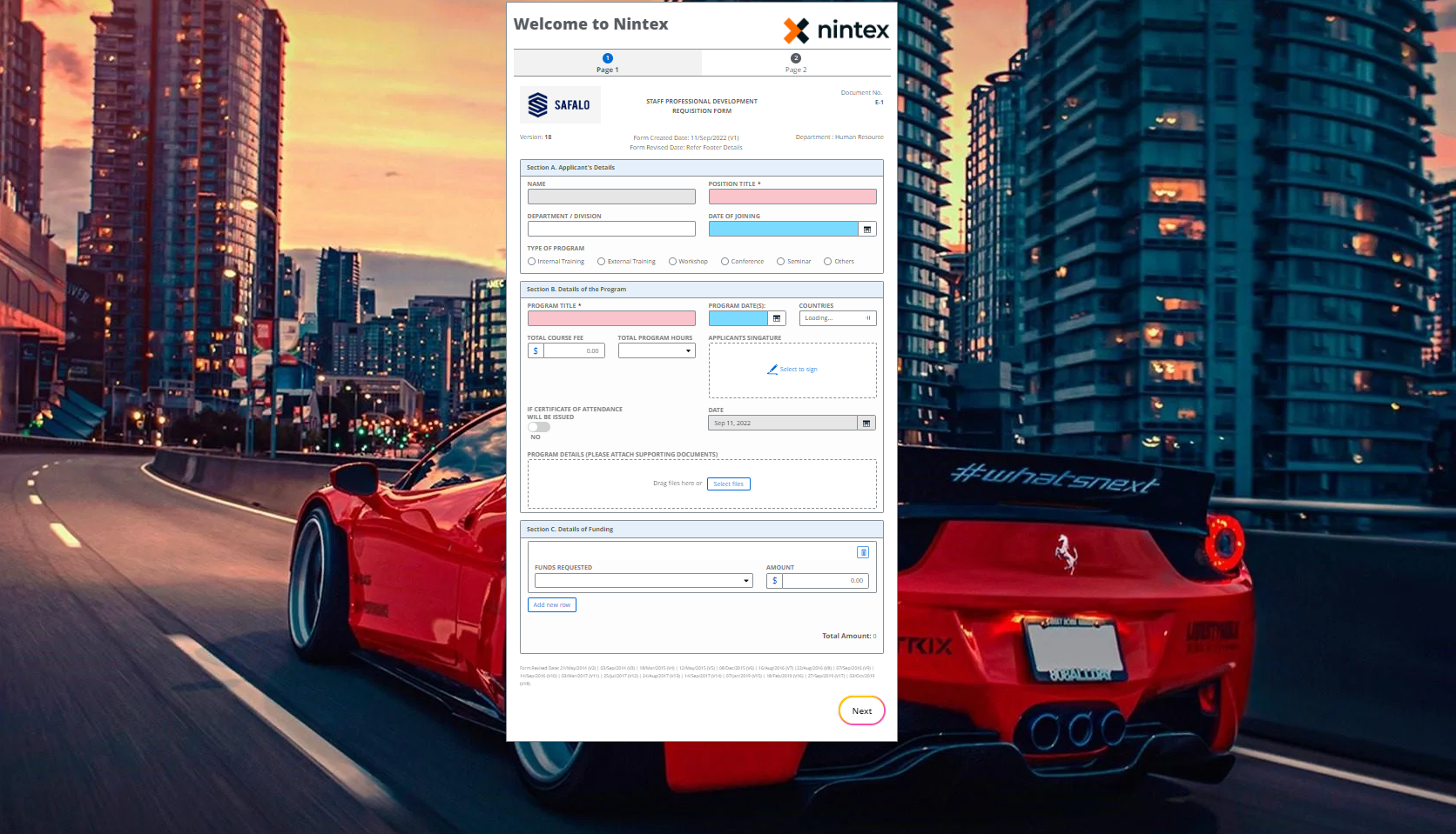
- Below is how the same form can be transformed and made more user friendly with Advanced Styles
Let us look at some of the most common scenarios where CSS can uplift the user experience in a form
- White Space on the Screen:
Many a times customer would use wide screen monitors and they may not be happy if there is a lot of white space in the form like below:
Organization would rather prefer to have a background image, maybe a logo of their organization or some image that would depict the usage of the space.
For instance, a luxury car company could have something as below.
This can be easily done using the following CSS
[dir] .nx-theme-styles .nx-theme-page {
background-image: url("");
background-repeat: no-repeat;
background-size: cover;
}
- Fixed Header for long forms
At times customer would want to have the header of the form fixed while the remaining to be scrollable.
| |||
| |||
This can be easily done using the following CSS
/* Sticky Header */
[dir] .nx-multi-page-heading {
position: sticky;
top: -30px;
z-index: 999;
background-color: white;
padding-top: 10px;
}
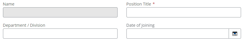
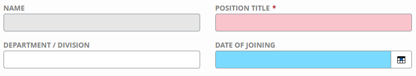
- Accessibility
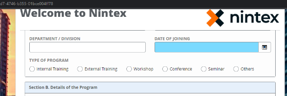
When we create a form, we need to cater for all personas / age group of users who will be using the system. At times, a red asterisk may not be very visible for an old age user to find on page. It can be made easier by color coding the text boxes that are mandatory or by color coding a text box to show relevant data on the form as shown below
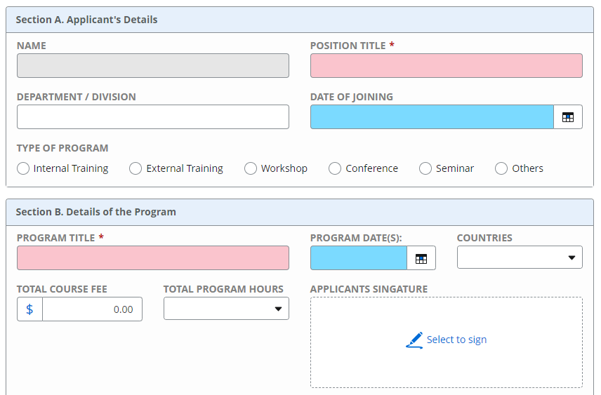
In the above example all mandatory fields have a reddish background while all the date fields have a blue background.
Nintex allows you to have a format for all control of a particular type or a control within a group. You can also target an individual control as shown above. To have a color coding as above all you need to input is
The below css will affect all date control
[dir] .nx-theme-styles ntx-datetime .nx-theme-input-1 {
background-color: #7bdaff;
color: #000000
}
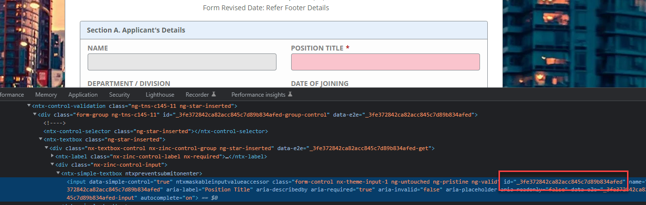
The below css will affect all control ID’s that are mentioned separated by comma
[dir] .nx-theme-styles #_3fe372842ca82acc845c7d89b834afed, #_eb49eb26f81eaeef0263fb29150bd060 {
background-color: rgb(250, 196, 205) !important;
}
To find the control ID you can use inspect element and target the control as shown in the image below
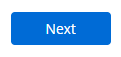
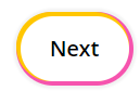
- Custom Buttons
Though Automation Cloud allows some customizations on button, CSS can bring a lot jazzier effect which may be required in your form.
| Button in out of the box Automation Cloud | With Advanced CSS |
| 
|
The below CSS will bring the effect of the button
[dir] .nx-theme-button-1 {
display: inline-block !important;
outline: 0 !important;
border:0 !important;
cursor: pointer !important;
text-decoration: none !important;
position: relative !important;
color: #000 !important;
background: #fff !important;
line-height: 20px !important;
border-radius: 40px !important;
padding: 20px !important;
font-size: 20px !important;
font-weight: 600 !important;
box-shadow: rgb(255, 198, 0) -2px -2px 0px 2px, rgb(246, 84, 174) 0px 0px 0px 4px, rgba(0, 0, 0, 0.05) 0px 0px 2px 7px !important;
transition: all 0.2s !important;
}
[dir] .nx-theme-button-1:hover{
box-shadow: rgb(246, 84, 174) -2px -2px 0px 2px, rgb(255, 198, 0) 0px 0px 0px 4px, rgba(0, 0, 0, 0.05) 0px 0px 2px 7px !important;
transform: scale(1.01) !important;
}
Do note the CSS above will affect only the primary button in your form as the CSS is meant to effect only the ones with .nx-theme-button-1. In case if you need to affect all the buttons on the screen then the same needs to be updated accordingly.
- Highlight labels of Control
When we have a busy form with many controls it is difficult to differentiate labels of control & text in the form. Converting the labels into a different color or making them upper case with bold could make it more intuitive and easier to read something as shown below.
| Labels in out of the box Automation Cloud | With Advanced CSS |
| 
|
The below CSS will convert all labels in the form to the desired format
[dir] .nx-theme-styles .nx-theme-label-1 {
color: grey;
text-transform: uppercase;
font-weight: bold;
}
There are many more options available in Advanced styles. For more details refer to Custom CSS Guidelines in our help portal.
Points to Remember:
- To debug an issue, you can disable the Custom CSS option. Custom CSS is still retained after this option has been Disabled, to enable all you must do is enable the option. But do note if you publish the form with this option Disabled, the deactivated CSS is deleted.
- If you have both external CSS and code in CSS editor, then CSS in the Code Editor will take priority over CSS contained in the external file.
- If the CSS is not well written it may damage browser accessibility features.
