Nintex Community Menu Bar
Question

Build Page in Lightning missing Page Include" under advanced."

  • July 9, 2024
  • 8 replies
  • 20 views

Forum|alt.badge.img+14

I am using “Build Page in Lightning” and the “Page Include” option under advanced is missing.

8 replies

Forum|alt.badge.img+17
  • Nintex Employee
  • July 9, 2024

Chatter and Page includes are not available in the Lightning Runtime.  Sorry.  Its a core salesforce limitation. 


Forum|alt.badge.img+14
  • Author
  • July 9, 2024

I use includes everywhere. Is there a tutorial on how to run skuid page in lightning?


Forum|alt.badge.img+17
  • Nintex Employee
  • July 9, 2024

No tutorials yet,  best thing would be to look at the Banzai introduction webinar:  https://www.youtube.com/watch?v=NkWJDbCcDlI  Lightning demo starts at minute 36. 

Lack of Include in Lightning runtime is not permanent.  We understand that lots of you guys use it to great effect. 


Forum|alt.badge.img+14
  • Author
  • July 9, 2024

Any changes with this constraint?


Forum|alt.badge.img+17
  • Nintex Employee
  • July 9, 2024

No changes yet with this constraint.   What is your reason for wanting to develop in lightning? 


Forum|alt.badge.img+14
  • Author
  • July 9, 2024

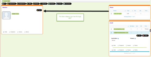
I cannot get my pages to be responsive.  The process to make them responsive seems to be more of an art than a science as they do not respond on iphones or ipads.  I am sure it is user error but cannot find any tutorial for when to use which feature and I end up with lots of extra space on the right on small devices.  Thee responsiveness works fine when resizing my desk top.  Thought lightning might be a solution. Thanks Rob.


Forum|alt.badge.img+17

I have some pretty complex pages that render well all the way down to iPhone… There is an art to it. First I replaced all panel sets with responsive grids. Then I played with the responsive grids until things did what I wanted them to do. Responsive grids have width and height parameters of vw and vh. I used those in many cases to adjust the size based on the height and width of the device… In some cases I had to use responsive grids inside of responsive grids to group components together for wrapping purposes.


Forum|alt.badge.img+14
  • Author
  • July 9, 2024

Could you should a video showing how you did this. Here is how mine looks.

Here is my CSS:
.sk-wrapper {position: relative;
border-width: 10px 2px 2px 2px;
border-style: solid;
border-color: #FF6600 #FF6600 #FF6600 #FF6600;
box-sizing: border-box;
background-color: #ffffff;
border-radius: 10px 10px 10px 10px;
margin: 0px 10px 10px 0px;
Padding: 0px 10px 10px 10px;
box-sizing: border-box;
overflow-y: auto;
position: relative;
display: table;
max-width: 800px;
min-width: 500px;
}