I need to create a css class to control the text of the selected option in a radio button - single choice control. I cannot find any examples of how to achieve this. I think if I have the proper class I could use Rules to control the text of the selected Option, like in the secreenshot below.
Best answer by Wei-Jye Wang
Hi @Wei-Jye Wang
This is working. Thank you so much. How can I apply this style to only one single choice control on my form and not to all of them?
Best Regards.
Art.
@artmov There are few ways to achieve that. The easiest way is to use custom CSS class in the config panel that we introduced recently.
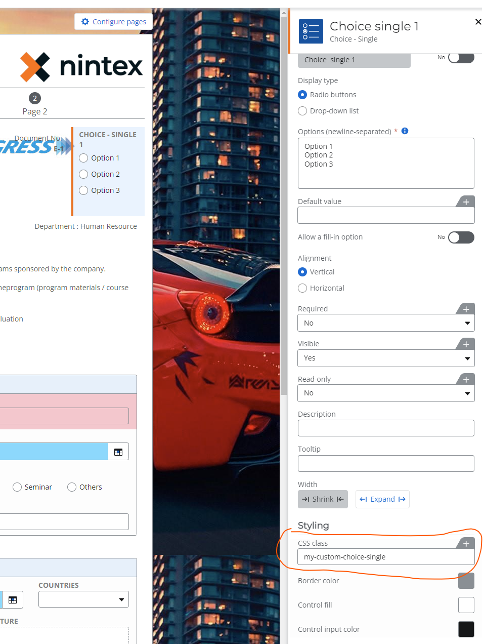
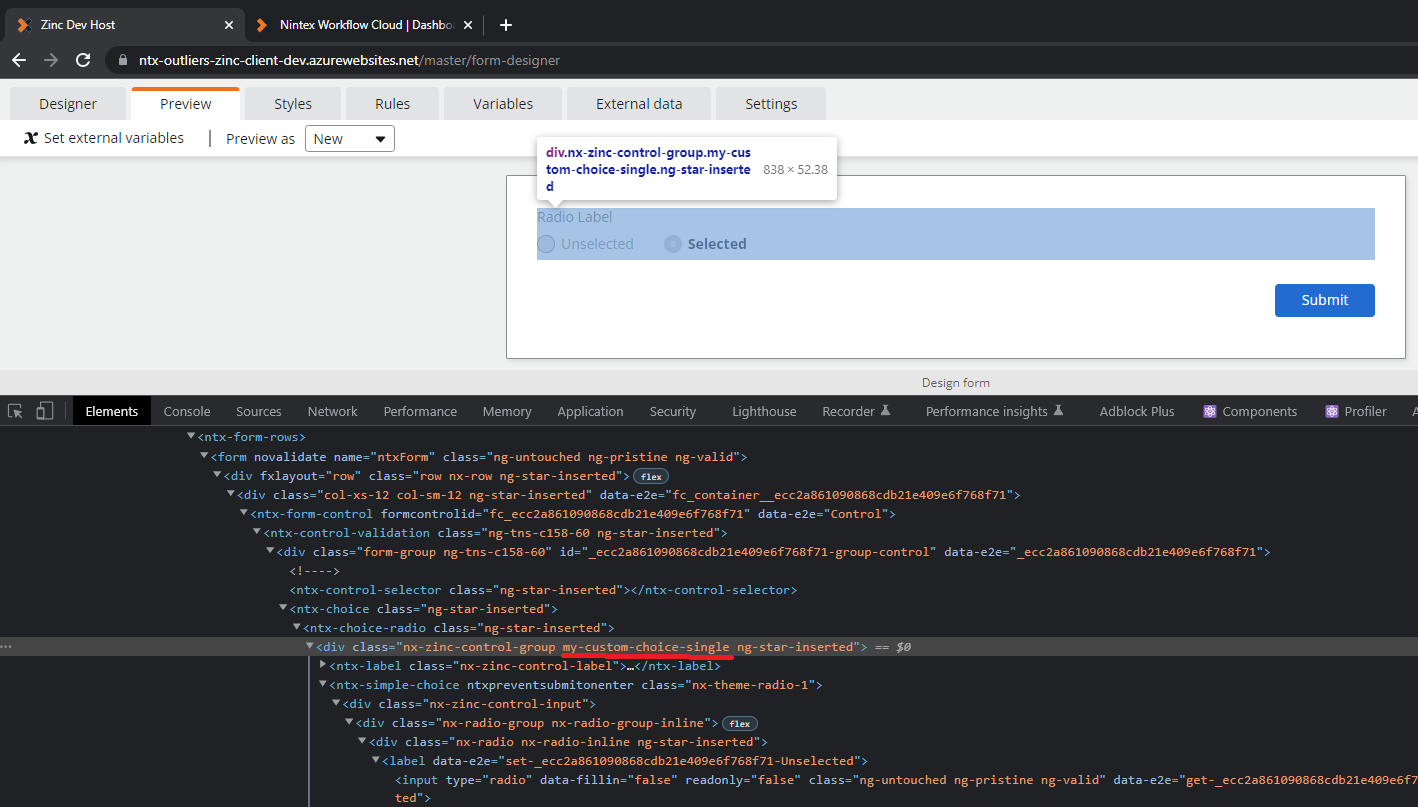
Say you added `my-custom-choice-single` in CSS class for the single choice control, you can now inspect element in preview tab and notice that the CSS class that you just entered will not be injected to the control group/container like this:
So based on the hierarchy above, we can now use the CSS class that we added just now, in the CSS code like this:
/* Radio button(s) that are not selected */ [dir] .nx-theme-styles .nx-theme-radio-1 .nx-radio input[type="radio"]:not(:disabled) + .nx-radio-container .nx-radio-faux { background-color: #e6e6e6; } /* label text for the radio button(s) that are not selected */ [dir] .nx-theme-styles .nx-theme-radio-1 .nx-radio .nx-radio-container .nx-radio-label { color: #7f7f7f; }
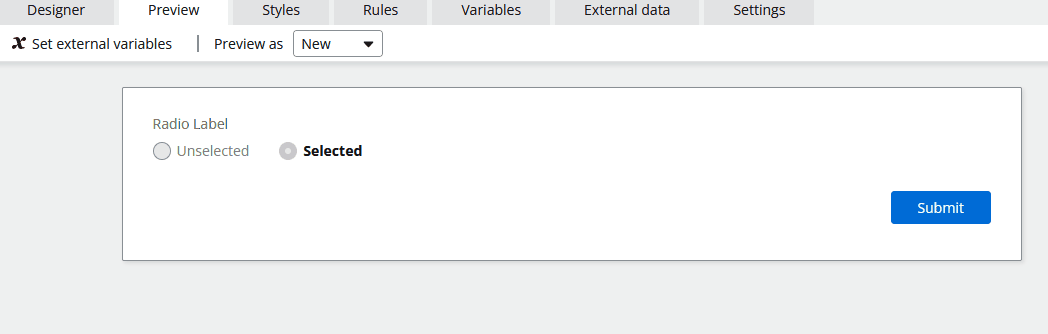
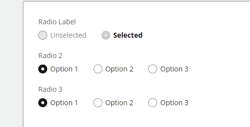
The above CSS code will only get applied to the single control that has `my-custom-choice-single` CSS class. And here’s the result:
Notice that the second and third choice control did not get the stylings from our CSS code, only the first choice control has it.
I saw this article before, but it is not extensive. They are just showing some samples. There is no documentation with complete list of Nintex CSS classes. My specific scenario is not described in that article.
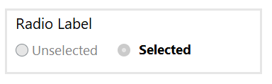
I attached the screenshot of what I am trying to achieve with my question. Basically it is a radio Button with two selections. When you select one, the text for that selection becomes Bold, and the de-selected options text is regular. So it is going to toggle between Bold and Regular font based on whish option is selected. It seems that I can control the label of the radio button(in my example Radio Label), but not the text for the options.
Hi Art, wondering if you have tried to define your own CSS Class in the config panel of the control under Styling. This custom class can then be utilised in the rules engined to toggle the bold and regular. Let me know if this helps.
/* Radio button(s) that are not selected */ [dir] .nx-theme-styles .nx-theme-radio-1 .nx-radio input[type="radio"]:not(:disabled) + .nx-radio-container .nx-radio-faux { background-color: #e6e6e6; } /* label text for the radio button(s) that are not selected */ [dir] .nx-theme-styles .nx-theme-radio-1 .nx-radio .nx-radio-container .nx-radio-label { color: #7f7f7f; }
The part for accessing the radio button selected text is from the first block:
This is working. Thank you so much. How can I apply this style to only one single choice control on my form and not to all of them?
Best Regards.
Art.
@artmov There are few ways to achieve that. The easiest way is to use custom CSS class in the config panel that we introduced recently.
Say you added `my-custom-choice-single` in CSS class for the single choice control, you can now inspect element in preview tab and notice that the CSS class that you just entered will not be injected to the control group/container like this:
So based on the hierarchy above, we can now use the CSS class that we added just now, in the CSS code like this:
/* Radio button(s) that are not selected */ [dir] .nx-theme-styles .nx-theme-radio-1 .nx-radio input[type="radio"]:not(:disabled) + .nx-radio-container .nx-radio-faux { background-color: #e6e6e6; } /* label text for the radio button(s) that are not selected */ [dir] .nx-theme-styles .nx-theme-radio-1 .nx-radio .nx-radio-container .nx-radio-label { color: #7f7f7f; }
The above CSS code will only get applied to the single control that has `my-custom-choice-single` CSS class. And here’s the result:
Notice that the second and third choice control did not get the stylings from our CSS code, only the first choice control has it.


