Yes. I also found this grey background a pain. To get around this, I put a rule on this input box, hiding it in display mode,
....and placed a Calculated Value control beside it, pointing to the SharePoint column. The Calculated Value control would be set to only show in Display Mode (inside the control Visible settings, using Expression isDisplayMode); or a rule could be used like above to hide in Edit Mode or Display Mode.
Here are the Theme Advanced Settings that I am using:
I think as long as your Background is set to white, then the Calculated Value will have a white background.
Hello,
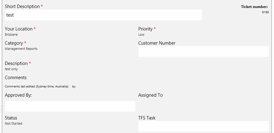
I am wondering a very similar thing - in View mode the field display changes.
As shown in the example below, some fields display with the white box visible and others display text only. I assume this depends on what kind of field it is, but I find that it presents a very 'messy' looking interface. Therefore I would like to align the look of all fields, either by hiding the white box on all fields, or by showing it for all.... I would prefer showing the white box for all.
Does anyone know how this could be done?