
I need some help bc after 3 hours of trying to get it - figured someone else might.
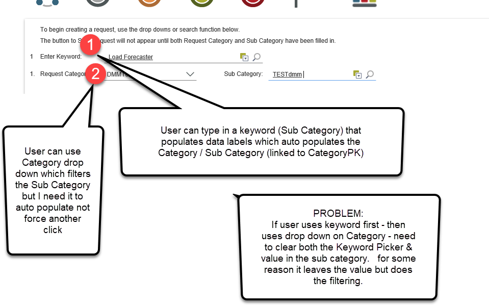
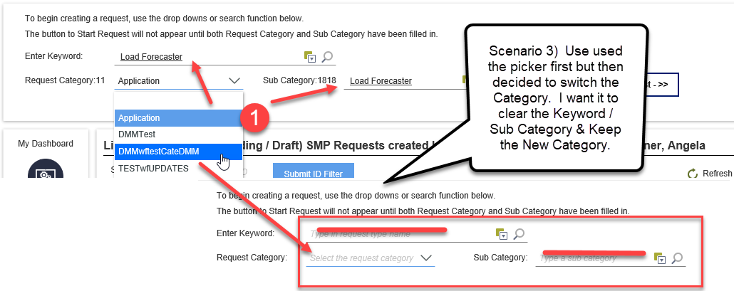
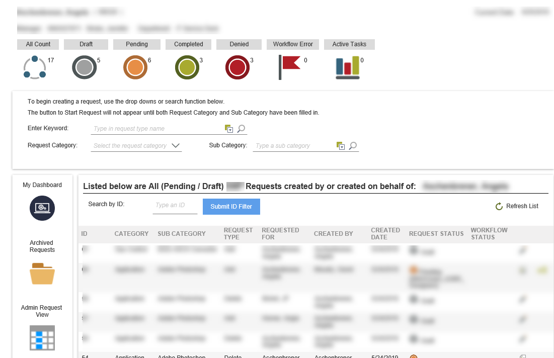
I have a 'Launch Screen' where users start a request based on Category / Sub Category.
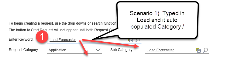
Users can either use a 'Search by Keyword' (Picker Control) -- that auto populates Category / Sub Category OR
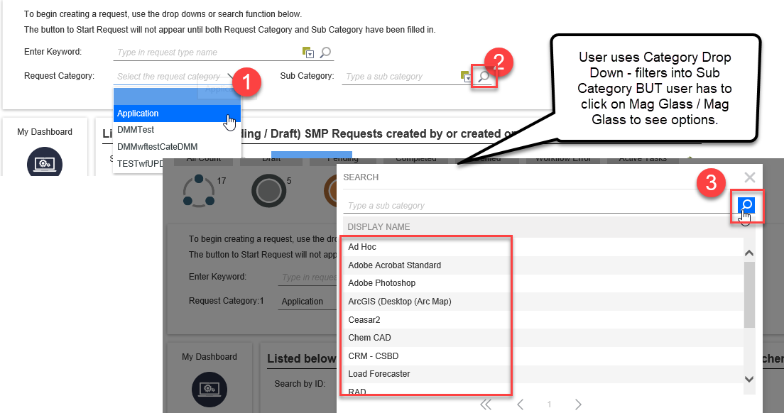
Use Drop down to select a category that would filter a Sub Category (Picker Control) by CategoryID OR
Change the Drop down for the category after already using the 'Keyword' which should clear out the pickers & start the new filter.
I do NOT want the Sub Category Picker to populate unless it's been populated by the KeyWord or Category Search.
My issues:
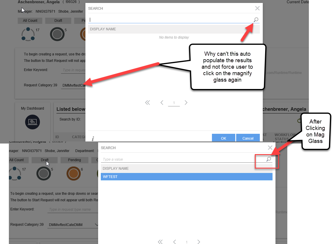
1) If I Use the Category Drop Down - it does filter the Sub Category but why can't it auto load the options. Why do users need to click on the magnify glass again when they get into the control.
2) If I use the Keyword search and then want to instead use the Category Dropdown - how do I successfully clear out the pickers and keep the new category in the drop down.
See Images...
I can't use dropdowns because there could be more than 200 Sub Categories.
But users will complain about having to click again on the magnify glass.