
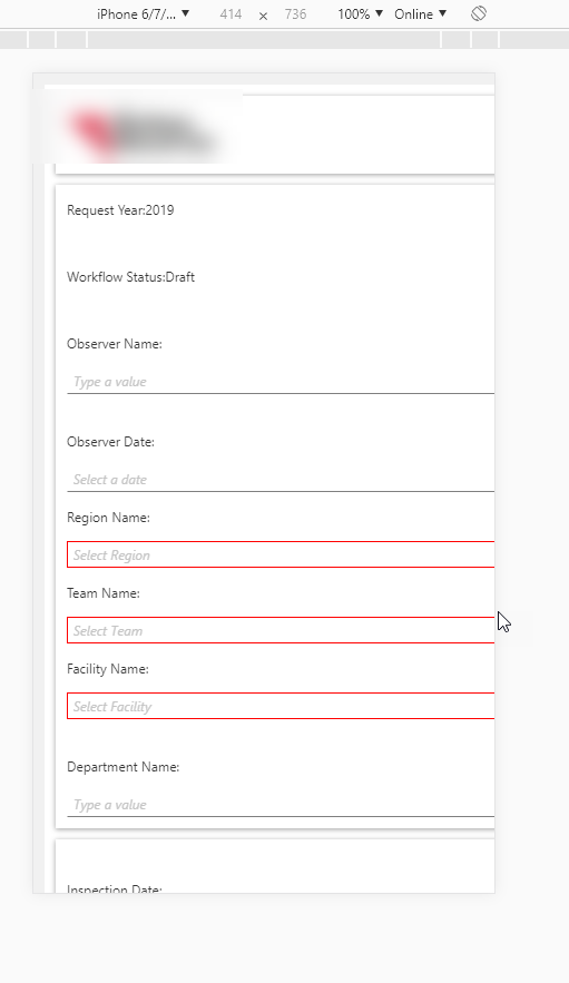
I'm attempting to emulate a mobile form and can't seem to find where the 'responsive' piece is coming from.


I put my form to a straight 1 column on all of my views and am using the Blue Void ( the Responsive Theme) on the Form.  The controls don't seem to respond however to the size (text boxes flow past edge of screen)


Any recommendations on Mobile? Layouts? Form Properties?  The documentation seems a little slim.


Does mobile responsive themes ONLY work in the workspace?  And does it only function properly if your on an actually phone?
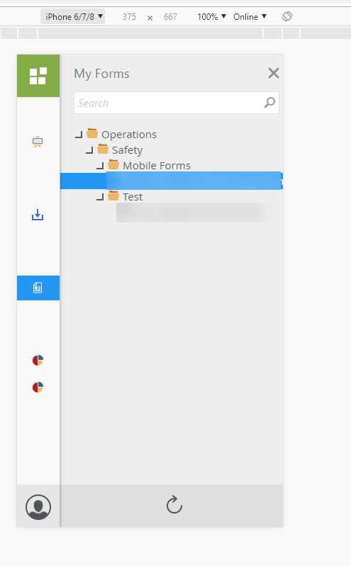
 

See Attachments.


11085i7158D17D1DC94D7E.png
15874i6E9CFA6B2CEC497A.png

If you actually try to open K2 workspace on your mobile browser, you will get to a page telling you to install the K2 workspace mobile app. So for K2 workspace, I recommend you install the K2 workspace app and use that on your mobile device instead.


As for forms, try selecting the Lithium theme. From what I know, that is the only theme that is responsive.


We tried the Lithium theme and it didn't seem to be responsive where the controls / fields are in a smaller screen size.  Looking at some screenshots we were expecting some different displays, but it may be because we weren't opening the form from workspace. 


Only way right now we have to simulate this is to use Google or to make the browser size smaller.    The company phones don't have the K2 Workspace downloaded yet.


Reply