Hi Lisaa, if I understand correctly you are using a Field Editor in a Deck. Looks like you can get this to work if you use a Wrapper’s border instead of the Deck Card’s border. Here is what you could try:
Design System Studio
- Modify your existing style variant or create new one for the Deck
- Set the Card border size to “None”.
- Modify your existing style variant or create new one for a Wrapper
- Set the Border to 1px and Padding to 4px (or similar, see what looks best)
App Composer
- If you created a new style variant for the Deck, select it.
- Put the Form component in a Wrapper.
- Select the respective style variant for the Wrapper.
- The Deck Card needs extra large “min width” to ensure that all fields are in one line, you might want to adjust and test a couple of values to find what looks best in your case.
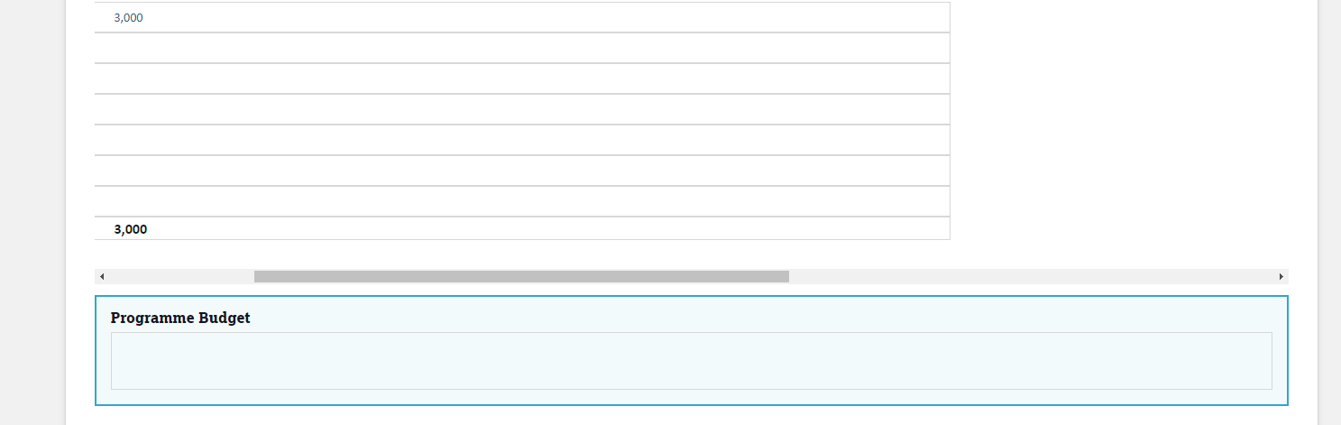
As result, you can scroll to the right and the grid lines remain.
Alternatively, I recommend using a Table, which saves you some of this extra design work. The Table is supposed to be scrollable and the grid lines remain intact automatically. I’ll just leave this information here for other users 🙂 as far as I know, you can’t use a Table in this use case based on some specific design requirements.
Let me know if you have any questions!
Luzie