
Topic
A client wanted a different field value to show up in a bar chart’s category labels, but didn’t want the data in the chart to change. When changing the label setup, the bars became very thin and spread apart.
Expected
Observed
Resolution
Use “template” for the category type to add your own styling decisions to the chart label, and enable stacking in the chart styling to prevent empty columns from shrinking existing columns.
Problem Details
Our client wanted to add “– present” to the label on the left of their bar chart to show “cfiscal year] – present.” By default, only the fiscal year text was visible. While trying to add the customization, we found that the chart’s bars changed shape – they became skinny and harder to see.
Resolution Process
Skuid uses the concept of a “template” in a number of places (Table columns, Form fields, Chart categories and series, and more). A template lets you mix field values through merge syntax with your own accompanying text and styling.
In charts, when you need more control over how your data points are grouped, templates can be used to split the data series up into groups defined by the template you write. You can also use templates to customize your chart’s category labels, which is what we did in this case. To do this:
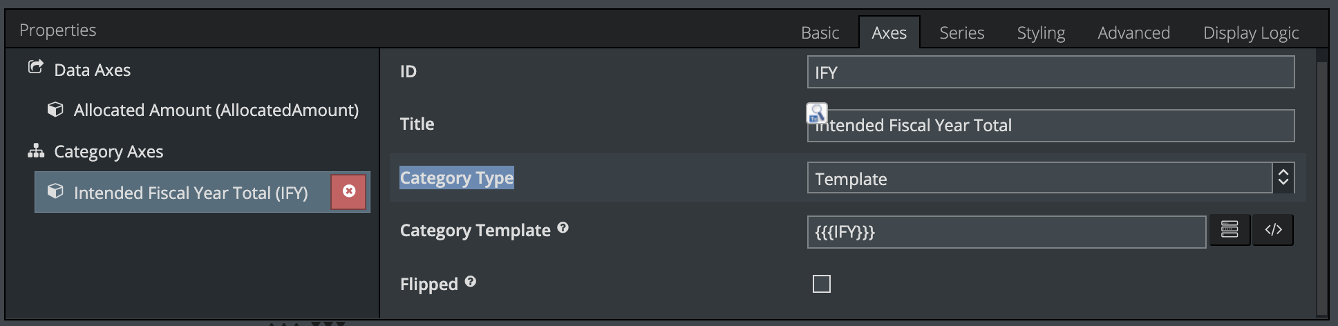
- In the chart’s Axes properties, under Category Axes, we changed the Category Type to Template.
- We used {{{Fiscal Year}}} field as the template.
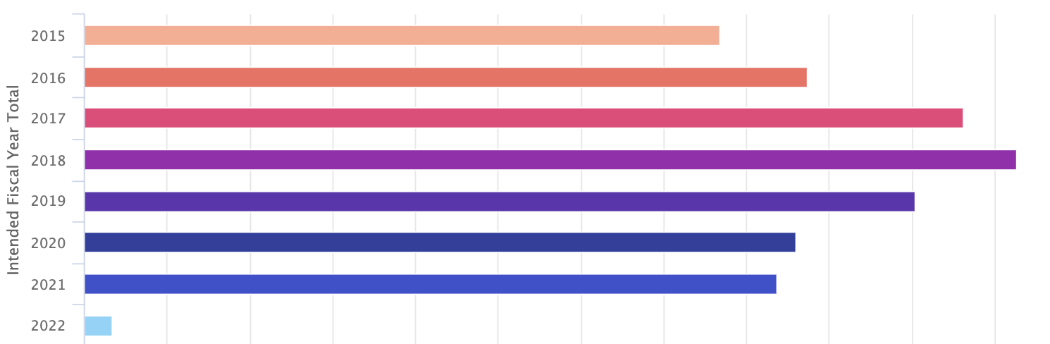
This had the desired results - the labels and the displayed data were correct. However, now, the bars on the chart were very skinny, and this wasn’t the case before.
There isn’t a chart setting that specifically controls the thickness of the bars, so it wasn’t clear why this change had come about. What else might have an impact on the width of the bars? Whatever it was, it was related to the change in the category groupings.
We tried removing the category template, but that just brought us back to the incorrect chart label issue we started with. Where else in the chart setup do things get grouped? Realizing that the Fiscal Year field was being used twice helped us identify the best solution. In this case, we noticed that the series also had a split type set up that uses the same Fiscal Year field that we had added to the category axis.
In each ‘fiscal year’ category grouping, there were also several ‘split’ bars that didn’t have any data points. These bars were empty, and effectively invisible, but they still occupied some of the vertical space in the chart and forced the visible columns to be skinny. Basically, this happened because we used the same field both as a category axis and as a split type in the series.
Outcome
To recap, we first fixed the chart’s bar labels by using a template in the category axis setup:
There are two ways that might fix the skinny bar issue that came from this change.
- Remove the split type from the series setup if you can.
- Enable stacking in the Styling properties.
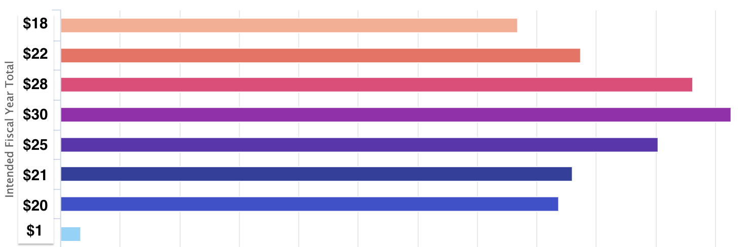
Our client enabled stacking to solve the issue.
Additional Information
Why did stacking fix the problem? Stacking moves those empty columns onto the same line as the populated columns. Similarly, removing the series’ split type removes those empty columns from the chart.
What is the difference between a category axis and a series that’s been split? In this scenario, since our client wanted to use fiscal years as chart categories, they could then also split those fiscal years into quarters or months using the split type setting on the series. Or as another example, the series could be split based on a field like Industry or Owner. Or, there may not be a need for a series to be split up at all.
Get help with an issue
- Ask in the Skuid question forum.
- If you have a support entitlement, ask your question in Nintex Customer Central.