I have several posts where I am applying CSS to a New Responsive form to get a changed layout. This is one of the first posts that go into detail about how to get the CSS to work Apply CSS to New Responsive Form
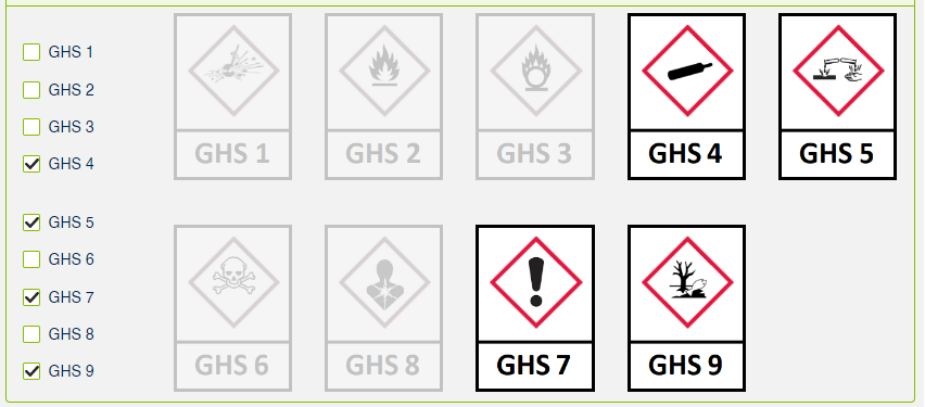
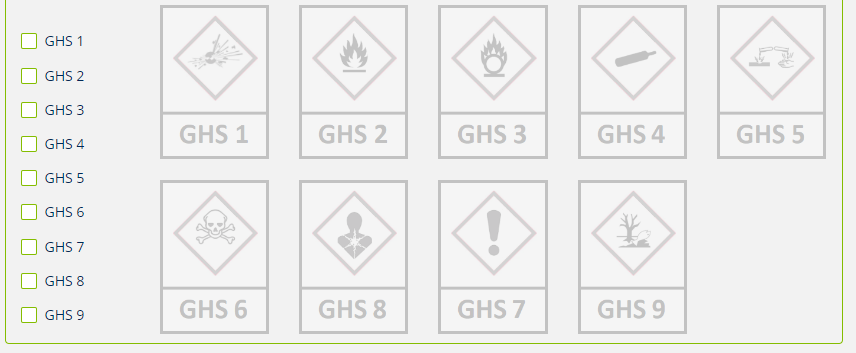
Today I have been tinkering with a New Responsive Form with multiple select Lookups to populate images based on the user selection dynamically. I did not like the horizontal layout of the checkboxes. If I set it to vertical and made two separate lookups, and could get close to having the checkboxes in the first column and the images to the right or remailing columns. This leaves a visible gap between the two “rows.”

I would have left it this way, but this uncovered some bugs in the form, specifically related to the two fields, and some users could not save the form when they interacted with these lookups. I stripped out the fields and went with the one multiple-select field across the top of the images, but it did not flow for me. I started digging into the CSS again. If I could manipulate other fields, why can’t I position these?
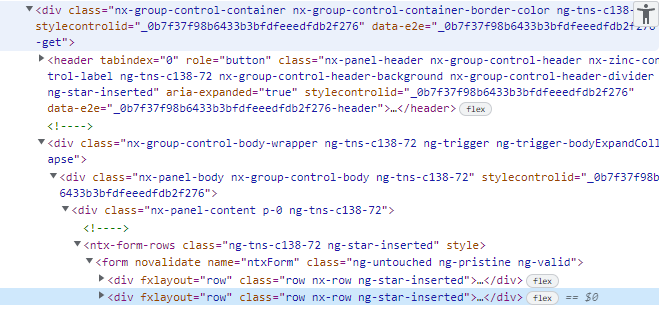
Targeting the correct element was a little tricker, even using Developer Tools. I eventually found a unique way to create my relative selector. I found the data-e2e attribute within a div; from there, I could target the “last row” or second child. Initially, I disliked using this selector because I am unsure if these IDs change. If the change, I will have to find another unique way to target the correct element.

Enough BS; here is the CSS:
div[data-e2e='_0b7f37f98b6433b3bfdfeeedfdb2f276-get'] form[name='ntxForm'] div[fxlayout='row']:nth-child(2) {position:absolute;right:0px;top:175px;}
Here I set the position to absolute, right to 0, and top, well, that was a guess again. The 175 looks good, so I am staying with that. One thing to note this for the setup or layout of the images. I used a label for the first position in the second image row, but I am sure this could be set using the “right” property through the CSS.
Here is the final output:

Good Luck!
Happy Coding!

