I am trying to get my Salesforce data to chart like this using the Skuid Charts (HighCharts): Note that there is a break in the graphed line when the result was left blank “null”. 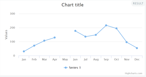 Here is a link to the JSFiddle HighChart page were this was made possible. http://jsfiddle.net/gh/get/jquery/1.7… Currently my data has blanks if no data was recorded, but instead of breaking the line, Skuid Charts shows the dataset with a 0 and no break in the line. In the image below 5/23 and 5/25 should be null values and should have a break. But instead it drops to 0. This erroneously makes it looks like the result was 0 instead of showing that no data was collected by breaking the line.
 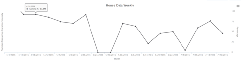 So I created three different columns of data in an attempt to get null results when the field was left blank. I got close but not quite there. 1. In column 2 below I used a UI only field formula set to return numbers. I used an If Statement to show the number of “null”. According to the table results I was successful in getting numbers and the actual lowercase word “null” to show up instead of the blanks. From my research into HighCharts a lowercase null was necessary to create the break in the line. 2. I also tried using a Salesforce formula field called “Calculated Results” (the last column in the table) to show numbers and null results. Unfortunately, in this example I had to list the numbers as text. So not as good as option 1. But both options 1 and 2 graphed the exact same way.(see below) 3. The “Results” column is the actual data entry field you enter the raw data. Numbers are numbers and blanks show up as blanks. This column graphs like the 2nd graph above where it has one continuous line but drops to zero instead of breaking the line. Here is my table of results.
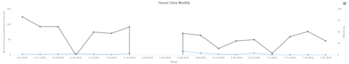
 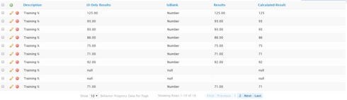 I thought the UI Only Field would work awesome because it lists numbers and it shows the actual word “null” for the blank fields. It did successfully fail to graph the the null entries (which is awesome) but it also made the whole chart turn into data points with no connections. The same thing happened when graphing number 1 and 2 options.
 Can anyone think of a way to connect the data points and leave a gap if it is null (i.e. no one entered any data for those points? Happy to send via email a $100 gift card to whomever can show me an example that will get me to the correct end result. Thank you!

Question
$100 Amazon Gift Card- High Chart Connect Nulls False
 +10
+10This topic has been closed for comments


Enter your E-mail address. We'll send you an e-mail with instructions to reset your password.