

As described in Raymond’s post, I’d like to have a mobile responsive tabset. Seems pretty straightforward when I inspected the HTML. The current HTML has a structure that can be replaced with a hamburger menu using CSS 3. ie. @media screen and (max-width: 600px) As described by Jackie Mathis in this webinar in which she references my how-to. My solution was built using js, whereas in this post, Huyen York, posts the CSS only solution.
Then to use the same HTML as the navigation component when on mobile.
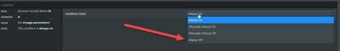
The current workaround is to use a nav component to show/hide components. Very messy builder experience. Each “Tab” is now stacked vertically. Need to have page title for each section that is never rendered to help navigate to each. Ugh. Would be nice to have an option to set default render conditions without having to set some field to a value it will never be. Similar to Model Condition State of “Always Off”.
Tabset should get Navigation component’s hamburger menu for mobile responsive.
Navigation should get tabsets user selection styling.