Nintex Community Menu Bar
Question

Is it possible in skuid page to Add a Horizontal Line in a Chart


Forum|alt.badge.img+1

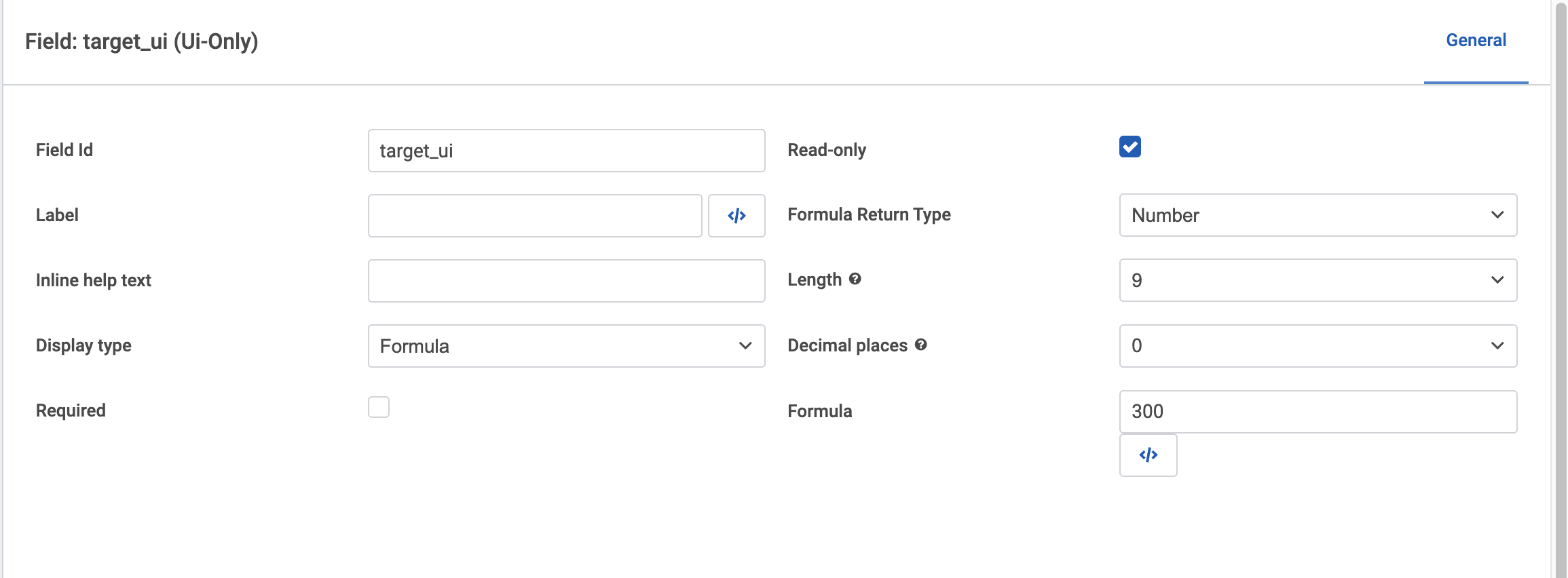
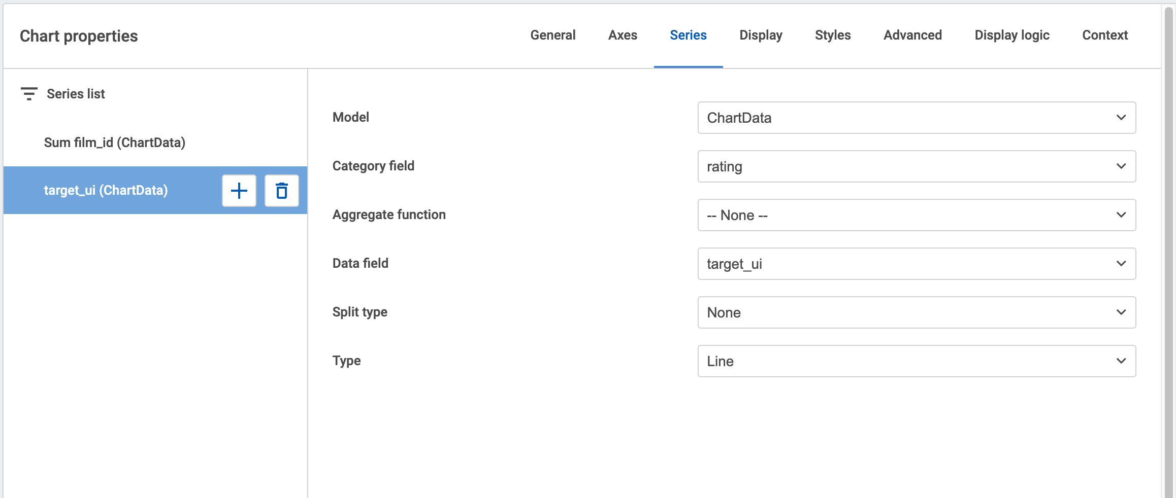
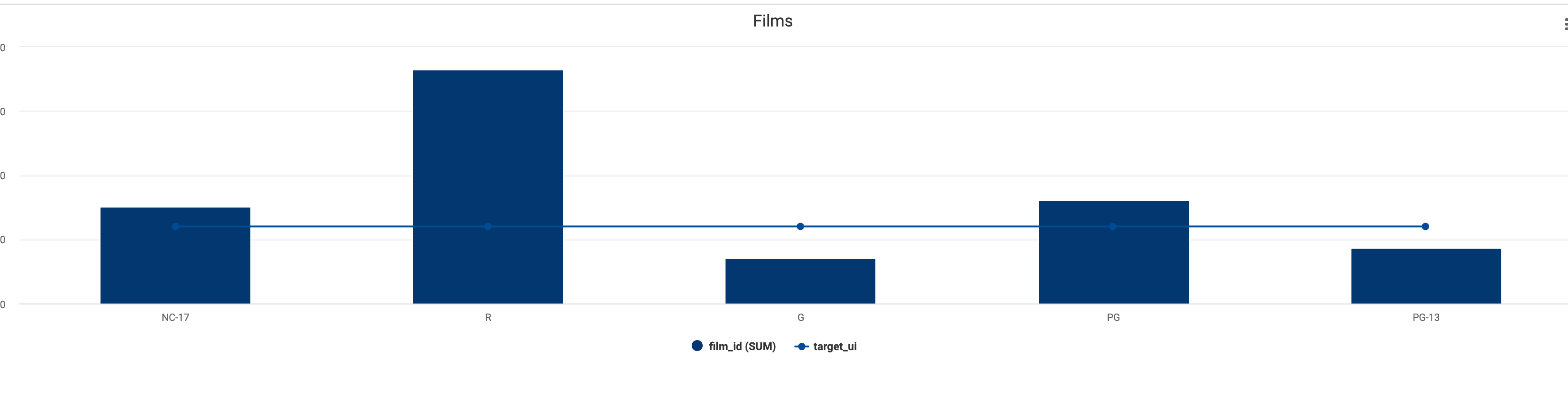
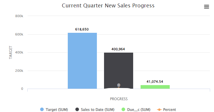
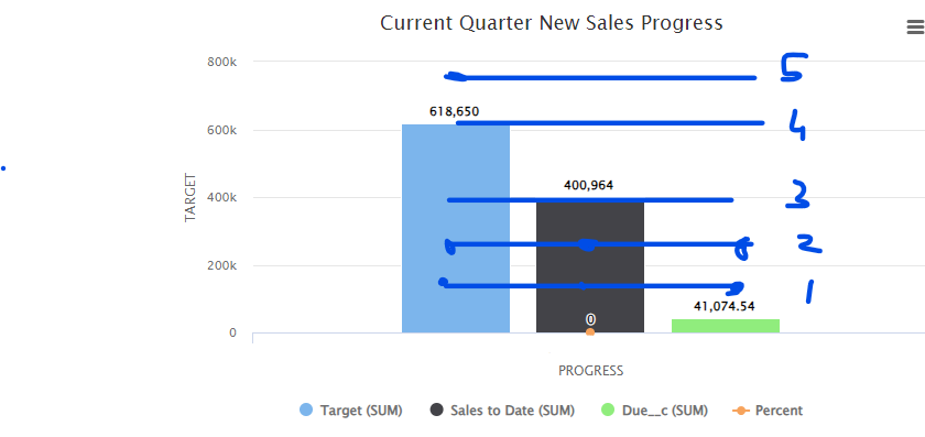
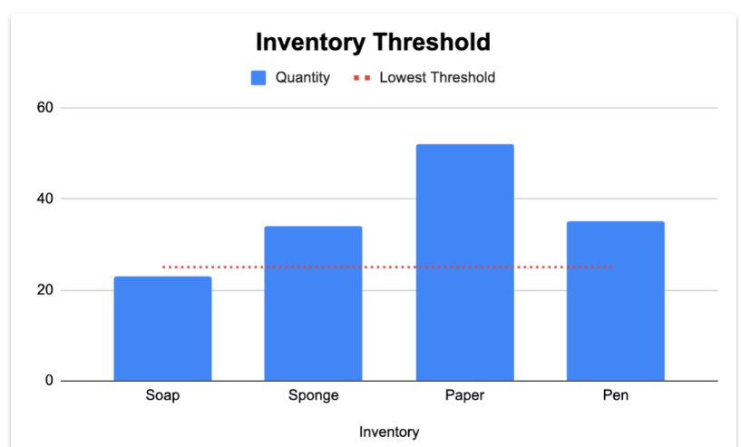
Is it possible in skuid to add a horizontal line in a chart just like we do in google spreadsheet to indicate a target line.

Translate
Did this topic help you find an answer to your question?

4 replies

Forum|alt.badge.img+5
  • Nintex Employee
  • 48 replies
  • July 12, 2024

Hi @Trupti, welcome to the Skuid Community!

You can add a line to indicate a target with a little bit of setup:

  1. On the model that’s providing data for your chart, add a ui-only field set to Display type: Formula, and Formula Return Type: Number. Then in the formula editor, add the number value you want your target set at.

  2. On your chart, create a new Series using the ui-only field as the Data field, and set the Type to Line. You’ll also want to make sure the new series is still using the same category field as the main data series. If you want to customize the label for the horizontal line, set the Split type to Template and enter your custom label in the Split template field.

With that setup, you should get something like this:

Translate

Forum|alt.badge.img+1
  • Author
  • Novice
  • 2 replies
  • July 12, 2024

Thanks Elena.

What if I am using 3 different models to generate a single chart? I have tried the above stapes but instead of line it is showing dot on a chart.

Translate

Forum|alt.badge.img+1
  • Author
  • Novice
  • 2 replies
  • July 12, 2024

I have attached chart. How can I add horizontal line in this chart so it can display the ranking
like 2nd image


Is their anyway I could do that.
Thanks.

I have tried your steps but instead of showing line its showing a dot.

Thanks for your help

Translate

Forum|alt.badge.img+5
  • Nintex Employee
  • 48 replies
  • July 12, 2024

Man, using multiple models definitely makes this trickier, but I think I’ve found a solution using a before render snippet.

Add the following snippet to your page, and then reference it in the Chart Properties > Advanced section in the Before-render snippet field.

Then you can adjust the snippet to configure how you want the plot lines to appear. There’s a bunch of options listed in the highcharts documentation:

77bdf5956c68ae5d2d3b5876c264dec8fa8c2389.pngHighcharts cf92bd3645c93b5e6ffee12a854baa38d6558504.png

Highcharts API Option: yAxis.plotLines

An array of lines stretching across the plot area, marking a specific value on one of the axes.

var chartObj = arguments[0],
 $ = skuid.$,
 targetModel = skuid.model.getModel('MyTargets').getFirstRow(); // get targets from a model

 $.extend(true, chartObj.yAxis[0],{
    plotLines: [{
        value: targetModel.target1, // you could alternatively use a static value here
        color: 'green',
        dashStyle: 'shortdash',
        width: 2,
        label: {
            text: 'Target 1'
        }
    },{

        value: targetModel.target2, // you could alternatively use a static value here
        color: 'red',
        dashStyle: 'shortdash', 
        width: 2,
        label: {
            text: 'Target 2'
        }
    }
    ],
 });
Translate

Reply


Cookie policy

We use cookies to enhance and personalize your experience. If you accept you agree to our full cookie policy. Learn more about our cookies.

 
Cookie Settings