Add to missing “Creating a new row doesn’t place the cursor in the first input fields of the newly created record.”
I’m going to have to disagree. V2 is much more stable, doesn’t have any grid misalignment issues when the header is frozen or “flashing” header issue and has an overall much much cleaner UX when scrolling.
User sorting is still available, just as an overall feature found within the table’s basic properties. It might be nice to give us back the option to specify which column are user-sortable, but I feel when users request sort access, they want to be able to sort on any column, rather than asking for sort capability on specific columns.
User can also adjust column width, just by grabbing the column border with the mouse and adjusting the size. There are lots of other cool features available in V2 like adaptive columns, cell overflow, allowing users to freeze columns, etc.
Personally, I like a clean table to start with, I never liked all the default set of actions and 95%+ of the time removed them immediately.
I agree drag and dropping rows would be amazing, but if V2 has drag and drop of columns…I’m sure rows will come soon enough…and hopefully with no jQuery required.
I also agree that navigation via tab or keys would definitely be handy, and placing the cursor in first input field seems like a nice feature as well, including likely good for accessibility purposes.
Another thing I’m no fan of is icon only row actions not being able to be remain unstacked/ungrouped. The old table only had the icon as buttons on the left of the row. I’d like to have that option back.
Don’t often use the frozen header, but I do appreciate having a stable option for this.
I keep most of the default options typically. I almost always remove the search box.
We also don’t have the templated actions available. ie. Mass Update. Now you have to construct it completely whereas it’s one of the most common actions I add.
Basically, I want the features of both. 
Pat - I really like your last comment. Its what keeps us going…
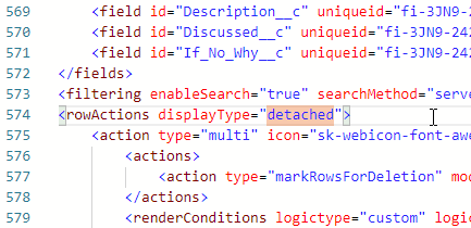
Here’s how to detach your row actions via XML.


