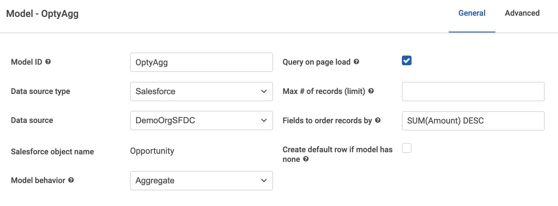
SOQL accepts aggregate functions in the order by clause. It looks like your field is something like GCNetWeightCaseLac. You should be able to add SUM(GCNetWeightCaseLac) DESC to the “fields to order by” property on the general tab of the model definition.
See below an example of ordering opportunity aggregation by amount.
Hey Rob! I tried this out, and although it appeared to do good things and change the order of my chart, I’m still seeing some strange behavior.’
When I add a ‘DESC’ property to my ‘fields to order by’ on my model, the order does change, but it doesn’t end up in DESC order on the chart, it’s just different. It also continues to include a ton of lines, but only displays every third label.
Model with condition:
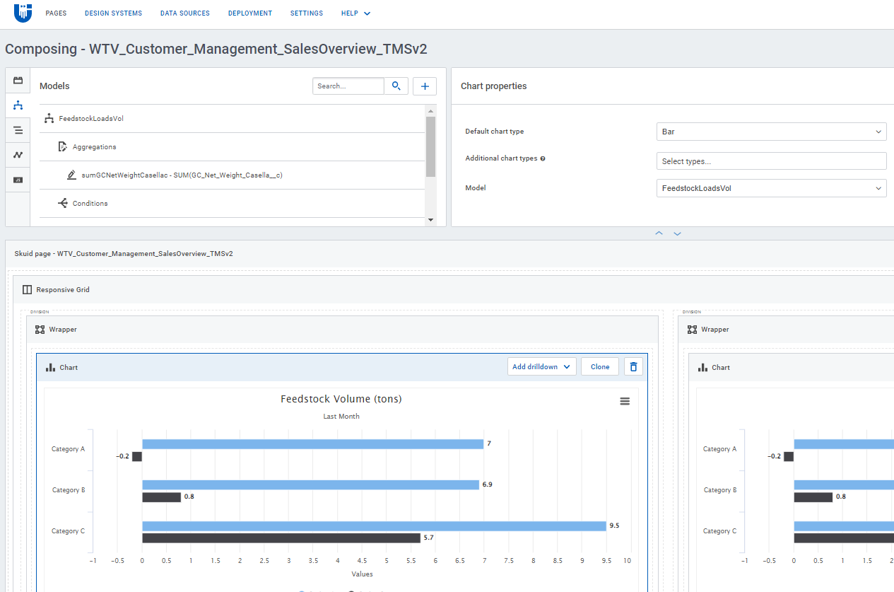
Chart with Model driving it:
Resulting chart:
Any direction would be appreciated, but I do think we’ll end up moving this piece into a Tableau visualization for now.
Best
Chris
Here are some guesses.
- I think you have more groupings than just Customers on the model. If you put the model into a table - you will find that the sort by
Sort_net_weight.... is in fact getting applied to the model, but that other grouping items are getting in the way.
- Then when the chart builds it processes those rows in order as they appear in the model, but when another row is found for a prior customer the additional value is thrown up into that prior segement. This is how the volumes get “unsorted” in the exhibit.
Finally - Our chart components start eliminating axis labels when there are too many rows. You might add a model limit to show top 10, or you might expand the chart height to ensure that all the axis labels show.
PS - I really don’t think you need to go to Tableau for this. Thems fightin words… 
Bingo! I cleaned up my groupings (which I originally thought were necessary to power the axis) and I’m in business. Once I reduced down to 10 records, all labels show. Ultimately I’d like to have a way to increase the default height to include additional records, but this does indeed make Tableau unnecessary - apologies for the unintended slight! 
No appology necessary. Tableau and similar BI tools do have thier place. They have richness and features we don’t offer…
You can increase the default height on the display properties of the chart. But I don’t think you can make that dynamic to the number of records you want to show.
Have a great weekend.


