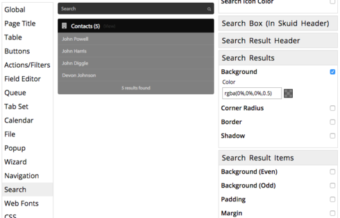
Can’t seem to find the setting to get the background to not be transparent.
Was able to fix the issue with CSS.
.sk-search-summary, .sk-search-result-header, .sk-search-result.ui-menu-item { background-color:#fafafa; }
For future reference, the Theme Composer allows you to set this in Search > Search Results > Background, or in Search > Search Result Items > Background, where you can set a different background for odd and even rows of results.
Hi,
If I may Hijack the thread, as my problem is similar…
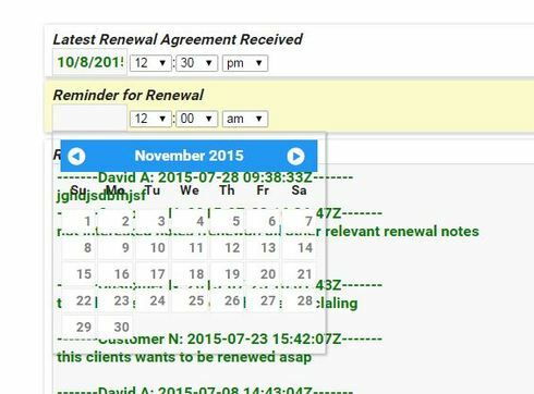
How would I do the same for calendar Popup(calendar popping out when editing a date field)?
Atm it’s transparent and sometimes not very east to see all clearly.
I tried changing in the theme , in Calendar Section, but seems it is is not for the Calendar i’m talking about
I would like to be able to have calendar with a solid backround color
Thank you
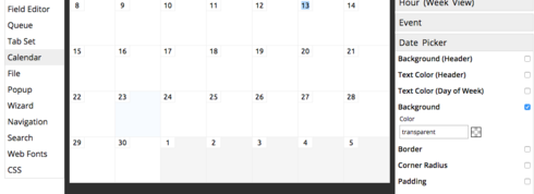
Hijack away! I’ve had that problem before too. It’s under **Calendar > Date Picker > Background
 **
**
Thank you Anna!
You’re welcome!
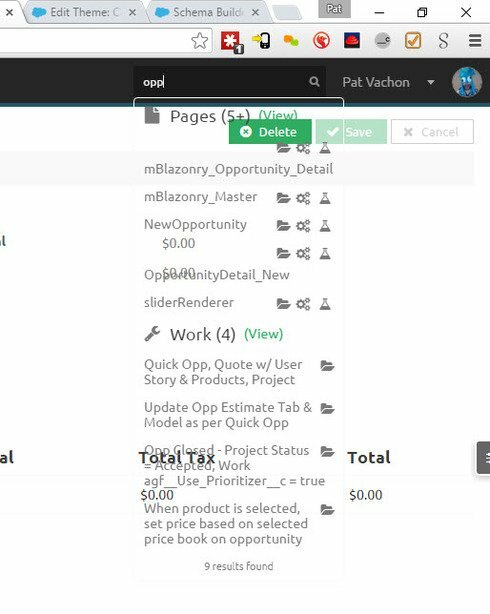
If you use the Lightning Design theme, the search results change depending on whether or not you are in a tabset. The behavior I’m seeing is:
- Inside a tab - transparent
- Outside - white background
Just wanted to leave a note for anyone else running into this issue in the future.
Reply
Enter your E-mail address. We'll send you an e-mail with instructions to reset your password.

