Is there any way to limit the number of categories in a visualization? Or would I have to create a specific model just for the visualization? For example, let’s say I have a model and a table showing all open opportunities. I would want to display a pie chart that breaks down only the top 10 accounts by opportunity potential, instead of the chart displaying every single account. OR it could group all the smaller ones together.

Page 1 / 1
To go along with that. I have another question. What is the best way to display 2 charts side by side? Right now I have each in a panel with width at 50%. But often on smaller screens the charts can be very different sizes. 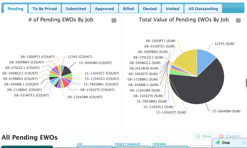
So a few questions…
1. To only show “Top 10 accounts” it would be best if you created a separate model to drive the visualization. You probably want to create an aggregate model so that the only data being sent from the server is the specific rows for the chart.
2. For bar charts, its not going to be super easy to create a separate “and everything else” slice in your chart. You can’t create an aggregation like that within a single SOQL statement (therefore within a single Skuid Model). So you are forced to create two models. Bar and Scatter plot charts let you add multiple series, which can tie to separate models. But pie charts cannot. The complex answer would be to create two models, and then in a “before render snippett” add the “and everthing else” values as a separate row in the the first model. This snippett would run before the chart reads its model data and paints. That would be the Javascript dark side…
3. Chart size. The trick is that chart size is not just about the graphic - it also includes the labels in its calculations. So to get even sized pies, you need even sized lables, and label sets that are shown in the same places. (the big pie above has no labels on its right side…). I would encouraage you to use the “Template” option for the category field. This will remove the “(Count)” from the label. A more drastic solution would be to write a before render snippett that hid the lables in the chart and then use a legend on the side. Or a snippet that forced the lables to 5 characters.
Options. Options. Options…
Since you almost certainly have to use javascript, I’m fairly certain you can use just the one model.
A series can be manipulated such that the “Top 10 accounts” are left as is and everything else is summed up to be the 11th value in the series. The part I’m not sure about is how to isolate the “Top 10 Accounts”. Here’s a post about it. I’d remove the “Limit 10” portion in order to lump rows 11+ into series value.
https://developer.salesforce.com/forums/?id=906F000000090VlIAI
Here’s a snippet that cuts off everything after the first 10.
var chart = argumentst0], series = chart.seriese0].data; if (series.length > 10){ series.splice(10,series.length - 10); }<br>
Chart Size - My personal favorite for having cleaner chart is just to turn off Legend and Data Labels Off in Chart Styling > Legend. This data will still display on hover, without crowding the page.
Have you checked out Matt’s Deep Dive into Filter and Search Capabilities in Skuid? Around minute 15:00 he covers using table filters to filter charts. May give you a few more options.
https://www.youtube.com/watch?v=ouFJVa6Ro1w
Great. Thanks for all the replies!
Hey Rob/any anyone who has had success with this…
I’m having difficulty with your answer for “2.” in Ryan’s question. I am similarly attempting to make a pie chart that has the top 10 Opps with an 11th ‘all other Opps combined’ display. Any chance you could share an example of the code/steps required to make this functional? The more detail the better ") . Or Ryan if you were able to get this to work could you share?
. Or Ryan if you were able to get this to work could you share?
Thanks for any help is greatly appreciated.
I don’t have any examples, but here is a sketch of one way you could solve the problem.
1. Create 2 aggregate models.
- One aggregates by record count, splits by category, sorts by (count)recordID Desc, and has a MAX rows loaded of 10.
- Another aggreages by record count, has no splits and has a condition where the record categories are NOT included in the categories returned by the first model. (You probably will have to go to XML to populate the alias value of the category field in this condition.)
2. Use an inline javascript resource to populate the value from model 2 into a new row on model 1 that has category “Other”. I don’t have that snippet handy, but it should not be that hard.
3. Create a pie chart on model 1 showing the 11 slices.
Thanks for breaking that down further for me Rob. That makes more sense, I should be able to get that functioning now.
Enter your E-mail address. We'll send you an e-mail with instructions to reset your password.