All,
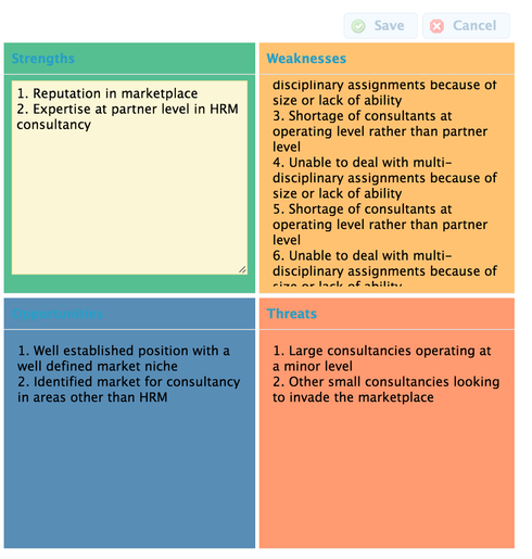
Above is a small screen cap of a form I am developing. I have two questions.
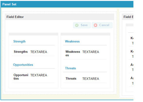
1 - Within the field editor there are two columns and 4 sections, one fro Strengths, Weekness, etc. I would like to have a different color background for each of the 4 sections. I saw how John Nelson did it in the Deep Dive video but I am not clear on how to just address the specific areas above. What do I put in the CSS to tell it to just do the background for each section?
2 - To keep the model looking symmetrical I would like to keep each section the same size regardless of the amount of data that each section has. Each of the fields (Strengths, Weaknesses, etc) are Text area Long. So the amount of data could vary. I would like the sections the same size and have a scroll bar to see data that does not fit in the allocated space.
Any thoughts?
Jeffrey,
I’m not an expert, but I think that each element would need a different class. Unfortunately, you can only assign a class with skuid on the field-editor level. You may be able to accomplish your objective with a panel and four field editors. Give each field editor a different CSS class. Then you can apply what John did at around min 18:30 of the video.
With the Superbank release you can add unique class names to individual sections and individual fields of Field Editors. This makes our work here be entirely a CSS exercize.
So first go and install the newest version of Superbank. Then, here is what you need to do to the field editor shown above.
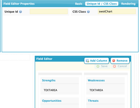
Click the “Field Editor” bar at the top. Look for Unique ID / CSS Class tab. Add a CSS Class. I used name swotChart.
Click each section and look for the CSS Class property. I added classes named strengths, weaknesses, opportunities, and threats.
Go to the resources section of the builder and add a CSS resource of type “Inline” add this code:
/* Colors for both section headers and items */ .strengths .nx-basicfieldeditor-section, .strengths .nx-basicfieldeditor-item { background-color:#55BF92; } .weaknesses .nx-basicfieldeditor-section, .weaknesses .nx-basicfieldeditor-item { background-color:#FFC271; } .opportunities .nx-basicfieldeditor-section, .opportunities .nx-basicfieldeditor-item { background-color:#588DB6; } .threats .nx-basicfieldeditor-section, .threats .nx-basicfieldeditor-item { background-color:#FF9A71; } /* Define height details section */ .swotChart .nx-basicfieldeditor-item { height:225px; } /* Define height and overflow of text fields */ .swotChart .nx-field textarea, .swotChart .nx-fieldtext { height:200px; overflow: scroll; }
This will produce output that looks like this:
The Strengths block has been clicked into edit mode. The Weaknesses block has more text than fits in the height and is scrolling.
Adjust the CSS code to fine tune colors and block height.
Enjoy!
Robert ( and Jim). That is excellent! Thank you very much. My colors look just like yours.
But I do have one problem. My ‘blocks’ are not the name size. Also how did you get rid of the 'Field" name. It looks like you have the section name and got rid of the field. name. I don’t see a way to do that. But it is very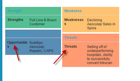 close!!!
Jefferey,
Are you using Rob’s code?
This is the section that deals with height:
/* Define height details section */ .swotChart .nx-basicfieldeditor-item { height:225px; }
/* Define height and overflow of text fields */ <br> .swotChart .nx-field textarea, .swotChart .nx-fieldtext { height:200px; overflow: scroll; }
Yes I saw that and I do have that in the CSS. Maybe it has to do with the upgrade. I thought we were at the latest version but I see we are not. I am running the upgrade right now in the test environment and will see if that fixes the issue. Sorry for kind of jumping the gun!
OK so I just did the upgrade but that did not correct the height issue. It seems like those parameters are being ignored. Do I gave to change anything else on the page? For all Width settings I am using %, Should I use px?
You need to go into the field editor properties. Set Field Layout to “Label avove Field”
Then go to field properties and simply add one space to the custom lable property.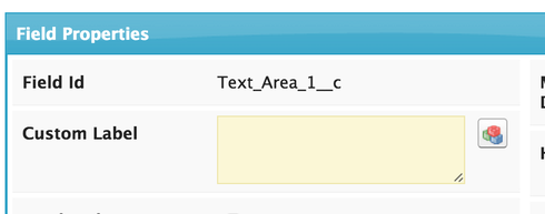
That will give you the effect you want. And will also probably make your CSS work since the selectors change when you adjust your Field Layout.
Robert - That fixed the label issue but the height issue remains. Any thoughts?
Make sure you have the class identified for the Field Editor as a whole as well as for the individual sections.
Robert - That worked. Thank you very much for all the assistance.
Glad to hear. Hope this is an effective interface within your organization.
Enter your E-mail address. We'll send you an e-mail with instructions to reset your password.

