
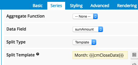
I can’t figure out how to customize the data labels of my visualization charts…I am only getting the standard format of (Aggregate Function): (see below)


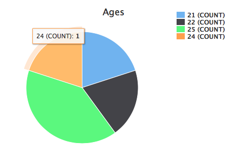
Since this is a pie chart of Age, it looks like the label is really the data point (24 records instead of 1 contact record of Age 24).


How can I customize these data labels to make this a little more straight-forward…e.g.


  1. Add % of Total

  2. Change format to say, "Age : 2 Contacts"

  3. Not include aggregate function title (e.g. COUNT/SUM/etc.)

I see on the Skuid Banzai page this is possible, as has been done with the World Bank Key Indicators data, so it has to be possible…just curious how to do so?


Thanks!


Conlan


Conlan, on the series definition for the pie chart there is a “split type” property. If you set that property to “template” you will have much more granular control of what is shown.


To get % of Total, you might have to add a second model that produces the “TOTAL” number and then UI only fields on the model that drives the chart that show the percentage of current value / the “total” model. You can use global merge syntax to retrieve the total back into each row. The UI only field formula might look like this: {{countIds}} / {{$Model.TotalModel.data.0.totalIds}}


The output of this formula can be used in the split template, or can even drive the chart as a whole.


Fun!