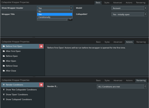
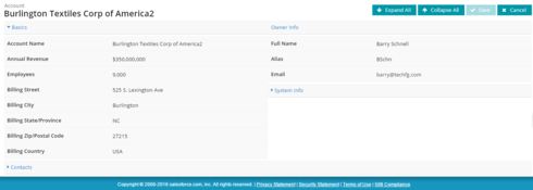
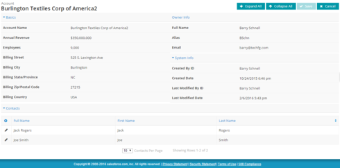
Barry,
This is pretty cool! With actions and everything! Thanks for sharing this. Your contributions to the community are incredible.
Emily
Thanks Emily 
Hi Barry,
I was looking to use your custom component with a chart. However, when I open the collapsible section the chart doesn’t show up; other components do show up, though. I wish I could give you more information beyond that, I checked the JavaScript console and there weren’t any errors.
That said, this is a really cool custom component that you made. I’m sure the community will get a lot of use from it. 
If there’s any other information you need, just ask.
Thanks!
Hi John -
Sorry about the issue you are having with the Chart component. I know exactly what the root cause is (thanks to some help from Zach). I’ve had it on my list to get fixed but haven’t had the cycles to do it yet. I’ll get it fixed and upload a new version as soon as possible.
Glad you are finding good use for the component!
Cool! Thanks for writing this component.  I’ll keep you updated if I find anything else in the future.
Hey John -
I tried to reproduce the issue you are having with the CW and the Chart component but unfortunately, I wasn’t able to reproduce the behavior your experiencing. That said, I did fix the issue that I was aware of with the CW Component and have uploaded a new version. I’m hopeful that it will resolve your issue as the symptoms that you are describing would present the same as the issue that I knew existed.
Can you download the latest version of the component pack and let me know if it resolves your issue?
If it does not, if there is a way that you can create a repro of the issue you are having using standard objects, etc. I can set it up in my DE Org to isolate and resolve.
Let me know. Thanks!
Awesome work!
Can save a lot of additional work with that custom component.
Thank you.
Great Job Barry and thank you for sharing!
I can already see how this will be useful to us
Thank you!
You’re welcome - glad to hear you’ll find this useful!
Hey Barry - simply wanted to add my Thank You as well!
This custom component is seriously awesome, and will help me solve some long-outstanding issues I’ve come across.
Cheers,
Great to hear that you are finding it useful, your welcome!
Hi Barry,
Thought i would make you aware of 1 potential issue I just noticed.
If i have a chart inside a CW which is initially collapsed, the chart come out pretty zoomed in…
If i add an action to query model after open, it fixes it.
No big deal, but would be useful not to have to run an unnecessary action
Thx
Hey Dave - Thanks for the feedback. I’ve seen a scenario where when the CW is initially collapsed, when you open the chart expands beyond the containing ‘div’ element of the CW itself. I think this is due to an issue with the chart itself but it definitely could be something in the CW. Is this what you are describing by “zoomed in”? If you can share a small repro of this using standard objects I’d be happy to work to isolate the issue and see if I can resolve it. If it’s something in the chart component itself (which I fear it is), there might not be anything I can do but if it’s in the CW, I can definitely address.
Btw, are you using the latest version of the CW. I fixed an issue a couple of weeks ago where the chart itself wouldn’t even display when the CW was initially collapsed.
Thanks!
Thank you for quick answer
1- I did update the static ressource before posting
2- here’s xml using opp sample page
Closed Lost
LAST_N_QUARTERS:2
NEXT_N_QUARTERS:2
THIS_QUARTER
TotalOppAggWon
TotalOppAggOpen
models.saved
{{Quantity}}{{UnitPrice}}((100-{{Discount}})/100)
{{UnitPrice}}*2
{{PricebookEntry.UnitPrice}}
row.updated
SalesPriceFormula
row.updated
Quantity
Opportunities
models.saved
{{{sumAmount}}}
Closed Won
Invoice
{{{sumAmount}}}
Closed Won
Closed Lost
Invoice
&n
Hey Dave - Thanks for the answers and providing the sample. Unfortunately, it looks like the entire page didn’t paste properly or possibly there might be a limit to the number of characters in a post. Can you post the page XML to a dropbox URL or equivalent?
Awesome, thank you! I’m able to reproduce the overflow of the chart when opening the CW. I’ll dig in and see what I can come up with. Keep you posted!
Dave - Thank you again for putting together the sample, made reproducing the issue very easy. Happy to report that your sample led me to the source of the issue and I have implemented a fix and updated the component pack.
Can you download the latest version of the component pack and let me know if it resolves your issue?
Thanks again for your help!
Good Morning Barry,
Thank you for quick fix. I just updated the resource and tried it, and works perfectly !
Yesterday I put those CW to good use and it makes some process so much easier and my pages now look much cleaner!
So thank you again for the awesome work 
Awesome news, thanks for the confirmation! Glad to hear the CW is getting put to good use. Let me know if you run in to anything else.
Hello All -
It’s great seeing the CW gaining traction, glad so many have found it useful!
Thanks to everyone for their feedback/input and especially to those that have helped uncover some shortcomings in the CW. Given all the latest feedback, here’s a current snapshot of where things are at:
1) tfgComponents only support Desktop - Please make sure to mark the component pack as Desktop Only
2) I just released version 1.3. Here’s the release notes:
- Version 1 - Initial Version
- Version 1.1 - Fix to support resource loading on child components within the wrapper component (e.g. chart would not display at all in some cases)
- Version 1.2 - Fix to ensure that child components are properly “drawn” within the CW container when CW was initially collapsed (e.g. chart would extend beyond the CW container on initial display if CW was collapsed to start)
- Version 1.3 - Fix to ensure that when tfgComponentPack is enabled for Mobile (which it should not be given #1 above), it won’t entirely break the builder
The latest version is always available at
component pack.
As always, feedback appreciated, keep it coming!
Thank you!
Hi Barry,
1 of the feature i love about your cw component is that it allows me to basically create ‘before load actions’ on any skuid page without having to write any JS or find creative ways
But 1 thing i’m not sure why, the action(s) will not work if the ‘show wrapper header’ is set to no, and/or ‘collapsible’ is set to no.
I can technically understand the reason, but it would be nice if I could ‘completely hide’ the component for this use case , and only use it as a before load action
I was able to do it as close as possible, but it’s showing a little section with arrow to collapse. if i choose to hide it with rendering options, ofc the actions will not apply…
Basically my goal: if possible, to be able to use actions of cw component, without showing the cw on page
Hope it’s clear

Thank you
Dave -
Love your creativity here! Using the CW to workaround the fact that Skuid doesn’t currently provide a way to define a onPageLoad sequence declaratively - brilliant!!
Skuid Team - Another indirect vote for adding onBeforePageLoad & onAfterPageLoad action sequences to Skuid Pages 
As you’ve discovered, the CW was written so that the open/close events only fire when there is a header and when it’s collapsible. I do tend to agree that it might make more sense to fire open events regardless of collapsibility. Let me knoodle on that one a bit but I can see that change making sense.
In the meantime, I think you can achieve what you are after. The key is hiding the entire CW using a CSS rule. If you apply a CSS class to the CW (e.g. pageLoadWrapper) and then create a css class setting display: none, it should hide the wrapper and still fire the events.
Here’s a sample page. Let me know if this works for you and thanks again for your feedback and ideas - love seeing the ingenuity!
<skuidpage unsavedchangeswarning="yes" personalizationmode="server" showsidebar="true" showheader="true" tabtooverride="Account">   <models>

      <model id="Account" limit="1" query="true" createrowifnonefound="false" sobject="Account">

         <fields>

            <field id="Name"/>

            <field id="CreatedDate"/>

         </fields>

         <conditions>

            <condition type="param" enclosevalueinquotes="true" operator="=" field="Id" value="id"/>

         </conditions>

         <actions/>

      </model>

   </models>

   <components>

      <tfg__collapsiblewrapper title="New Wrapper" showheader="yes" collapsible="open" uniqueid="pageLoaderWrapper" cssclass="pageLoaderWrapper">

         <components/>

         <styles>

            <styleitem type="background"/>

            <styleitem type="border"/>

            <styleitem type="size"/>

         </styles>

         <onbeforefirstopenactions>

            <action type="blockUI" message="Loading..." timeout="1000"/>

         </onbeforefirstopenactions>

         <onafterfirstopenactions/>

         <onbeforeopenactions/>

         <onafteropenactions/>

         <onbeforecloseactions/>

         <onaftercloseactions/>

         <renderconditions logictype="and"/>

      </tfg__collapsiblewrapper>

      <pagetitle model="Account" uniqueid="sk-lx3g8-68">

         <maintitle>

            <template>{{Name}}</template>

         </maintitle>

         <subtitle>

            <template>{{Model.label}}</template>

         </subtitle>

         <actions>

            <action type="delete"/>

            <action type="clone"/>

            <action type="share"/>

            <action type="savecancel" window="self"/>

         </actions>

      </pagetitle>

      <basicfieldeditor showsavecancel="false" showheader="true" model="Account" mode="read" uniqueid="sk-lx3g8-69">

         <columns>

            <column width="50%">

               <sections>

                  <section title="Basics">

                     <fields>

                        <field id="Name"/>

                     </fields>

                  </section>

               </sections>

            </column>

            <column width="50%">

               <sections>

                  <section title="System Info">

                     <fields>

                        <field id="CreatedDate"/>

                     </fields>

                  </section>

               </sections>

            </column>

         </columns>

      </basicfieldeditor>

   </components>

   <resources>

      <labels/>

      <css>

         <cssitem location="inline" name="newcss" cachelocation="false">.pageLoaderWrapper {

    display: none;

}</cssitem>

      </css>

      <javascript/>

   </resources>

   <styles>

      <styleitem type="background" bgtype="none"/>

   </styles>

</skuidpage>
Barry,
It’s exactly what i needed , thank you
Skuid should add your component as part of their standard product and pay you 1 free squid for every client that uses it!
here’s 1 from me
