Nintex Community Menu Bar

This praise is for Matt Brown of Skuid. He created a dashboard and added filters to the charts.

Works like this.

  1. Place chart on page
  2. Place table above chart
  3. Add Filters to table
  4. Remove all elements from table. ie, row actions, search bar, etc.
  5. Use this method to remove the table footer
The dashboard that was created has a 3 panel set with 6 charts. Each chart has it’s own set of filters. The result is AWESOME!

I’ll confess my jaw dropped when I saw it… Way to go Matt!

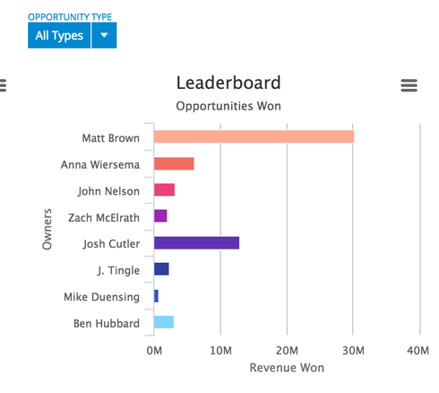
Here is a picture of what a single chart looks like.


Anyone notice who’s the leading Sales Rep?  How’s that for self promotion! 


This is a great idea. Thanks for posting, guys.


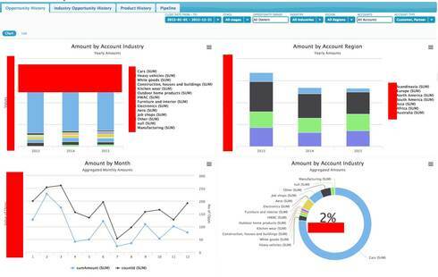
This is exactly how we did some of our charts for a customer. We also added the feature of duplicating the table on another tab. So the base layout would show filter and charts but it is possible to switch to a tab with the table data and export option to excel. See examples attached (with some ugly boxes to hide customer data)
ec3412187073d585811492d8c3e800bcff2561a3.jpg
384865a871425a4200ff5aa3439965f7a93c2500.jpg


Reply