I am using a Choice control which is rendered as buttons on a Classic Designer form (SharePoint 2019) as a tabbed navigation control.  When a button is pressed, only one panel is shown (all others hidden).  In a Modern form, the selected button is automatically highlighted by changing the border and background color; in the classic designer it is only slightly changes the border color - almost undetectable.

Any help would be appreciated!  Custom JS/CSS?  Rules?  Thanks!


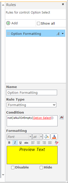
You can try using a Formatting form rule on the Choice control. It might not be exactly what you are looking for, but maybe close enough. Below are the steps to configure:

  • Select the Choice control and add a rule to it.
    - Name = Option Formatting (or whatever you would like to name the rule)
    - Rule Type = Formatting
    - Condition = not(isNullOrEmpty(Option Select))
    - Formatting - Choose a desired fill color, text color, font, bold, italics, etc.
  • Change the sizing of the Choice control so that there is no space below and to the right.
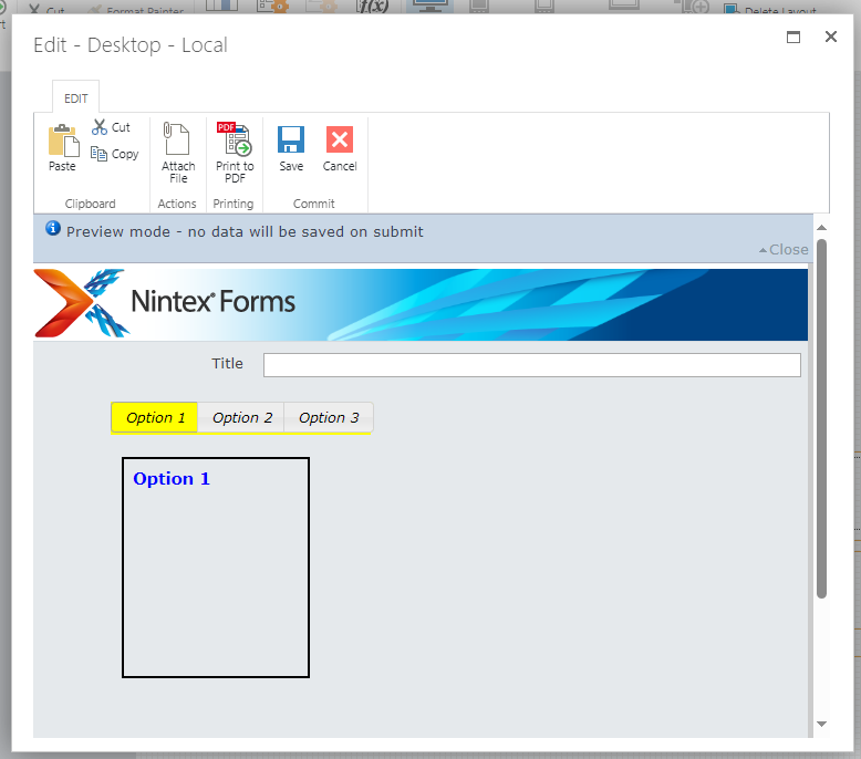
  • The images below are the configuration and the results on the form.


Close!  Unfortunately, my list of choices spans several rows, so no rectangle will encompass it.  I placed it in a panel and made the panel background match the selected color, and that seems to look better.


Reply