Hi

I’m looking for a way to alter the formatting of the choice list column control so that each choice starts on the same line as its tick box.

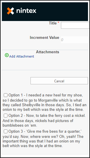
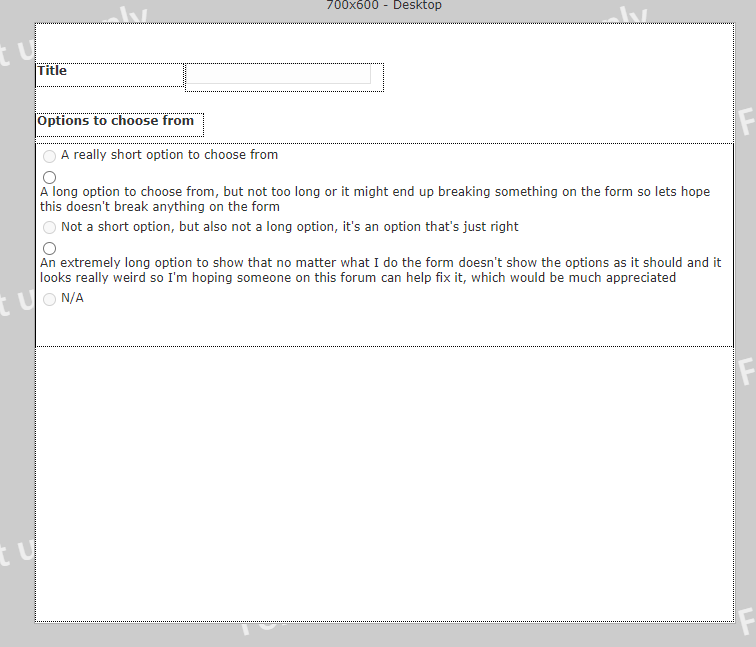
At the moment, if an option is longer than one line, the text starts from below the tick box.

I can’t make the options shorter, nor can I make the form wider.

Currently using Nintex Forms for Office 365.


Heads up to whoever looks at this

I can’t reproduce this on the latest version of Classic Forms for SP2019, so maybe it is strictly an 365 nintex styling issue:


Which forms designer are you using - New Responsive, Responsive, or Classic?

Is there a control on the same line to the left or right of this one?

Please provide a screenshot of the design canvas.


I’m using the Classic Forms designers on Nintex for Office 365.

I’ve created a new list just so I’m not sharing any sensitive information and as can be seen, this issue happens on any list.

The choice column is currently set to Radio buttons, but this issue also happens when the column is set to Checkbox.

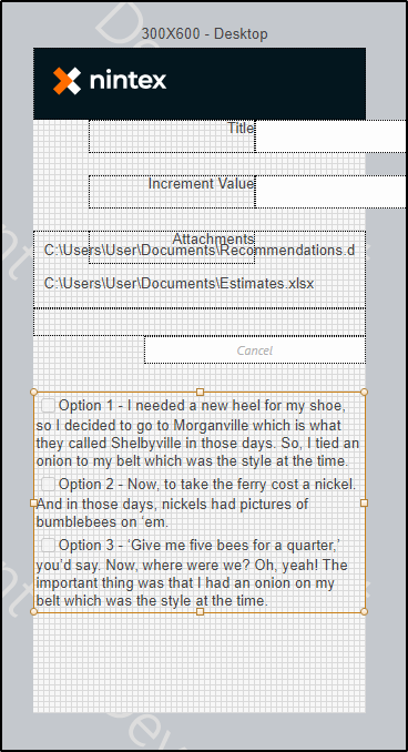
This the form in the designer:


Hey, 

open up the settings for that control, expand Formatting and in the Control CSS class field, type in cbSingleLine

Click save.

Then in the designer, click the Designer tab, then click on Form Settings, expand Custom CSS, and add the following:

.cbSingleLine

{

white-space: pre;

}


See if that helps.

cheers,

Vadim

Hi Vadim

Thanks for your response.

I’ve just tried that and it somewhat works. It puts all the text on one line, but it doesn’t break the text when it gets to the edge of the control. See pic below.

I tried using ‘white-space: pre-line;’ but that returned the format to original, incorrect format. I also tried adding ‘overflow-wrap: break-word;’ but that didn’t work either.

Do you have any further suggestions?


Hey AL21279,

the only thing I can think of, is going back into the CSS Settings (in Form Settings) and adding this,


span > label
{
 white-space: normal;
}


It’s not perfect, but it might get you closer to what you need.

cheers,

Vadim


Hi Vadim

Thanks for your input on this.

I added the code, but it’s still not working. I’ll log a ticket with support and see what they say.

Thanks for your help!


Hey AL21279,

the only thing I can think of, is going back into the CSS Settings (in Form Settings) and adding this,


span > label
{
 white-space: normal;
}


It’s not perfect, but it might get you closer to what you need.

cheers,

Vadim


Reply