Question

Creating Data Filter and Display Cards in Nintex Forms


Hello!

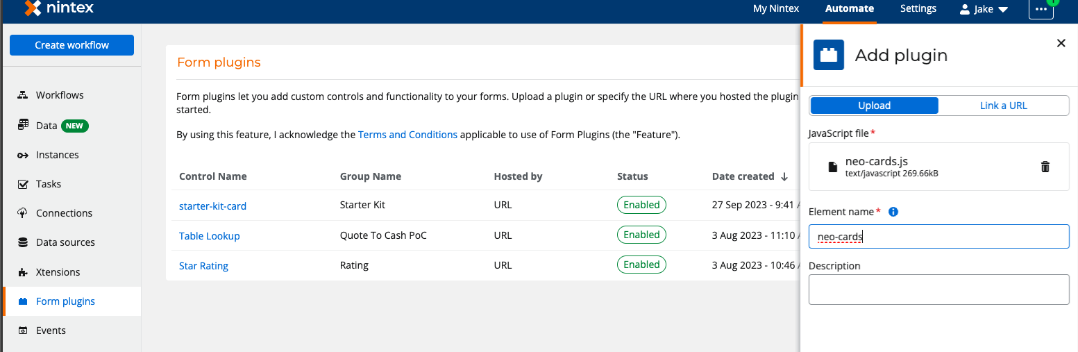
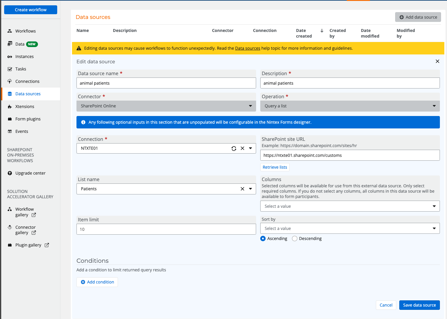
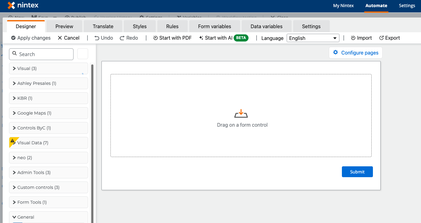
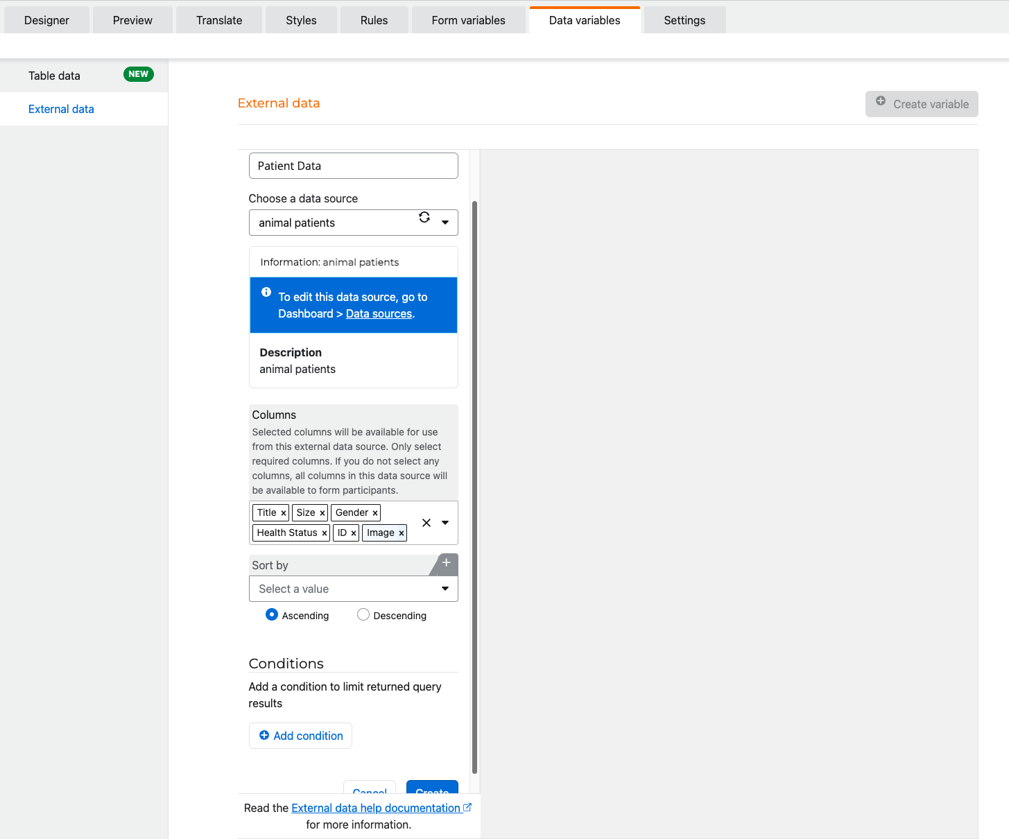
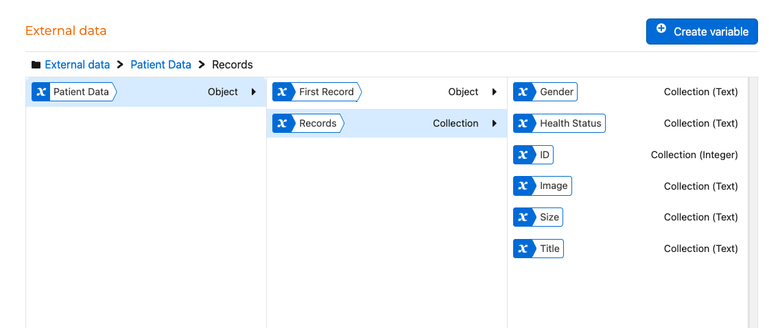
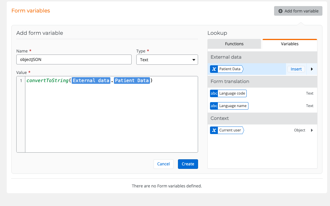
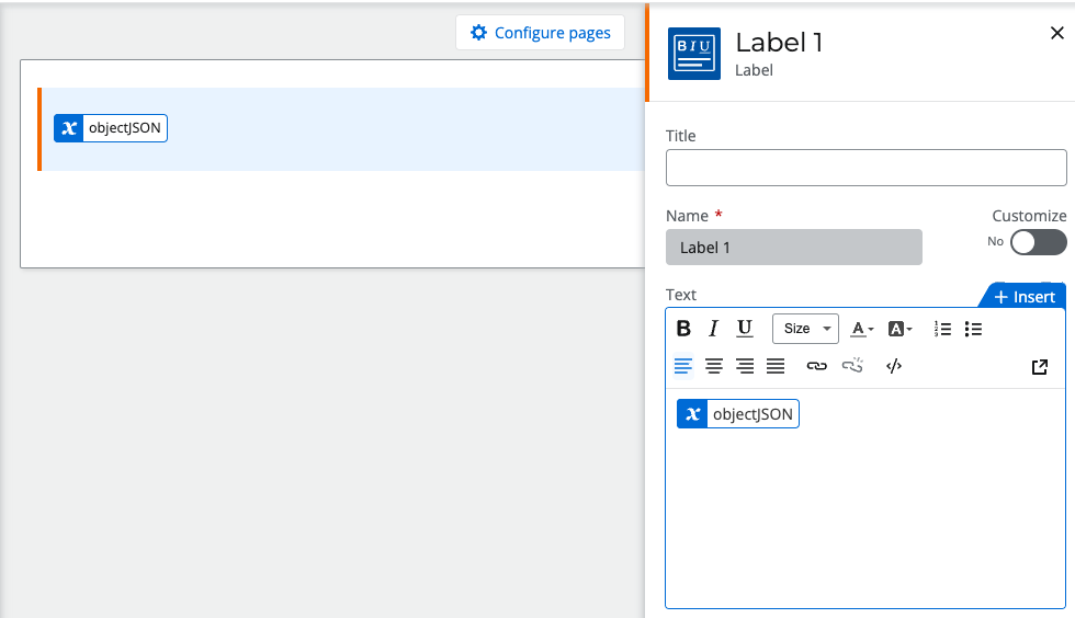
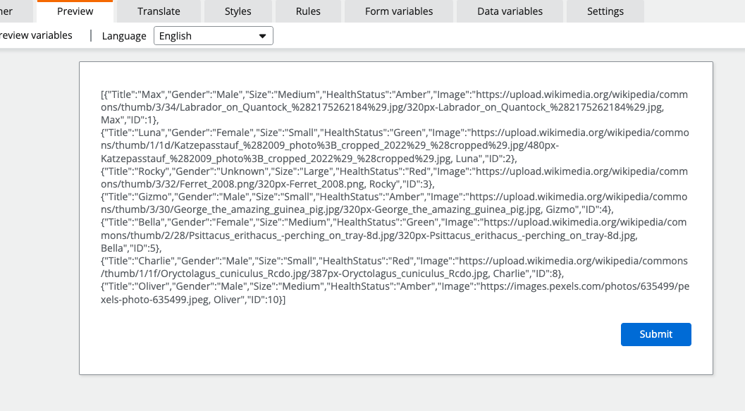
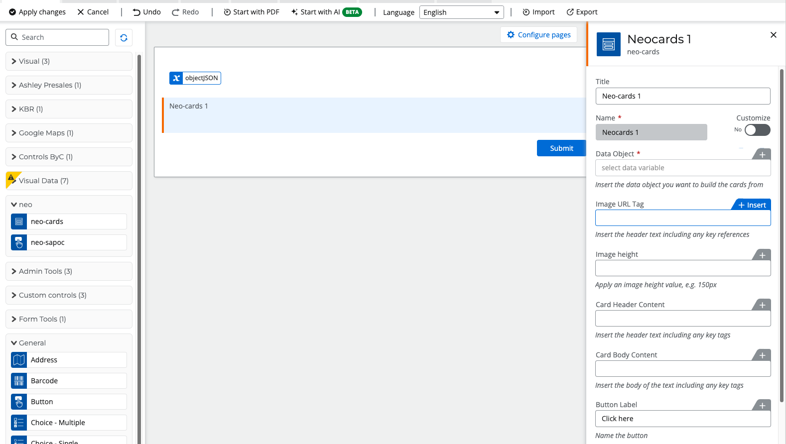
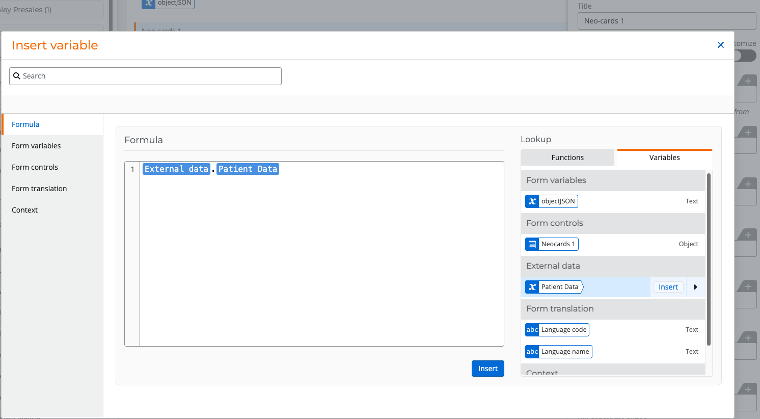
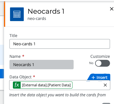
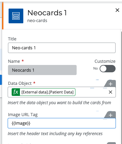
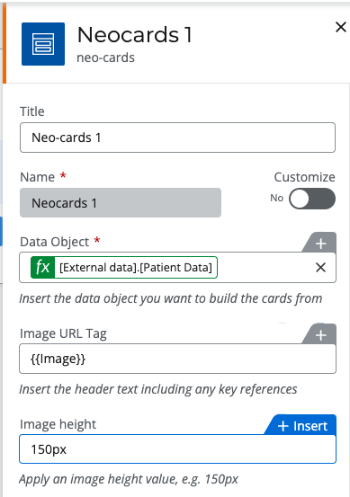
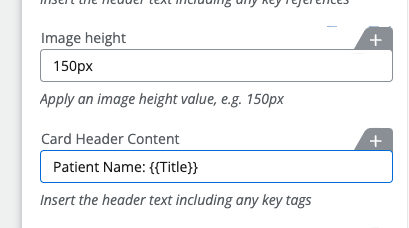
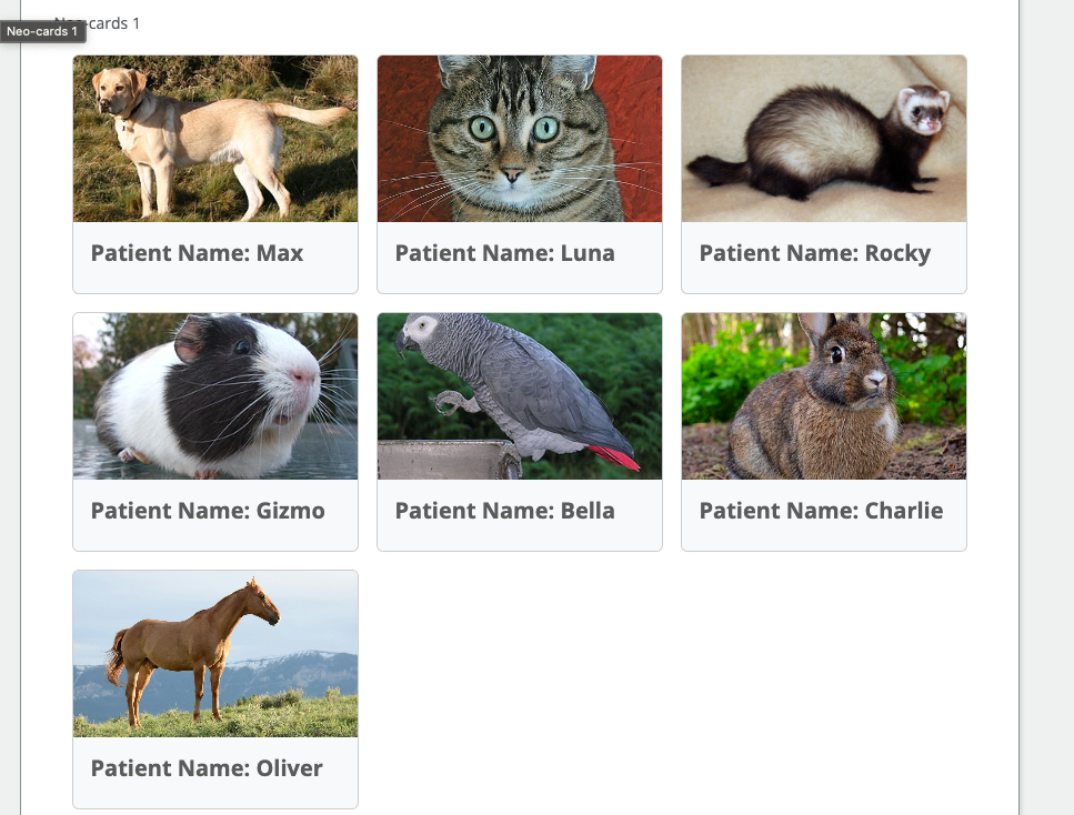
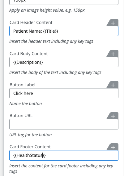
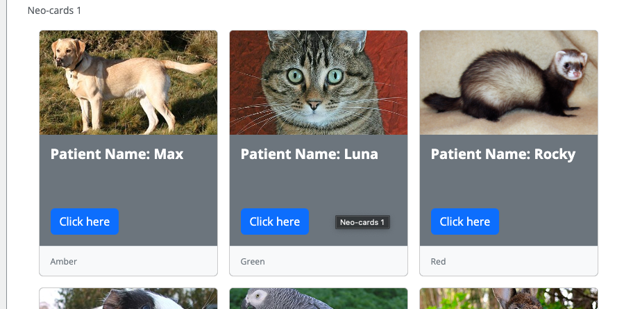
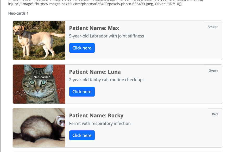
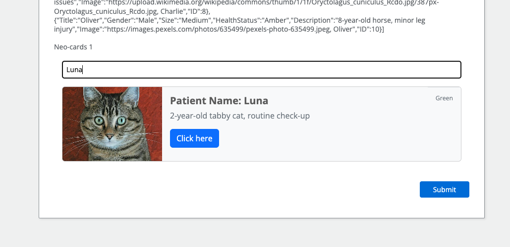
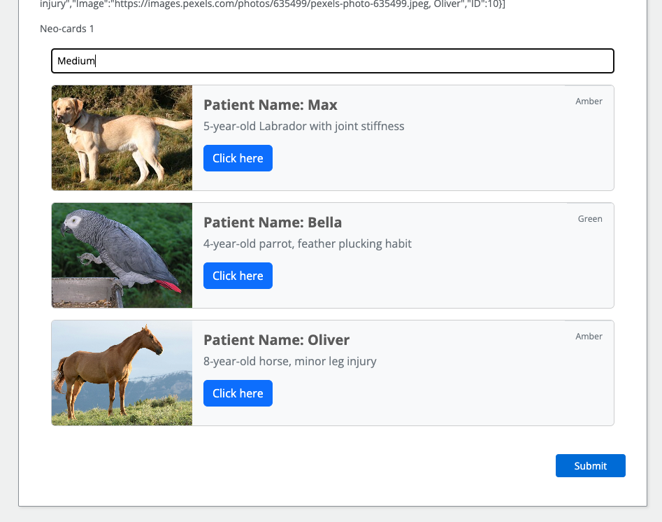
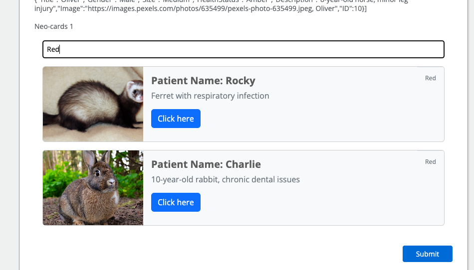
I would like to know if anyone has any idea how I could create a filter in Nintex Forms that displays a series of cards with data that match given characteristics, considering that the data is stored in SharePoint.

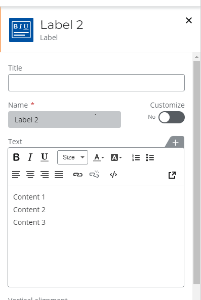
I have already tried some methods, but for some reason, the data takes a long time to load, doesn't load, or when it does load, it says there is no data. Additionally, I am having difficulty separating the data from SharePoint into separate cards per row of information.

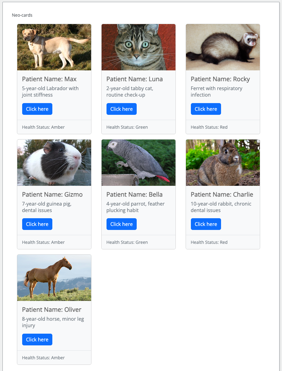
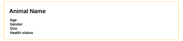
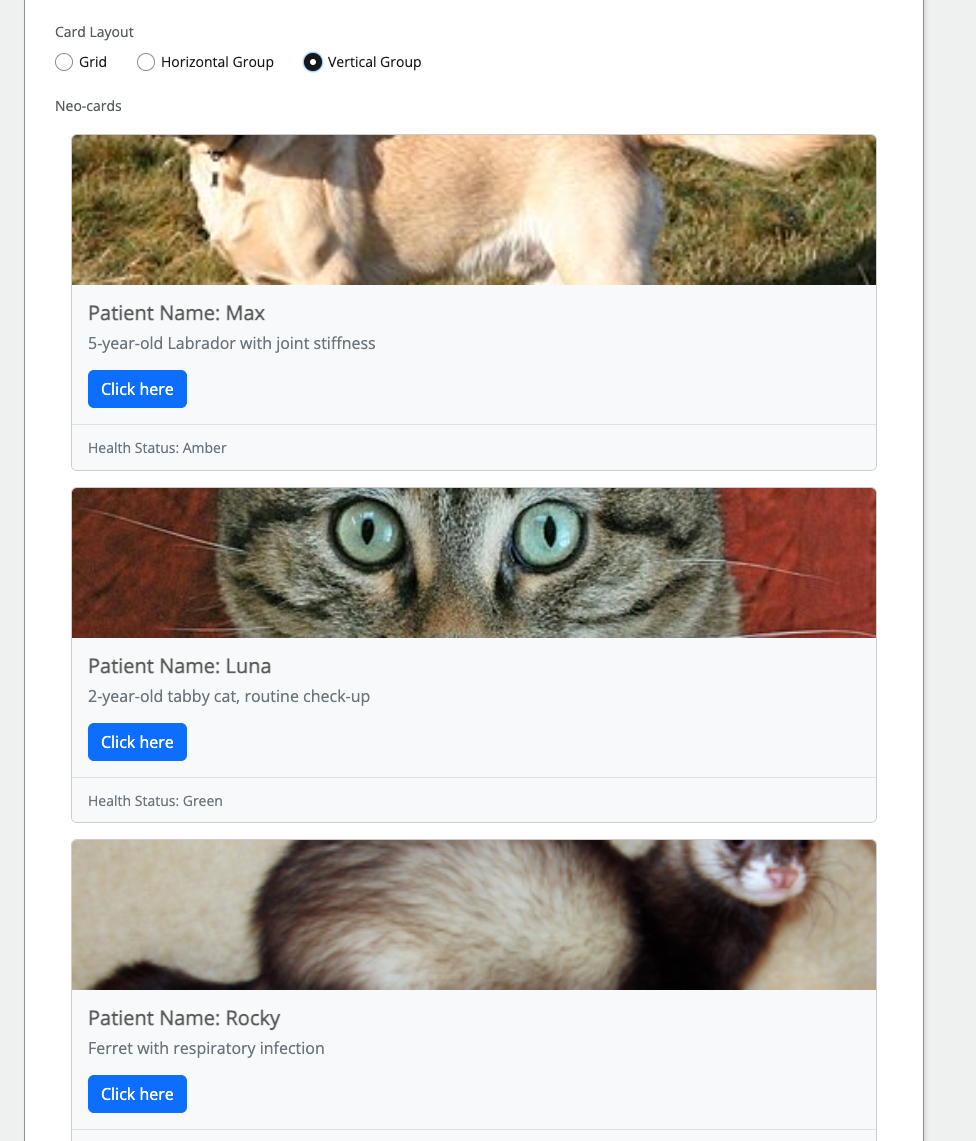
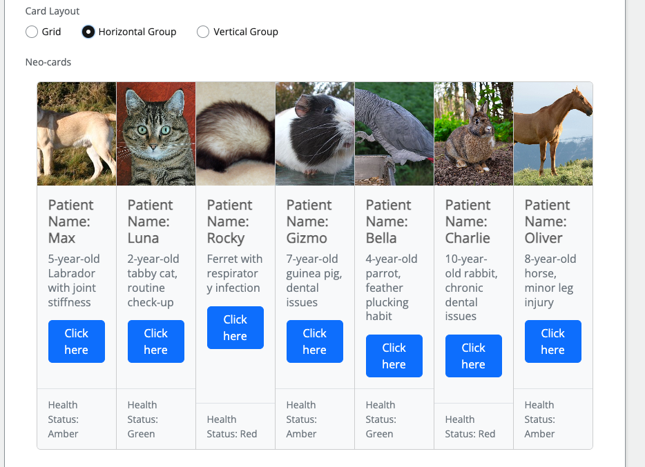
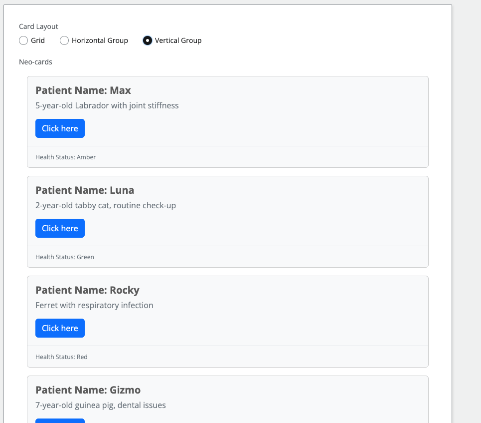
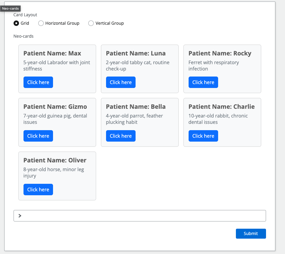
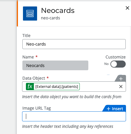
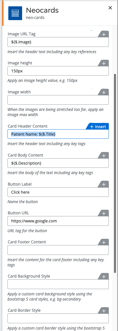
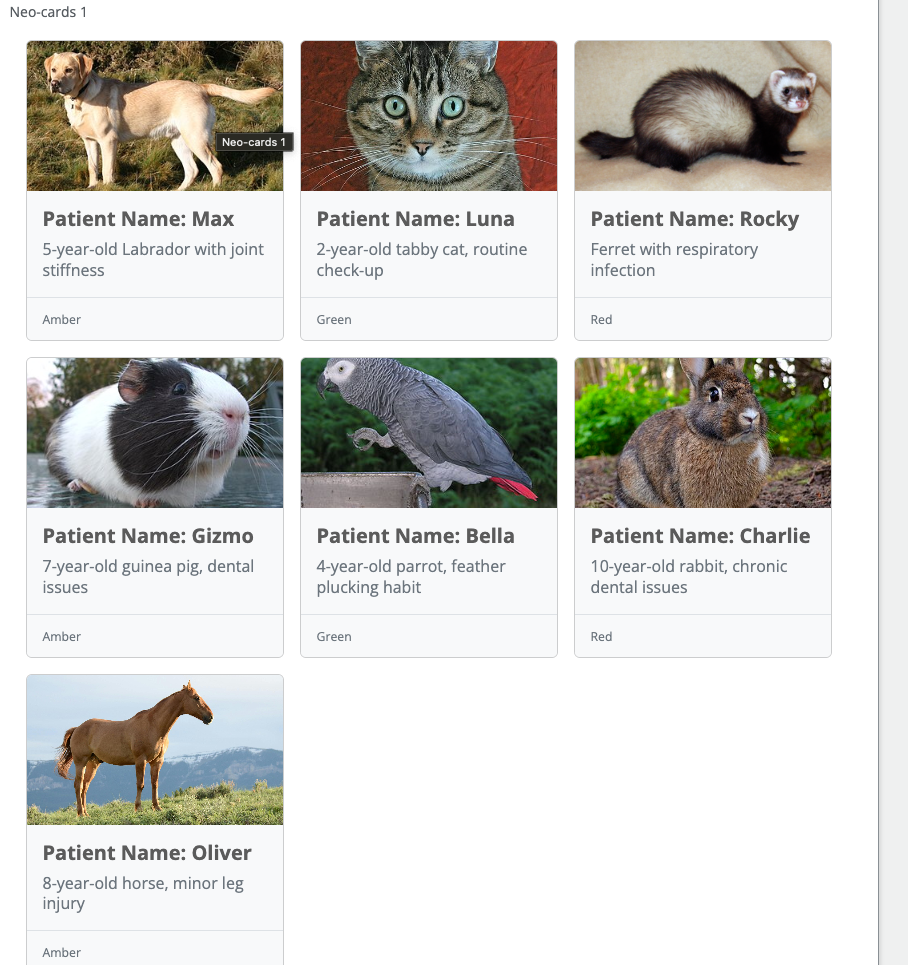
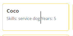
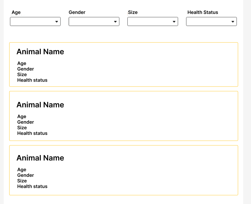
Below, I have included a design to help you understand my idea a bit better.


Any help will be appreciated. Thank you very much!

15 replies

Userlevel 6
Badge +13

Hi @Yhaizley RV 


can I confirm if you are using Nintex forms for 365 app or are you using forms in Automation Cloud? 
 

I ask as the answer changes between the two. 
 

Jake 

Badge +3

Hello!

I’m using forms in Nintex Automation Cloud

Userlevel 6
Badge +13

Hi @Yhaizley RV 

that is very helpful because yes it is possible by using a plugin.


I have another question, say you were able to create the cards as intended, do you need to be able to select them or do anything with them? 


Jake 

Badge +3

Hi,

I tried searching with a plugin but couldn't find anything helpful. If you could suggest some good options, I would appreciate it.

On the other hand, regarding the cards, I'm having trouble separating the information. When the data loads, it shows all the matches in the same card. I need to separate them into individual cards.

Additionally, the cards are view-only, but I will probably need to add a button with a link by card to download the information.

Userlevel 6
Badge +21

Hi @Jake 
Any more advice you could add here please? :) 

Userlevel 6
Badge +13

Hi @MillaZ @Yhaizley RV 

Yes sorry, I am working on a plugin for you :) I will post it here once it is finished.


Jake 

Userlevel 6
Badge +21

Awesome thanks @Jake!  

Badge +3

Hello!!

I really appreciate it   @Jake !!

Userlevel 6
Badge +13

Hi @Yhaizley RV 

I am still working on the plugin at the moment but I wanted to make sure you knew what I was working on, I am yet to implement any filtering options as I don’t quite know what the best approach is yet but displaying cards sort of looks like this, what do you think?:


Badge +3

Hello!!

Great! The cards look very similar to what I need, but I have some questions about how customizable they are, as I will need the plugin not only for this job but for other similar ones as well.

  • Can the names of the cards be modified or additional information be added if necessary?

  • Can the size of the cards be adjusted? I need them to be more horizontal, like the image below.


  • On the other hand, I am not sure if they will use images or avatars, so I was wondering if the image is optional or if it must be included.

Please let me know what else you need to understand the requirement.

Thank you very much!! 😁

Userlevel 6
Badge +13

Dont worry @Yhaizley RV I have you covered already 😁

here is the cards in list mode and group modes:


Also yes, Image and footer are optional:


You can do this by removing the input from the control:
If it is empty the image isn't shown,


I am using a JSON tagging to refer to the imported data so ${$.Image} is used to select the image from my object:


The idea is that I can make this plugin solve your needs but also anyone else who needs cards.
Data from the imported object can be used inline also, see card header content where Patient Name: is a fixed value but Title is a reference which the plugin knows to take from the input object.

I will explain all of this in detail once I am finished and provide step by step instructions on implementing it but it might take be a little time to resolve any and all bugs in the plugin so could be next week before it is finished. 

Jake 

Badge +3

It's awesome, @Jake !! 🤯 Thank you so much for your help. I will be waiting for the result! I'll be monitoring the chat in case you need anything else from my side.

You are the best!! 😁

Userlevel 6
Badge +13

Hi @Yhaizley RV 

Sorry its taken a while it has been a little bit of a challenging project and not had too much spare time to work as there are still improvements and bug fixes to make on it but I think it is in a usable state for you to try out.

I do plan on improving the plugin at some point in the future but for now you should be able to work with the current version attached to this post. 


Installing


Extract the JS file from the zip and upload it into the plugins page in NAC making sure to use neo-cards as the element name:


Preparing the card data


Now we need to make sure there is a data source correctly set up that we want to build the cards with:

In my example I am pulling Sharepoint list data using a data source, however I have designed the plugin to support data from any data source.


One of the things that is going to be important in using the cards plugin will be getting the key names from the data source, these can be random but should be fixed so long as you use the same data source and do not remove/replace any fields.

To make this simple, they key names describe the values you want to use so using the following JSON as an example, the key names are ‘name’ and ‘email’ as they show what each value is. 
 

[  
{"name":"Ram", "email":"Ram@gmail.com"},
{"name":"Bob", "email":"bob32@gmail.com"}
]


To learn these key names the easiest way would be to use the data source output in a label to write the JSON.

Lets start by creating a new workflow and opening up the start form:


Lets add the data source as a data variable:


There is going to be a number of columns to select from however I advise you avoid using all as this will just increase size and complexity of the JSON, just pick the columns you need to show data in the cards.

You should then just get an object back with the fields you want.


Now to view this JSON lets add it to a variable and show it as a label. 

Create a new variable, insert the convertToString() function and inside place the new object:


Then place the new variable in a label to show it on the form:


Hit preview and you will see the JSON structure, If you get an error at this point, just apply the form and re-open the designer:


​​​​​​​The important part here is to note down the key names of all of the different values we need, we can do this easily just by copying the first record, each record will be surrounded by a set of curly brackets, In the code preview below, each of the key names are shown in green with values in red, so we need the following, Title, Gender, Size, HealthStatus, Description and Image, We will ignore ID as its not in use.
 

{"Title":"Max","Gender":"Male","Size":"Medium","HealthStatus":"Amber","Image":"https://upload.wikimedia.org/wikipedia/commons/thumb/3/34/Labrador_on_Quantock_%282175262184%29.jpg/320px-Labrador_on_Quantock_%282175262184%29.jpg, Max","ID":1}

Now we know these values we can use the plugin control. 

Drag the neo cards control into the canvas and open the properties:


Lets go through each property and configure them


Data Object


First add the data variable for our object into the Data Object field, you do not need to use the objectJSON variable, you can just add the object its self:


Image URL Tag


Now if you are using an image and would like one displayed I have configured the plugin to allow for image URLs to be inserted, we have the image url stored in the JSON as ‘Image’ to insert this as a reference put the key name in 2 sets of curly brackets like this {{Image}}:

​​​​​

​​​​​​​

You may notice that the URL stored in the image JSON is not a valid url as there is a comma separated value at the end being the patient name, this is because the Image field on Sharepoint is actually a hyperlink field, the comma value being the descriptor, I have taught the plugin to use this as the aria label to describe the image, if your URL doesn’t contain this, it will just use it as is.


Image Height
 

This is just a fixed value you want to use to fix the height of the images, this helps if the images are not all the same size so I like to use something like 150px


Card header content is the title of the card you want to display such as displaying the name, in any field marked with the end name ‘Content’ will allow you to combine text with the tags we used before, so entering Patient Name: {{Title}} Lets the plugin use fixed text with non fixed text​​​​​​​ like so:


If you preview now you will actually see quite a simple card setup emerging:
​​

​​​​​​​

Lets add more detail by filling out the Card Body and Card Footer:


The cards are really taking shape:


Buttons


Buttons are straight forward, again you can use tags to fill these if available and if they are filled the button will show:


Styling
 

This will allow you to use standard bootstrap card styling and even custom CSS styling you added into the styles tab on Nintex to customise the look and feed of the cards to your need, for example if I wanted darker cards I would use the following:


Card Layout
 

This option allows you to switch the desired card layout, by default it is set to Grid but I think you would prefer Vertical Group, switching this will display the cards differently, or Horizontal group shows the cards on a single row but this is not the best when there is lots of cards.


Last but not least:


Filter Field Tags​​​​​​​


this was the most complex part of the plugin, I think it is too difficult to build out filter controls for dynamic JSON data we cannot determine, I have to design the plugin with this in mind, so I decided that using a generic search will be a better approach, in this control property you can comma separate the key names to add them to a search like so:


Now you will see a search bar appear above the cards, inserting a value that matches one of the keys you added will return the result, so searching Luna shows Luna, as Title contains Luna’s name:

​​​​​​​


Medium returns all animals, please forgive the fact the JSON has both a parrot, dog and horse marked as Medium but they are, the fact is wrong but the data is correct:

​​​​


And finally putting in Red will return red status animals:

​​​​​​​


I hope this goes some way to support your needs.

​​​​​​​Jake 

Badge +3

Hello @Jake 

Thank you very much for all your help!! and for the details in the instructions! I will carefully review all the steps and get back to you with the results or if I have any questions. 😁

Thank you!! 

Badge +3

Hi @Jake ,

I wanted to let you know that the guide was very clear, and I was able to implement it without any difficulty. Thank you very much.

I understand what you mentioned about the filter. It would be very useful if it were separated by categories, but I understand the complexity, and I think it's functional for now.

I wanted to mention two things:

  1. In the body content section, is it possible not only to use the card body content for a description but also to separate the information by pressing enter or use a format similar to when adding a label (I’m attaching images to clarify). This would help with customization and prevent all the information from being on a single line.


    Separate with an enter
    Do not display linearly
    Like text on a label


  2. I think it's great that Bootstrap styles can be used. Many people have used this tool at some point, and it makes it more user-friendly. However, I would like to know if it's possible to style the text in the card header or content, for example, making the text bold.
     

Thank you very much 😁

Reply