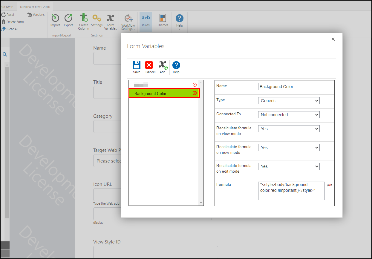
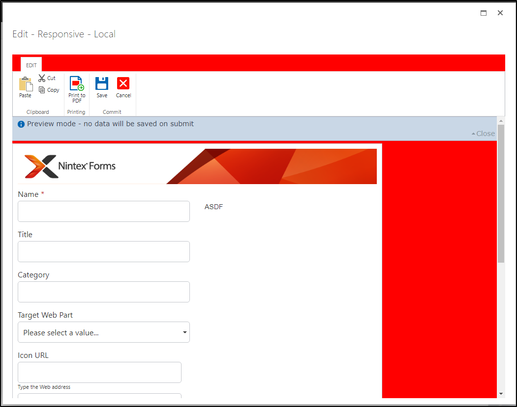
In a previous post, I discussed how to implement CSS into the New Responsive Form: https://community.nintex.com/t5/Responsive-Forms/Add-HTML-and-CSS-to-New-Responsive-Form/td-p/228037. Today I am going to show you how to take this another step further, and apply CSS to horizontal radio buttons to align them evenly.
The Responsive Form provides little formatting and layout modifications. Beyond this, it stops or is very limited. In a form I was developing, I had a choice dropdown next to choice radio buttons. They did not fit horizontally, and I did not want them vertically, so I had to think of a way to align them creatively. I guess you can add spaces to all the choices so they are all the same length, but this is not something I want to play with for now, or if my options change, play with them later.

Going back to Developer Tools, I was able to see the layout and structure of the radio buttons. Inside the group container, I could see that each radio button input had an attribute of data-e2e=, and part of the vails was the value of the radio button.
<div class="nx-radio-group nx-radio-group-inline"> <div class="nx-radio nx-radio-inline ng-star-inserted"> <label data-e2e="set-_d6778143f7fd5d865eed05a7dde4f7f9-Liquid (Standard)"> <input type="radio" data-fillin="false" data-e2e="get-_d6778143f7fd5d865eed05a7dde4f7f9-Liquid (Standard)" class="ng-untouched ng-pristine ng-valid"> <div class="nx-radio-container"> <span class="nx-radio-faux"></span> <span class="nx-radio-label">Liquid (Standard)</span> </div> </label> </div> <div class="nx-radio nx-radio-inline ng-star-inserted"> <label data-e2e="set-_d6778143f7fd5d865eed05a7dde4f7f9-Liquid Halogeen"> <input type="radio" data-fillin="false" data-e2e="get-_d6778143f7fd5d865eed05a7dde4f7f9-Liquid Halogeen" class="ng-untouched ng-pristine ng-valid"> <div class="nx-radio-container"> <span class="nx-radio-faux"></span> <span class="nx-radio-label">Liquid Halogeen</span> </div> </label> </div> <div class="nx-radio nx-radio-inline ng-star-inserted"> <label data-e2e="set-_d6778143f7fd5d865eed05a7dde4f7f9-Solid (Standard)"> <input type="radio" data-fillin="false" data-e2e="get-_d6778143f7fd5d865eed05a7dde4f7f9-Solid (Standard)" class="ng-untouched ng-pristine ng-valid"> <div class="nx-radio-container"> <span class="nx-radio-faux"></span> <span class="nx-radio-label">Solid (Standard)</span> </div> </label> </div> <div class="nx-radio nx-radio-inline ng-star-inserted"> <label data-e2e="set-_d6778143f7fd5d865eed05a7dde4f7f9-Special Waste"> <input type="radio" data-fillin="false" data-e2e="get-_d6778143f7fd5d865eed05a7dde4f7f9-Special Waste" class="ng-untouched ng-pristine ng-valid"> <div class="nx-radio-container"> <span class="nx-radio-faux"></span> <span class="nx-radio-label">Special Waste</span> </div> </label> </div> </div>
Now I know I can target these specific radio buttons with a relative selector, add the styles to a label on the form, and force the alignment. At this point, I was not concerned with the alignment; I focused more on the item width or the CSS property of min-width. There is no real math or scientific way to figure this out. I started throwing darts at the board until I found the magic number. The good thing is that by using Developer Tools, you can add and change the styles on the fly, so it is a quick task to identify the correct min-width.
The hardest part was how to identify the relative selector. If we refer to the page HTML, we can start the selector with the input attribute and a wildcard selector. One of the inputs is coded like this:
<input type="radio" data-fillin="false" data-e2e="get-_d6778143f7fd5d865eed05a7dde4f7f9-Liquid (Standard)" class="ng-untouched ng-pristine ng-valid">
We can target that input with the contains like this:
input[data-e2e*='Liquid (Standard)']
but this does not drill down to the label, which is a child of a sibling. I know getting a little confusing. The span tags contain the label. They are a child of a div. the div is a sibling of the input. We must go this way because we do not want to target all radio buttons, at least not for this task. To target the sibling:
input[data-e2e*='Liquid (Standard)'] + div
Here we are getting much closer. And can target a child, or a specific class, on the span tag of the label like:
input[data-e2e*='Liquid (Standard)'] + div > .nx-radio-label
this only accounts for one of the radio options. We must replicate this selector for each option and then apply the min-width to all options. Initially, I tried to use a multiple-class selector, but it was not read correctly in my variable.
input[data-e2e*='Liquid (Standard)'] + div > .nx-radio-label, input[data-e2e*='Solid (Standard)'] + div > .nx-radio-label, input[data-e2e*='Liquid Halogeen'] + div > .nx-radio-label, input[data-e2e*='Special Waste'] + div > .nx-radio-label {min-width:155px;}
If you placed this on one line, it probably would work in a variable, but for me; I want to be able to read it, so I modified it to this:
input[data-e2e*='Liquid (Standard)'] + div > .nx-radio-label {min-width:155px;} input[data-e2e*='Solid (Standard)'] + div > .nx-radio-label {min-width:155px;} input[data-e2e*='Liquid Halogeen'] + div > .nx-radio-label {min-width:155px;} input[data-e2e*='Special Waste'] + div > .nx-radio-label {min-width:155px;}
This is how to code it in the variable:
"<style>" +"input[data-e2e*='Liquid (Standard)'] + div > .nx-radio-label {min-width:155px;}" +"input[data-e2e*='Solid (Standard)'] + div > .nx-radio-label {min-width:155px;}" +"input[data-e2e*='Liquid Halogeen'] + div > .nx-radio-label {min-width:155px;}" +"input[data-e2e*='Special Waste'] + div > .nx-radio-label {min-width:155px;}" +"</style>"
Add a label to your form, add the style to your label, and like magic, the out looks like this:

Until next time, let's see what additional functionality we can add.
Good Luck!
Happy Coding.


