After upgrading to Spark 12.1.3 (from 12.0.8), the design system is being overridden in many areas. Most of the issue is with dark black elements (borders mostly) where previously they were gray. Button colors also appear wrong.
Examples:
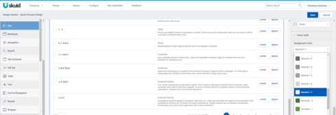
List component in the Design System has a Neutral + 7 hover property (light gray)
In run time, the hover shows black (and the black borders should be gray.) The search area button overlaps the search entry.

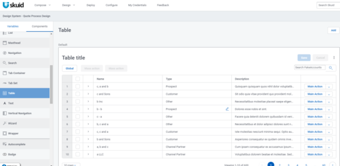
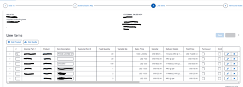
Table borders and the wizard connector - black border. Previously was light gray and shows as light gray in the Design System builder. Note the standard Save/Cancel button the table also looks different (the Cancel button). There’s also some overlapping issues that weren’t there previously.

I did Update design system themes and that button is gone. No issues when I did that. I also cleared by browser cache and started fresh. Still there.
Thanks!
