Thanks for starting a list! We'd love to hear from others as well if they've noticed anything missing. We’ve tried really hard to make sure we have feature parity between our V1 and V2 (Spark) components, but inevitably we knew we’d miss a couple since Skuid is such a large and feature rich product.
Some of the things you mentioned were actually conscious design choices, and I’m going to do my best to explain why we made these choices or established these constraints. I’ve acknowledge a few thing that I’ll write down, but this does not guarantee any specific timeline.
Custom CSS in design system and/or skuid pages
This was probably the biggest and furthest reaching choice we made, but this is intentional. We spent a lot of time talking through and debating this, but ultimately the pros of not supporting custom CSS greatly outweigh the cons.
We always have and always will want Skuid to be an extensible product. However, even above that, we want Skuid to be a stable product. In order to have a stable and extensible product we had to make some hard calls about the points at which our product is extensible. In our V1 components we have always supported custom CSS targeting any element on the page. However, leaving CSS open ended has meant that we cannot change the DOM structure of our components without introducing huge risks in breaking currently implemented custom CSS during upgrades. It’s hard to overstate how much custom CSS has created friction for upgrades and inhibited our development of new features or fixes for bugs.
That being said, we’re really excited about how applying some contraints the scope of extension points in V2 sets us up for the future to focus and flesh those points that we’ve decided upon. We’re working hard to make custom component creation much more developer friendly as well as looking into a successor for custom field renderers (which will occupy the same role but probably be called something different).
Form option to display field labels next to field (vs. above)
We did this because because of accessibility and usability concerns. To quote from this sitepoint article the disadvantages of labels beside fields:
(start quote)
On small screens, when focus is in-field, label may not be visible (because of zoom).
User is unlikely to be able to see the label and the field within one glance.
When form is translated into other languages, labels may no longer fit into allocated space.
Form is wider compared to having labels above fields.
Labels may be far away from their corresponding fields, so it can be hard to see which goes with which (zebra striping can help to minimise this issue).
(end quote)
Lastly, one that they didn’t mention is that users utilizing a screen magnifier due to visual impairment or other reasons will suffer the same fate as small screen users; the label and the field may not be visible simultaneously.
If you’d like to provide feedback on use cases where labels beside fields is better though, we’re all ears.
Form collapsible section headers
Good catch. I’ll write it down.
Required field red border? Cant find any styling for the required fields
I’ll write it down. It’s worth noting though that having solely a color indication for required fields can provide trouble to users who cannot distinguish colors, so if we do add support for styling the borders of required fields, we most likely will still enforce a symbolic/written indication of the fields level of requirement.
Table row edit? Is table limited to inline only?
Yes. However, you can navigate the table fully using the arrow keys, space, enter, and escape now, so hopefully the need for table row edit has been reduced.
Min/Max widths on components (button for example)
Do you have specific use cases with this? I think I see where you’re going with it but I’m curious.
Style for form section headers
It’s there. Open the DSS -> Component -> Form. Then in the form properties on the right Nested Components -> Section header
Hi Andrew,
Thanks for the quick and detailed response! I do have some concerns and will try and keep them brief.
Custom CSS in design system and/or skuid pages
This is a bummer to hear. I ended up loading a blank v1 page in Lightning that contained my custom CSS. Do you see any concern in doing this?
Form option to display field labels next to field (vs. above)
While I agree with the points you’ve made, ultimately I think Skuid has made a widly bold decision without fully vetting (maybe?) the impact it has on Enterprise companies. For example, we (Workday) have hundreds of fields on certain object page layouts. When labels are above the fields the whitespace/usability becomes out of control.
I think the most prominent “case and point” example is that of salesforce implementing compact lightning page density because of the backlash they’ve received on the comfy layout (labels above fields). Labels above fields just don’t work at scale.
It’s also worth noting that Salesforce converts labels that are beside fields to labels above fields when the screen shrinks. Can Skuid not do the same?
Required field red border? Cant find any styling for the required fields
Somewhat agree. But I think this is a decision based on a small percentage of the population suffering from color blindness. It’s definitely worth noting, but “required” text in the field label just wont cut it.
Table row edit? Is table limited to inline only?
This is very unfortunate to hear. Are there any plans for this to be implemented in the future? This small piece of functionality is so heavily used here and this alone will be the sole factor for us to never move to Spark. I wouldn’t bring this to the table because I know the response I’d here from my stakeholders.
Min/Max widths on components (button for example)
Example is an a button with label of “Edit” being tiny while sitting next to a button that says “Send for Signature” being much larger. I’ve created some level of consistently with min-width. It’s in line with our Workday product design which I replicate in our pages.
Hi Josef,
Thanks for the feedback. We will certainly review your concerns in more detail, continue to gather feedback from other users, and make adjustments as needed. Spark is the first release of the v2 components and design system, and we knew we would not be able to cover everything in the first release.
The option for “label-left” (for more compact designs, and responsively moving to “label-top”) is a case we expected and can address in a future release, though we opted for label-top as the better default (for the reasons Andrew mentioned). Declarative style options for required fields, table row edit options, and min/max width settings for components are items we will also revisit.
Thanks again for digging in and sharing your thoughts with us.
Just wanted to chime in on the CSS - I hear you on the upgrade issues, however, there have been times where elements don’t exist in the theme builder yet need to be styled. Some of these are major issues that have to be addressed - and we can’t necessarily wait for the theme editor to be re-worked in an upcoming release. I also understand that you have a long list and can’t possibly do everything.
I am not using Spark yet, but was one of the early Lightning movers - so we are using a custom Lightning based theme (copied from the Skuid lightning theme.) I took a look at the custom CSS on my theme, and it was all to fill gaps in the original Lightning theme:
- The navigation component lacked any CSS or styling, with no way to adjust in the theme builder
- Boolean checkboxes show large in some browsers, causing fields to mis-align
- Tables with required fields in edit mode lacked the red border so the user had no way of knowing the field was required
- The Date picker was cut off (width) and the user couldn’t see the whole month
- Field editor picklists drop down elements didn’t match (text, background)
I believe most if not all have since been fixed in patch releases, and if I was more proactive I would have gone back and confirmed and removed the custom css. But my point is I was able to resolve the issue with a few lines of CSS that applied instantly to 100s of skuid pages and not have to live with it until a patch fix was released.
PS - I’d also like a button width controller. Many times I have stuck a button in a grid just to control its width.
Form collapsible section headers
Could just include the form inside an accordion, disable section header from the form, and add it to the accordion header. I've been using this structure way more than the version 1 Field Editor's ability to collapse sections (since you can collapse entire component sets).
Just as a heads up, the Accordion & Form section header are by default set as different font sizes. Not sure if your variants can affect this though

I couldn’t agree with this more. Pretty much all of the custom css we use sits as an extension of the Skuid Lightning Theme to try and make Skuid sit more elegantly within the surrounding Lightning interface. Back in the Salesforce Classic days I was fine with Skuid looking like Skuid, but increasingly we have the need to make Skuid look like Lightning.
At one point I was thinking of publishing to github a set of CSS for this purpose that we could all contribute to. We put this Lightning CSS in a Static Resource that’s linked to in every Skuid Page.
I will likely not try Spark until there have been a few more updates but I’m keen to understand the limitations here. I was actually hoping that at some point Skuid would use the Lightning Design System as an available theme for their components - though I know it’s easier said than done!
Am I missing any documentation saying that inline record creation would not be carrying over into v2 Spark? I see notice of table edit being limited to inline- but following that line of thought, creation should be inline as well.
Also- I third the css issues above in regards to having to bridge the gap to lightning layouts. And being able to limit button widths.
Hi Andy, Yes the option “Allow inline record creation” is no longer available in the basic table properties, however you can simply add a global action and use the action “Create new row(s)”. This will add a new line in the table. Does that work for you?
Thank you for this, having to un check allow inline record creation on every table was getting far too tedious.
Global action to create new row in either the table’s model or to link to a page include with the “Create New” page is the way to go for most use cases. On popup close just refresh the table’s model so the new data can be pulled.
Oh, yea that is fine. Our use cases are primarily in-line so the old method was utilized for convience.
I know it’s an exhaustive task, but is there a plan to release streamline changes from v1 to v2? Even if users were to wait for conversion provided from skuid, it would allow us to plan out additional conversion work to be done
Thank you for the feedback, Andy! If you use a global action to “Create new row(s)”, this will add a new line in the table, so it looks like before. The advantage of not using the “Allow inline record creation” but using the action framework, is that you have more control of the design and what should happen on that action.
Regarding the second point, I’ve been informed that there is a plan to do that, but there is no timeline.
We recommend using V2 pages for new work and wait for our migration tool to be released, before trying to do manual migration from V1 to V2.
Josef,
I have been referencing your points as I’m currently building out a Spark v2 solution.
I found some options that might be helpful to you:
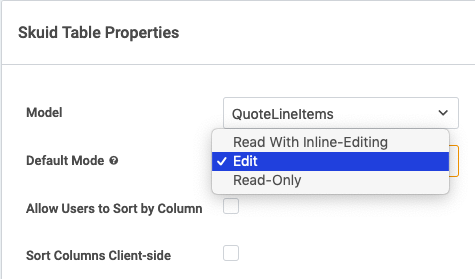
- Table Edit – it looks like table Edit mode is in fact available (see screenshot below). Is that what you were looking for, or specifically a row action for Editing that specific row? I agree this might be a nice out-of-the-box row action to have available (along with a Delete row action)…although you can quickly create custom row actions that mimic Lightning functionality…your Edit action could launch into a Modal with a form of the row to edit, and your Delete action could execute a sequence of “Mark rows for delete” followed by a Model save.

- Required field – I agree it might be nice to have the ability to declaratively add some additional sytling to the required class/design variant…for example a red asterisk, instead of the (Required) text. Nonetheless, have you looked at the Necessity Addendum styling under Form –> Label –> Necessity Addendum within the design system. You could set this color to red, which makes the (Required) turn to red before a user saves, and when a user does try to save without filling out a required field, the text box becomes outlined in red.

Conlan,
Great find on the required field! That definitely helps guide the user experience.
As for the modal edit screen…I appreciate the out of the box thinking on this, but that solution just doesn’t offer the same sense of speed and ease of use that our users are used to. Also, a Spark table may consist of read and editable fields, but a user won’t know which is which until hovering over a cell. I can’t count how many of our pages utilize the edit icon on tables. It’s a real bummer.
How do I reproduce the v1 responsive grid division, “Fit to Content” in v2 without setting a static min/max width? Fit to content was a create feature of responsive grids in v1.
+1 for: Form option to display field labels next to field (vs. above). I understand your point about accessibility and usability concerns however making the option available would be helpful in certain use cases.
Love that you guys added the toggle table row action in spark! I have a few comments about the v2 table.
- Why is a multi-row selector available when there are no mass actions configured for the table?
- In the table display properties, there’s a section for “Height/Scrolling”, but there are no choices to change scrolling behavior. My pages are currently stretching the screen.
- Moving table buttons/filters to the left of the table is not available.
Louis, just to follow up on this, we do now have a Lightning Design System for Skuid V2.
Oh cool! Thanks Zach. I’ll definitely be taking a look. Cheers!
It was recommended in a previous nautilus notes that you make a “Style Sheet” for your style variants before beginning to apply to page(s). I’ve got to say that’s been an invaluable recommendation for getting the look & feel down before beginning to make those changes. Plus if you do the design first, you can edit the default components themselves so you don’t have to apply a whole bunch of style variants across all pages.


