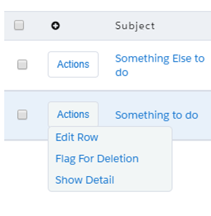
Seriously!!! What’s it look like in action?
That is rocking! Ditto Pat
Here’s a screenshot

Wow! Thanks for this! Unfortunately my button shows up, but doesn’t do anything on hover or click. Could you possibly post a sample page with a table so I can see it in action?
I think it’s something with the CSS. Usually in my css I name it in the code, like
.myTableCSS .nx-list-footer-left {
display:none;
}
and then I apply myTableCSS to the advanced properties of the table in the CSS field. Is that the same process here? I wasn’t sure what to call the CSS, and how to apply it.

Chandra - Similar approach on the css. Here’s the piece for hiding the rowactions:
.HideActions .sk-action-field{
display:none;
}
Also, here’s XML for a sample page. I stripped out all the custom field references so you should be able to import into you org and play around with it.
            <field id="ProductCode"/>

            <field id="Description"/>

            <field id="Family"/>

            <field id="Id"/>

            <field id="Name"/>


            <field id="RecordTypeId"/>

            <field id="RecordType.Name"/>


            <field id="RecordType.DeveloperName"/>

        </fields>

        <conditions>

            <condition type="fieldvalue" value="" enclosevalueinquotes="true" field="Family" state="filterableoff" inactive="true" name="Family"/>


        </conditions>

        <actions/>

    </model>


</models>

       <components>

            <skootable showconditions="true" showsavecancel="true" showerrorsinline="true" searchmethod="server" searchbox="true" showexportbuttons="true" pagesize="10" alwaysresetpagination="false" createrecords="true" model="Products" buttonposition="" mode="read" allowcolumnreordering="true" responsive="true" uniqueid="sk-KUUQe-182" cssclass="HideActions">

                <fields>
<field id="RecordTypeId" hideable="true" uniqueid="fi-LDDLh-203" valuehalign="" type="" snippet="">
Record Type
                    <action type="edit"/>

                    <action type="multi" label="View record details" icon="sk-icon-popup">

                        <actions>

                            <action type="showPopup">

                                <popup width="80%" title="Viewing {{Model.label}}: {{Name}}">

                                    <components>

                                        <basicfieldeditor showheader="true" showsavecancel="true" mode="edit" model="Products" uniqueid="sk-KWR75-402">

                                            <conditions>

                                                <condition type="contextrow" field="Id" mergefield="Id" autocreated="true"/>

                                            </conditions>

                                            <columns>

                                                <column width="50%">

                                                    <sections>

                                                        <section title="Section A">

                                                            <fields>

                                                                <field id="IsActive" uniqueid="sk-KWR6i-381"/>


                                                                <field id="ProductCode" uniqueid="sk-KWR6m-385"/>

                                                            </fields>

                                                        </section>

                                                    </sections>

                                                </column>

                                                <column width="50%">

                                                    <sections>

                                                        <section title="Section B">

                                                            <fields>

                                                                <field id="Description" uniqueid="sk-KWR6s-389"/>

                                                                <field id="Family" uniqueid="sk-KWR6u-391"/>

                                                                <field id="Id" uniqueid="sk-KWR6w-393"/>

                                                                <field id="Name" uniqueid="sk-KWR6x-395"/>


                                                                <field id="RecordTypeId" uniqueid="sk-KWR6_-399"/>


                                                            </fields>

                                                        </section>

                                                    </sections>

                                                </column>

                                            </columns>

                                        </basicfieldeditor>

                                    </components>

                                </popup>

                            </action>

                        </actions>

                    </action>

                    <action type="multi" label="Features" icon="sk-icon-escalate" openicon="">

                        <renderconditions logictype="and"/>


                    <actions>
                            </components>

                            <beforeload>


                            </beforeload>

                        </drawer>
                </actions>

            <exportproperties usetablecolumns="true"/>
.dropbtn {
padding: 0 10px 0 10px;
color: #0070d2;
cursor: pointer;
font-weight: normal;
font-size: .75rem;
line-height: 1.875rem;
text-transform: none;
border-radius: .25rem;
white-space: nowrap;
position: relative;
margin: 5px 4px 7px 0;
box-shadow: none;
vertical-align: middle;
border: 1px solid #d8dde6;
font-style: normal;
background:#fff;
margin-left: -35px;
}
/* The container <div> - needed to position the dropdown content */
.dropdown {
position: relative;
display: inline-block;
}
/* Dropdown Content (Hidden by Default) */
.dropdown-content {
display: none;
position: absolute;
background-color: #F2F6F6;
min-width: 150px;
max-width:250px;
z-index: 1;
border-radius:5px;
border: 1px solid #d8dde6;
margin-left: -35px;
margin-top: -9px;
}
/* Links inside the dropdown */
.dropdown-content a {
color: #0070d2;
padding: 4px 8px 5px 8px;
text-decoration: none;
white-space: nowrap;
display: block;
border-bottom: 0 solid transparent;
content:none;
}
/* Change color of dropdown links on hover */
.dropdown-content a:hover {
background-color: #f1f1f1;
cursor:pointer;
}
/* Show the dropdown menu on hover */
.dropdown:hover .dropdown-content {
display: block;
}
/* Change the background color of the dropdown button when the dropdown content is shown */
.dropdown:hover .dropbtn {
background-color: #F2F6F6;
}
.dropbtn>.nx-actionselect-arrow>.ui-icon{
padding: 0 0 0 10px;
}
.nx-actionselect-arrow {
margin-left: 7px;
}
.HideActions .sk-action-field{
display:none;
}
.InsightText{
color:#000;
display:inline;
position:relative
}
.InsightText-tooltip{
display:block;
visibility:hidden;
overflow-y:visible;
overflow-x:visible;
box-sizing:border-box;
height:0;
cursor:help;
background:#D6E0E1;
color:#000;
font-size:14px;
z-index:9999;
position:absolute;
width:400%;
border-radius:5px;
box-shadow: 0 2px 2px 0 #6D6E70;
}
:hover+.InsightText-tooltip{
margin-bottom:0;
height:auto;
visibility:visible;
padding:5px 15px;
z-index:9999;
bottom:100%;
color:#000;
display: block;
}
.InsightText:hover .InsightText-tooltip{
display: block;
}
.InsightText-tooltip:hover{
display:block;
}
.nx-skootable-data{
overflow-y: visible;
}
<jsitem location="inlinesnippet" name="RowActionFieldButton" cachelocation="false">var field = argumentse0];
var value = argumentse1];
var cellElem = field.element;
$ = skuid.$;
cellElem.text();
var dropdown = document.createElement(‘div’);
dropdown.setAttribute(“class”, “dropdown”);
button = document.createElement(‘button’);
button.setAttribute(“class”, “dropbtn hoverReady”);
button.append(“Actions”);
area = document.createElement(‘div’);
area.setAttribute(“class”, “dropdown-content”);
dropdown.append(button,area);
cellElem.append(dropdown);
var LoadActions = function(){
if (cellElemu0].childNodes<0].childNodeso1].childElementCount !== undefined){

    $(cellElemn0].childNodesd0].childNodes>1]).empty();

}


var act = cellElem.parent().parent().find(".sk-action-field");


    skuid.$.each($(act).children(),function(){

            titl = this.title;

            cls = this.childNodest0].classList 1];

            selecthtml = document.createElement('a');

            selecthtml.setAttribute("class","action"+cls+" rowActionSelect");

            selecthtml.append(titl);

            cellElemt0].childNodesl0].childNodes 1].append(selecthtml);

            cellElemp0].childNodesl0].childNodes 0].setAttribute("class","dropbtn hoverDone");

    });
};
var RunAction = function(){
target = event.target.classList>0].substring(6);

field.element.parent().parent().find("."+target)d0].click();
};
if (value !== undefined ){
field.element.on(‘mouseover’,“.hoverReady”,LoadActions);
field.element.off(‘click’);
field.element.on(‘click’,“a”,RunAction);
}
So, I can’t get your sample page to work either. :*( It looks the same - action button kind of there, but no hover so no actions. And the row action icons don’t hide. I’ve cleared my cache, upgraded to 9.5.13, updated out of date themes and tried different out of the box Skuid themes on the page. Tried Chrome, Firefox and out of desperation… even tried IE. And IE, low and behold, threw an error in the console… maybe my problem??

Seems the button doesn’t like the append method…
Here it is

:
Thanks for the help with this. Getting this working would be a huge win for us!!
This is a versioning issue. We’re on 10.0.4 and SKUID changed their rendering of the table DOM at some point from the prior release we were on. I noticed when I was putting this together that the pages that were created prior to our our upgrade had a different element structure. There were some architectural changes in the move to 10, which seems to be the source of the issue with what you’re seeing. Since the snippet logic depends on specific knowledge of the DOM hierarchy, it will need to be adjusted if there are differences in that element structure, as is the case here. Basically, what you’re doing with the logic in the snippet is moving up the DOM to a certain point and then moving back down the hierarchy in a very specific path. I’d prefer a direct call to the SKUID API to perform all of this, but I’m not aware of this being available yet.
If you’re not ready to move up on versions, you can console.log the levels found in this section of the code to determine where an adjustment needs to be made:
var act = cellElem.parent().parent().find(“.sk-action-field”);
skuid.$.each($(act).children(),function(){
------
cellElem/0].childNodes�0].childNodesl1].append(selecthtml);
cellElemm0].childNodes�0].childNodes�0].setAttribute(“class”,“dropbtn hoverDone”);
If you start at the first line with the console and work your way up you should find the break-point and hopefully only need to add or remove a parent layer or two. I also found that different parent and child reference techniques worked at different points in the hierarchy, which is why you see children() and childNodes mixed around. This makes for some trial and error to see what works, but I’ve found it consistent on our release.
Also, there are some good prior posts with ideas on using an inline script to travesing the DOM, which was a starting point for this solution. I can’t find the original posts, but they were very helpful as a starting point for this development.
We’ve (Chandra and I) have made some good progress with this and have incorporated it into two key applications that we will release soon. We have encounter one issue with using this with IE11. We are seeing this error message “There was a problem rendering a component of type skootable: Object doesn’t support property or method 'append”. So the page die without rendering the table at all. I’ve gone back to the page xml above to reproduce the error and eliminated anything that we have done. In general, we do steer users away from IE but wanted to put this out there and see if there are ideas.
We’ve also redesigned the default styles for row actions with our new design system and components. We plan to update the configuration options on current components to support this style of row actions as well (action button with menu for multiple actions).
Are you saying this is on the roadmap declaratively? (safe harbor, of course…)
Yes, it is currently on the roadmap to be handled declaratively. Exact release timing is still TBD.
Not sure what version of SKUID you’re on, but there was a change in the DOM structure when moving to 10, which we’re currently on. The script isn’t finding the classlist for the desired element because it’s not finding it in the parent child structure. You probably just need to count through the element structure and adjust the number of parent and child levels. If you console log the different levels in the dom you should be able to pinpoint where the breakpoint is. The row actions should be located in the second column of the table structure.
older structure

New structure

We made some adjustments to the code for compatibility purposes with edge, which had an issue with the append method. Here’s the updated snippet:
var field = argumentst0];
var value = argumentst1];
var cellElem = field.element;
$ = skuid.$;
cellElem.html(‘
’);
var LoadActions = function(event){
if (cellEleml0].childNodesd0].childNodesd1].childElementCount !== undefined){

    $(cellEleml0].childNodesd0].childNodesd1]).empty();

}


var act = cellElem.parent().parent().find(".sk-action-field");

    skuid.$.each($(act).children(),function(){

            titl = this.title;

            cls = this.childNodesd0].classLists1];

            selecthtml = document.createElement('a');

            selecthtml.setAttribute("class","action"+cls+" rowActionSelect");

            selecthtml.innerHTML=titl;

            cellEleml0].childNodesd0].childNodesd1].appendChild(selecthtml);

            cellEleml0].childNodesd0].childNodesd0].setAttribute("class","dropbtn hoverDone");


    });
};
var RunAction = function(event){
target = event.target.classLists0].substring(6);
field.element.parent().parent().find(“.”+target)�0].click();
};
if (value !== undefined ){
field.element.on(‘mouseover’,“.hoverReady”,LoadActions);
field.element.off(‘click’);
field.element.on(‘click’,“a”,RunAction);
}
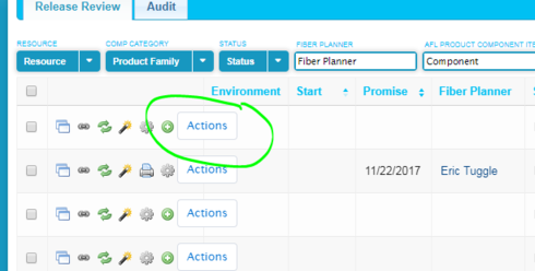
Also, looks like you’ve got it working in the first screenshot. Where it gets cutoff has to do with the overflow on the table. The following CSS should fix this:
.nx-skootable-data{
overflow-y:visible
}
That did the trick!
I’m on 10.0.0 in production and 10.0.9 in sandbox.
The CSS fix worked in both versions.
Any update on release timing? We’re using Skuid in LEX pages and want to align closely with the visuals. Changing from row action icons to a dropdown like in the LEX list view would be a big help, and I don’t want to implement this snippet solution if I can avoid it.
Right now this update is scheduled for our late summer release.
John,
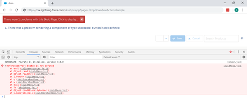
Your sample works beautifully in classic; however, whenever I use the preview in lightning I receive an error that the skootable can’t be renedered because a button is not defined. Do you know of a fix for this issue?
Here is a screenshot of the page preview in lightning with the error and the console details.

Thanks for your help.
CM,
This solution was put place a while ago, but it’s based on a predictable DOM structure to operate correctly. If you’re on a different Skuid version or there’s another variable at play, like Lightning, you’ll need to find out where the HTML path is different from what the script expects and make appropriate adjustments. There are some examples in this post on troubleshooting this.
Just to be clear, reliance on DOM consistency is not a great approach for scaleable solutions - I’t’s better work directly with the API methods that are more consistent and supported long term. Any SaaS based solution is subject to modify the DOM as they release innovations and adjustments to their platform(s).
Also, Skuid has incorporated some nice usability improvements in V2 pages that leverage a similar drop down menu for row actions,which is an out of the box capability for Spark. I’d definitely check this out if you’re in a position to leverage Spark.

