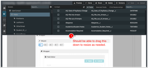
The new “collapse” feature for the “toolbox” in the page composer is a welcome addition. A couple of other ideas to improve the experience:
1) Allow the “toolbox” to be expanded by making the current separator control that supports collapse to be draggable to increase/decrease height of the toolbox. Often times the controls that I need are several sections deep and it takes a while to collapse everything and find what I’m looking for. Additionally, being able to see more fields or conditions, etc. on a model would ease in identifying what is there and what is not.
2) In the models tab, provide sections (similar to folders in components) for Master & Child models so that all the master models can easily be collapsed since they are not likely to be needed often.
Thanks!
Yes and yes!
- The Devs just shake thier heads and mutter…
2. We never thought anyone would put so many models in a master page as Barry has. The reuqest is totally viable in his case. I wonder if it is overkill for most page builders. We will consider…
Some way of ‘grouping’ models would be awesome… even if it was just the ability to arbitrarily group them into folders or some such.
Generally, though, the ability to significantly expand the toolbox would eliminate most of the desire to collapse models into groups.
Definitely not the first time I’ve made people shake their heads and mutter - gotta push those boundries 
Agree with Matt on this, if you could expand the toolbox, grouping would be less important on models although still nice to have in addition to expanding/collapsing toolbox.
The Ability to Adjust the Height of “nx-pagebuilder-toolbar” would be a big help!
The only way I know how to currently do this is to go into the Console and manually edit the height of “nx-pagebuilder-toolbar”, which is annoying to have to do each time.

As to item 1 in Barry’s request: I’m a brand new skuid user, and I’ve already been wanting to drag the toolbox handle to make it larger.
Looks like there are now three built in options for the height of the toolbar: Closed, Classic, and the new one that expands to ~85% of the window height. I feel like Goldilocks complaining that none of them are just right. Still, a step in the right direction.
Enter your E-mail address. We'll send you an e-mail with instructions to reset your password.
