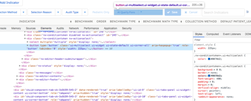
Multi-select filters look fine for standard users after upgrading to 12.1.13, but for community users any multi-select filter gets a set width of 225px
normal:
community users:
Multi-select filters look fine for standard users after upgrading to 12.1.13, but for community users any multi-select filter gets a set width of 225px
normal:
community users:
Any word on this? It’s happening regardless of theme, and I’m having a heck of a time overriding the css since it’s not part of the ui-multiselect class, but seems to be something applied by some other class I don’t know - maybe related to a button? see how the width is set in element.style rather than in the ui-multiselect class:


Any update on this? Updated to 12.1.4 and it’s still like this. I’m thinking it’s a design decision and not a bug, but I’m not a fan.
Any chance someone could post how to target this in CSS? I can’t figure it out
Found it. For anyone else wanting the old style of multi-picklist filters, here’s some css you can add:
button.ui-multiselect {width:100% !important; font-size:12px !important;} div.ui-multiselect-menu {width:225px !important;}
This is great, applied the css to table and all filter buttons now display correctly
Thanks Jack
Enter your E-mail address. We'll send you an e-mail with instructions to reset your password.