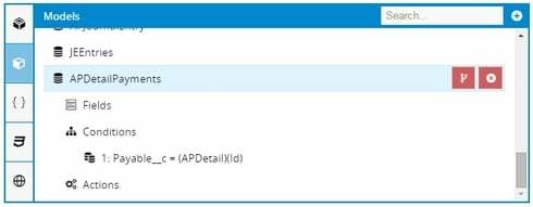
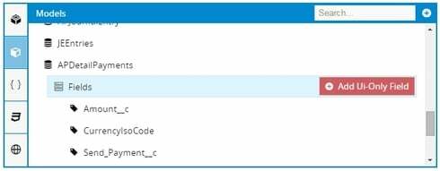
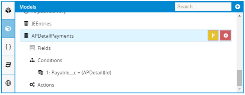
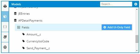
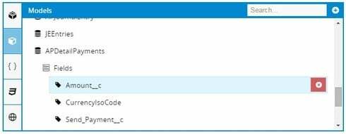
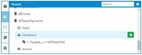
Hmm, interesting. How about these? http://bit.ly/1VOoAPT
Sorry, could not resist. Working late and hyped on too much caffeine.
TOTALLY Agreed - we need different styles for action buttons that create, modify, and delete. It’s way too easy to accidentally click on “destructive” buttons right now without triggering a “DANGER! DON’T CLICK THIS!” impulse in the brain, when all you were trying to do was click on a different red button next to it which, unintuitively, is non-destructive. And conversely, your brain fears to click on these non-destructive red buttons when they’re actually quite safe!
Under consideration!
Thanks! and yes, precisely! My main use-case was when watching someone ahem work on a skuid page(from a bit further away from the monitor, or on a video) I sometimes can’t tell which button is being pressed. The down-pressed button colors also need to be accentuated a bit

