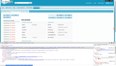
be nice to be able to format the buttons to give them an uniform width
(i know… picky, picky) Note: This topic was created from a reply on the Create Buttons on Tab topic.
Reply that Ben Hubbard gave:
Hi Ken,
Adding this code as an inline CSS resource should get you started down that road.
.nx-panel-left-inner .ui-button {
display: block;
background: lightblue;
}
.nx-panel-left-inner > div > div > div > div {
display: block !important;
}
.nx-panel-left-inner > div > div > div {
width: 100%;
display: block;
}
Can this code be modified to only affect specific buttons? Or specific components (like a popup)?
Each button has an “Advanced” properties tab where you can give the button a specific class. This class can then be added to the CSS defined above.
I think I’m doing something wrong then. I have separate CSS entries, each with unique names. I have assigned some buttons to one CSS and others to another CSS. For some reason they are all defaulting to one particular CSS. Any thoughts?
Use your Element inspector in your browser to see what classes are being applied. Getting the correct selectors applied to your elements is a tricky business.
Can you see the attached image? I’m not really sure what I’m looking for. I’ve assigned the buttons on the left to different CSS, but they are all the same…
more specifically, it appears that the buttons on the left do load with the correct CSS, but they are then re-run with the wrong CSS when the default page loads…
Reply
Enter your E-mail address. We'll send you an e-mail with instructions to reset your password.
