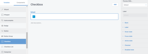
Learning some basics of Design Systems with Skuid V2 on Salesforce but feeling stumped by aligning and/or updating positioning of the check marks on the following components following sizing changes: Checkbox, Checkbox List, and Select (viewing as multiselect).
See example of how displaying in photo (wanting to move check more toward center in this particular example).*
Anyone have wisdom on how to approach this in V2 Design Systems? Thank you!
*Edit note: to clarify for this example. The check marks are centered in standard/default design system. They only become off-centered when you increase the size of the checkbox itself, with the marks hanging leftward by default. Curious if there is a setting to change marks positions easily in that scenario.
Page 1 / 1
I have seen notes for the workaround of CSS inserted into the page with the Text component. This seems a stretch over being able to alter in Design System, especially as this workaround may become obsolete with future updates AND not sure it applies to all form components. Almost seems that this could be a bug, if not alterable in the Design System itself. Welcome any suggestions though? Or ideas on the CSS hack for the time being…
Reply
Enter your E-mail address. We'll send you an e-mail with instructions to reset your password.
