Hey @TWyatt_Bluefin,
You can style the read mode and the edit mode of the Form in the DSS to where you will just need to adjust those styles to match.
I’m not sure if this is useful for what you are trying to accomplish, but why not just always have it in edit mode so they don’t have to click a pencil or guess which mode it’s in? This can help with the user’s experience and remove any confusion one may have when interacting with the form.
I hope that helps. 
@QuinnRyan What I’m trying to do is show a read-only page (no edit option at all) that looks exactly like the data input page, which is always in edit mode.
In the DSS, I can’t seem to change the background of the data section. I can get close by changing the field options but I still have background that seems to bleed over.
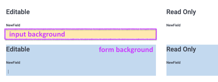
Hi @TWyatt_Bluefin, can you explain more by what you mean by the background of the data section? Is it the part referred to as “input background” in the screenshot below?
I took an initial look and couldn’t immediately find a way to change the background color in the DSS for fields in read-mode.
Have you tried using a custom form variant extended with JSS?
In the field.js tab you should insert:
"read": {

        "background": "white",

        "borderRadius": "4px",

        "border": "solid 1px #dddbda",

        "padding": "8px",

    }
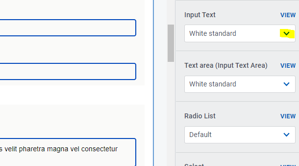
Circling back on this to see if anyone has any new ideas. I think what we want is to be able to select the field variation in Read Mode like we can in the nested component view.
Nested Component screenshot:

Read Mode does not have that option. I want the edit version (shown) and the read version to look like this:

The read version will have the pencil in the right corner if editing is allowed.
A year later and I still haven’t come across any way to do provide a border around the field in read-only view. I tried the supplied field.js but that didn’t work.
Has anyone come across a way to do this?
How can this be so hard? I just want my read view to look just like the edit view. A simple field border in read mode.


