Hello @Jili -
Thank you again for bringing the deprecated API to my attention, sorry for the delay in getting back to you on this.
I’ve reviewed the TFG Component code and it is currently using the instance level createChildComponents API and not the API marked as being deprecated. In short, there does not appear to be a need to change anything or release a new version.
I did notice that the deprecated API does emit a console warning if called, however there are no warnings emitted when using TFG Components which would further indicate that no changes are required.
Can you let me know why you believe TFG Components is using a deprecated API - possibly I am overlooking something?
Thank you!
If anyone is on a version of Skuid that has wrappers with interactions (I believe 11.2 or later), you can accomplish somewhat similar with wrappers, actions, and a UI only model. It’s basically just a wrapper with the title that toggles a checkbox that determines whether the table (or whatever else) is shown. Here’s an example:
<skuidpage unsavedchangeswarning="yes" personalizationmode="server" showsidebar="true" useviewportmeta="true" showheader="true">
<models>
<model id="UI_Rendering" limit="20" query="true" createrowifnonefound="true" datasource="Ui-Only" processonclient="true">
<fields>
<field id="ShowAccountsList" displaytype="BOOLEAN" label="ShowAccountsList" ogdisplaytype="TEXT" defaultvaluetype="fieldvalue" defaultValue="false"/>
</fields>
<conditions/>
<actions/>
</model>
<model id="Account" limit="20" query="true" createrowifnonefound="false" datasource="salesforce" sobject="Account">
<fields>
<field id="Name"/>
<field id="Id"/>
</fields>
<conditions/>
<actions/>
</model>
</models>
<components>
<wrapper uniqueid="sk-3eQE-247">
<components>
<wrapper uniqueid="sk-3eQH-263">
<components>
<grid uniqueid="sk-3eri-596">
<divisions>
<division behavior="fit" verticalalign="center">
<components>
<template multiple="false" uniqueid="sk-3erl-619" allowhtml="true">
<contents>&lt;span class="ui-button-icon-primary ui-icon fa-caret-right sk-icon inline" style="font-size:24px"&gt;&lt;/span&gt;</contents>
<renderconditions logictype="and">
<rendercondition type="fieldvalue" operator="!=" enclosevalueinquotes="false" fieldmodel="UI_Rendering" sourcetype="fieldvalue" nosourcerowbehavior="deactivate" field="ShowAccountsList" value="true"/>
</renderconditions>
</template>
<template multiple="false" uniqueid="sk-3esN-830" allowhtml="true">
<contents>&lt;span class="ui-button-icon-primary ui-icon fa-caret-down sk-icon inline" style="font-size:24px"&gt;&lt;/span&gt;</contents>
<renderconditions logictype="and">
<rendercondition type="fieldvalue" operator="=" enclosevalueinquotes="false" fieldmodel="UI_Rendering" sourcetype="fieldvalue" nosourcerowbehavior="deactivate" field="ShowAccountsList" value="true"/>
</renderconditions>
</template>
</components>
</division>
<division behavior="flex" verticalalign="top" minwidth="100px" ratio="1">
<components>
<pagetitle model="Account" uniqueid="sk-3eQF-258">
<maintitle>Accounts List</maintitle>
<actions/>
</pagetitle>
</components>
</division>
</divisions>
<styles>
<styleitem type="background" bgtype="none"/>
</styles>
</grid>
</components>
<styles>
<styleitem type="background" bgtype="none"/>
<styleitem type="border"/>
<styleitem type="size"/>
<styleitem property="cursor" value="pointer"/>
</styles>
<interactions>
<interaction type="tap">
<action type="branch" whenfinished="stop">
<formula>{{$Model.UI_Rendering.data.0.ShowAccountsList}}</formula>
<iftrueactions>
<action type="updateRow" fieldmodel="UI_Rendering" affectedrows="context" field="ShowAccountsList" enclosevalueinquotes="true" value="false"/>
</iftrueactions>
</action>
<action type="updateRow" fieldmodel="UI_Rendering" affectedrows="context" field="ShowAccountsList" enclosevalueinquotes="true" value="true"/>
</interaction>
</interactions>
</wrapper>
<wrapper uniqueid="sk-3eQJ-276">
<components>
<skootable showconditions="true" showsavecancel="true" showerrorsinline="true" searchmethod="server" searchbox="true" showexportbuttons="false" hideheader="false" hidefooter="false" pagesize="10" alwaysresetpagination="false" createrecords="true" model="Account" buttonposition="" mode="read" allowcolumnreordering="true" responsive="true" uniqueid="sk-3eQd-394">
<fields>
<field id="Name" uniqueid="fi-3eQd-395"/>
<field id="Id" uniqueid="fi-3eQd-396"/>
</fields>
<rowactions>
<action type="edit"/>
<action type="delete"/>
</rowactions>
<massactions usefirstitemasdefault="true">
<action type="massupdate"/>
<action type="massdelete"/>
</massactions>
<views>
<view type="standard"/>
</views>
</skootable>
</components>
<styles>
<styleitem type="background"/>
<styleitem type="border"/>
<styleitem type="size"/>
</styles>
<renderconditions logictype="and">
<rendercondition type="fieldvalue" operator="=" enclosevalueinquotes="false" fieldmodel="UI_Rendering" sourcetype="fieldvalue" nosourcerowbehavior="deactivate" field="ShowAccountsList" value="true"/>
</renderconditions>
</wrapper>
</components>
<styles>
<styleitem type="background" bgtype="color">
<styles>
<styleitem property="background-color" value="#d8d8d8"/>
</styles>
</styleitem>
<styleitem type="border" padding="all">
<styles>
<styleitem property="padding" value="16px"/>
<styleitem property="box-sizing" value="border-box"/>
</styles>
</styleitem>
<styleitem type="size"/>
</styles>
</wrapper>
</components>
<resources>
<labels/>
<javascript/>
<css/>
<actionsequences uniqueid="sk-3eQ5-221"/>
</resources>
<styles>
<styleitem type="background" bgtype="none"/>
</styles>
</skuidpage>
I would like to move to V2 as it some functionality I need. Will the TGF components work in V2?
Hi Bill -
I’m not sure what you mean by V2 - can you provide additional information?
When creating a new page there is an option to use the new features in API version 2 
Quick explainer:
API V2 refers to the complete rewrite of our UI components that was released as part of the SPARK release last year. (We’re working on improving lableing here…). We allow you to build pages either with the original components you’ve always known and loved (API V1), or move to the new set. But beware - there are a lots of differences, and that is why we let you go either way…
The component definition is different enough that custom components will have to be completely rewritten to work as API V2 components. So Bill - you will not be able to use the TFG components as currently wriitten on your V2 pages. I’d look at Matt’s comment below for a solution that uses the currently available components to provide similar functionality.
Thank Rob. I was afraid of that. Can V1 page call a V2 page and can a v2 page call a V1 page? Can a V2 Page have a popup with an include which is a V1 page?
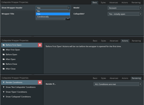
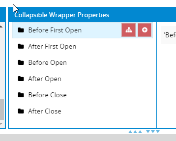
That is a whole lot of steps. How I use TFG is to trigger actions when a collapsible wrapper renders to show.

I use TFG in well over 100 places. There must be an easier method? Why don’t you work with TFG to bring the product into the skuid umbrella and support it?
@Rob - Thanks for the assist! Can you point me to the docs that describe the API changes so I can evaluate what it would take to make a TFG Component V2?
@Bill & Community - I can’t make any promises on releasing a TFG Component for V2 but I’ll at least evaluate and see what it would take and whether or not I can find the cycles to complete depending on the effort required.
@Rob - Per above, can you provide a link to information describing what’s changed from V1 to V2 (e.g. removed APIs, deprecated APIs, breaking changes, etc.)? Thanks!
Hello Barry and Rob,
Any updates on TFG components in V2?
Cheers,
Bill
Hi Bill -
I’m still waiting to hear from Rob regarding some type of migration guide from v1 to v2. I’ve read through the docs but there’s no clear guidance on the “differences” between v1 & v2 and how to properly migrate a component to v2.
Additionally, based on the information at https://docs.skuid.com/latest/v2/en/skuid/components/original/manage-component-packs.html, component packs are not even supported in v2 so even if there was clear guidance on how to migrate to v2, TFG couldn’t provide a component pack that would be able to be installed and used on a v2 page.
Possibly I’m misunderstanding what I’m reading but that is the state of where things are at on my end as far as I can tell.
I’m hopeful that Rob or someone from Skuid can provide some clarity on the following:
Is my understanding of component packs in v2 correct? Assuming yes, when will component packs be supported in v2?
Is there a migration guide or at least something that clearly and concisely describes the differences between v1 & v2 (e.g. if you used “XYZ” api in v1, you need to use “ABC” api in v2). A migration guide would be the ideal scenario here.
the TGF functionality is such a productive game changer. I and others are awaiting the answer from Skuid.
Bill and Barry. Thanks for your continued exploration in the V2 page API. Good stuff. We’ve released the base set of redesigned components, (and pretty completely new way for those components to interact with the DOM etc.) but we have lots more work still to be done and pushed out. One of the remaining deliverables is a custom component framework, and migration instructions for moving V1 custom components to V2. We know we need to give you guys that instruction, and we’re working hard on it.
We have also taking the feedback about collapsable panels we got originally and pushed some of it into the core component set. While the new Accordion component doesn’t have all the features that Barry’s custom TFG set does - it may be satisfactory in the near term.
Sorry this isn’t the answer you want, but its what we got right now.
Hi Rob, thanks for the update. Great to hear that component pack support and migration guide are on the way! I’ll revisit a TFG v2 once those are available.
In the meantime, one suggestion would be to put some information on the main v2 doc page regarding what v2 currently supports and what’s on the roadmap. Was very difficult to find information on v2 while reviewing the docs. I actually only stumbled upon the page that indicates no component pack support by doing a google search so having a summary on the main landing page for v2 API would be helpful.
Barry and Rob,
Hope all is well. Any updates?
Bill
Hi Bill -
I’m at a standstill on this until Skuid adds the required v2 features and documentation as Rob mentioned in his previous post. Once that is done, I’ll be able to evaluate the effort required and let the community know whether or not a v2 compatible TFG Component Pack will be released.
In the meantime, I’m still hopeful that the docs will be updated with more information about what’s currently available and planned to become available so that others have an easier time discerning how to handle v1 component packs.
Hi All - I’m new to Skuid and I tried to install this custom component, but even though I went through the steps to suggested in Skuid’s documentation, this error message keeps showing up and the component is not running!
![]()
Tristan
Barry and Rob,
Hope all is well. Any updates?
Bill
@Bill - Status quo on my end. Still at a standstill on v2 support pending more information from Skuid.
@Tristan - Were you ever able to get your issue resolved or are you still having issues? I did notice that you called the component back “TGF” instead of “TFG” but I don’t think that would cause an issue. If you are still having an issue, per Bills’ question, are you on V1 or V2?
Hi Barry, I tried to follow your steps for the API. I am getting a ‘JQuery is not defined’ error. Did I miss a step? Does this work with the Skuid API v1?
Hi Eva -
Sorry you are having trouble. The jQuery is not defined error would indicate that something is not configured properly as every Skuid page has jQuery on it
I believe the original version of Skuid is called V1 so yes, it should work with V1.
Couple of questions:
1) Did you try the demo page from the setup steps?
2) On the page where you get the error, do other Skuid components work on it?
Barry, thanks for your response. I was missing the # on the section selector.
Thanks for the update Eva, glad you got it squared away!

