Hey Bill -
Unfortunately, there is no way to target a specific reference popup because there isn’t an event or action to hook in to when the reference popup opens.
Depending on your use case and requirements, you can ‘hide’ the ‘x’ on all reference popups using the following css class
.sk-dialog-autocomplete.ui-dialog .ui-dialog-titlebar .ui-button.ui-dialog-titlebar-close {<br> display: none;<br>}
Keep in mind that this does not disable the ‘escape’ button so users could still press escape to close the dialog.
Barry - Thanks again for making such useful components available to the community. It would be cool if we could have different header titles for when the wrapper is collapsed or expanded.
For example, a section containing fields for providing a “latest update” on a record would have a header titled “Latest Update” when expanded. When collapsed, the wrapper header could be “Latest Update - 8/2/2016 - Text snippet from the latest update field…”
Hi Jared -
Thanks for the feedback and idea, glad you are finding the wrapper useful.
I’ll add this to the features list for a future version. If others would like to see this as well, please let me know.
In the meantime, what you could do is something along the lines of the following:
1) Create a UI Only checkbox field called “IsOpen”
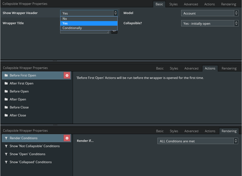
2) Add an action to beforeopen to set the field to True
3) Add an action to afterclose to set the field to False
4) Use merge syntax in the title text to condition on the UI Only field
{{#IsOpen}}Latest Update{{/IsOpen}}{{^IsOpen}}Latest Update - 8/2/2016{{/IsOpen}}
Hope that gives you what you are looking for short of having the component natively support it. If you try it, let me know how it goes!
Above and beyond as usual, Barry. Thanks for the work-around example!
Hello All -
Today I am publishing version 1.5 of TFG Components. This release includes a workaround for a bug inside of Chrome that was introduced in Chrome Version 53.
This workaround should eliminate the intermittent issues that some users are seeing with “e.createConditionsFromXml” exception. Please note that this does NOT fix the Chrome bug itself. Instead, it is just a workaround to avoid the known code path inside of jQuery that exposes the bug that is inside of Chrome.
I have also filed a bug against Chrome which you can track at https://bugs.chromium.org/p/chromium/issues/detail?id=647887.
Version 1.5 Release notes:
The latest version is always available
here.
Full release notes are available in the
readme.
As always, feedback appreciated, keep it coming!
Thank you!
Thank you Barry, some of my users where experiencing this issue and i could not figure it out.
The new version helped as the error is now gone
Like usual, great job!
Thx
Glad the new version helped Dave, thanks for the update! FYI - It looks like Chrome team has already made a fix for the Chrome bug and indicated they will backport it to 53. See updated details at 647887 - chromium - An open-source project to help move the web forward. - Monorail.
wow. Bravo! That was ninja-freaking fast. So awesome to see them backporting this aswell
All - The Chrome fix is now available in Chrome Version 53.0.2785.143 m. I believe it made it to the 54 & 55 branches as well, just not sure which specific version.
Amazing work, Barry. I’ve asked my team to take a look at this as I think it could be really useful.
Thanks Glen, hope you guys find it useful. Enjoy!
It’s an awesome component Barry … great work. Is there a piece of javascript that will trigger it to close - I have menus in a collapsible wrapper and would love it to close when a button pressed?
Thanks David, glad you find it helpful.
Yes, you can trigger wrappers to open and close - there are two options depending on your use case:
1) Publish tfg.openwrappers or tfg.closewrappers events - Using the stock Skuid action framework, you can publish these events and all wrappers on the page will either open or close
2) Use the javascript API - You can open/close all wrappers or open/close specific wrappers.
The information on both approaches is detailed in Video #2 starting at the 2:30 min mark.
Huh, that's funny.. I use this component all the time, but I think I skipped over your explanation of the API when you first released this (out of my technical comfort-zone at the time).
And here I am, only now discovering that you can use the API as a trigger for collapsible wrappers.
Learn something new every day. Thanks Barry!
You’re welcome  Also forgot to mention that you can do things via the API beyond just open/close such as inspect state (isOpen, isClosed, etc.). The video has all the details.
Hi all,
Is it possible to add this on the Skuid platform?
Hi Matt, this should definitely be possible. Rather than uploading a Static Resource, with the Skuid Platform you can upload ‘Files’. See this post:
https://community.skuid.com/t/skuid-native-platform-uploading-static-resources?topic-repl…
Although admittedly, I haven’t tried uploading/using Barry’s custom component on the Skuid Platform myself - so perhaps he can confirm that for you 
Hi Matt - Roman is correct, the TFG Component pack should work on Skuid Platform. When Skuid Platform was first launched, I tested and confirmed everything worked although I haven’t tested recently. If you encounter any issues, please let me know and I’ll do my best to investigate.
Hi Barry,
Quick question regarding small visual issue i’m having with the TFG Collapsible wrapper and wondering if you have any suggestion
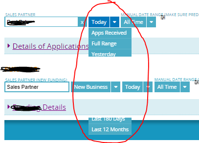
On my page I have a table showing the aggregate results of an object, and under that table I have a collapsible wrapper with a table to go see the details of those aggregated data if needed. By default it’s collapsed
the problem is table filter treat the wrapper as if it does not exist and we cannot access many of the condition/values as they get hidden by the wrapper (see screenshot below)
Any ideas?

Thx
Hi Dave -
I’ve seen a problem similar to this before. When Skuid first released the Nav menu, the drop-down from that menu would behave similar to what you have captured in your screenshot. Without digging in to this, I’d venture to guess that the problem you’re having is more with the drop-down menu from the table than with the CW.
That said, a few questions:
1) What version of Skuid are you running?
2) Can you try putting a collapsible field editor under the table instead of the CW and see if the same problem occurs?
3) If the same problem doesn’t occur with #2, can you provide a sample page using stock objects and send over? I haven’t used Skuid in years so I can’t promise anything but I’ll try to carve out a few cycles to take a closer look
Thanks!
Hi Barry and thank you for your help
So testing your request with a collapsible field editor under the table I do not experience the same problem
And furthermore discovered a new detail, my problem only happens when this is a Page include
So basically when i preview this page with table and CW under, it works normally and CW does not affect drop down
Now the same page when it’s a Page Include , behaves as the screenshot shown above.
Will try to create the page you requested shortly and will have to probable create both pages for you to see the issue.
Thx
Dave, this was a bug with nav components and page includes at some point, but is fixed in more recent versions of skuid.
Workaround by adding some css to your page:
.nx-include-panel { z-index: -1; }
See https://community.skuid.com/t/search-component-drop-down-suggestions-dont-render-over-pag…
Ok Test Page done, and 1 more important detail, it only happens when there’s another page include under the original page include
Here are both pages with stock objects
<tfg__collapsiblewrapper title=“New Wrapper” showheader=“yes” collapsible=“collapsed” deferrenderingcontents=“true” uniqueid=“sk-2Jlhz-127”> </tfg__collapsiblewrapper>
And here is page include sample page
Thank you

