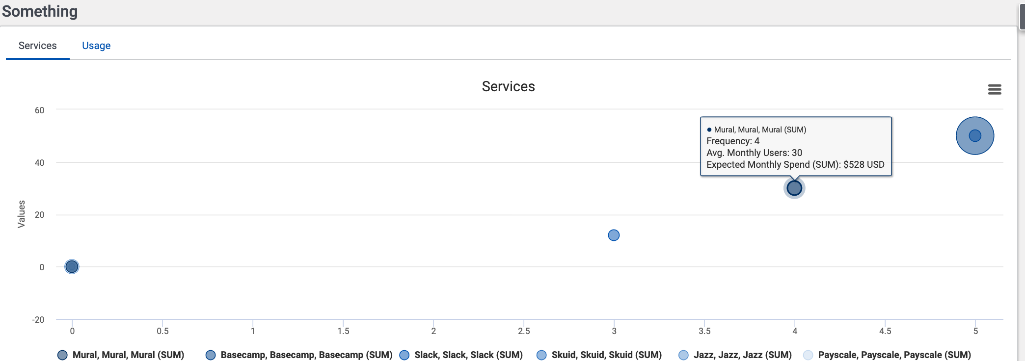
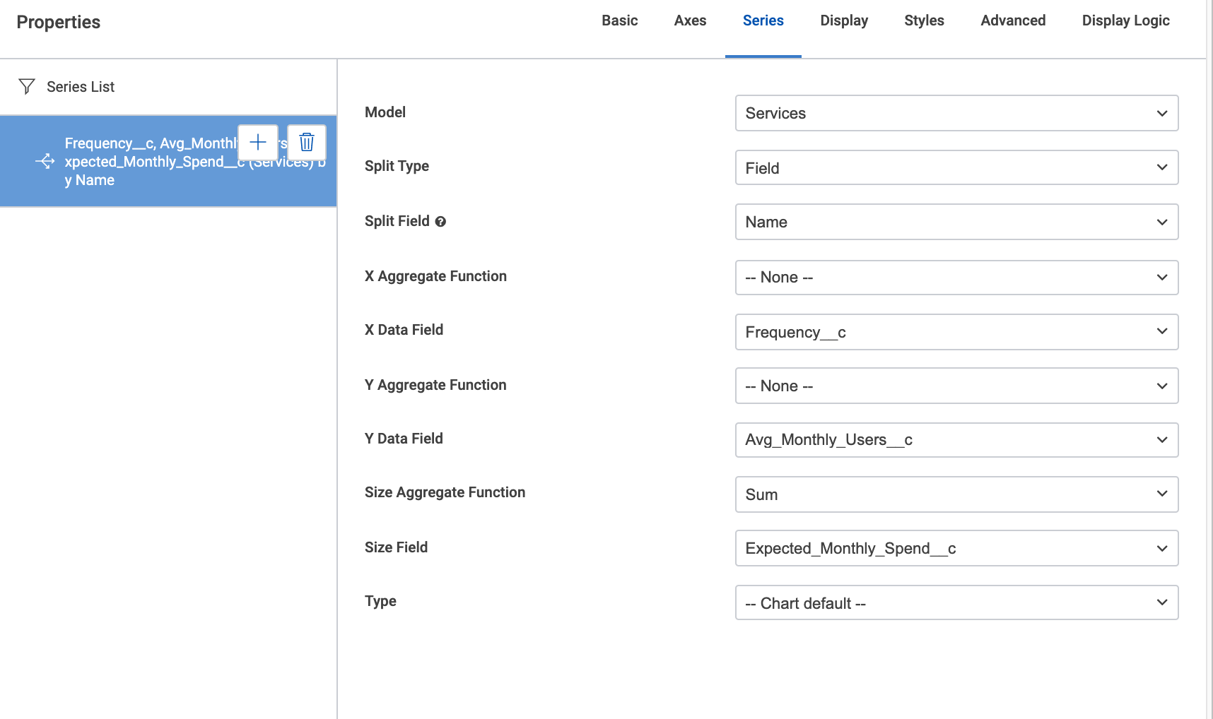
In my 8(?) years of building with skuid, I have yet to use a bubble chart. Well - today is the day. I’ve spent an hour trying to figure it out and I can’t crack the code or find anyone else asking the same questions (maybe I’m not searching the new community correctly - I don’t know.)
Any idea how I can get the series labels to list the name of the record just once, instead of three times, as seen here"
Note: the only way I could get the Expected Monthly Spend field to show anything other than 0 is by using the SUM aggregate function for the bubble size… weird because the other fields are showing just fine without needing to tell them to aggregate.
Any ideas?


