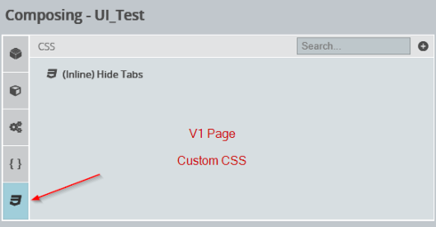
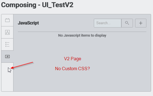
Hi Mark, that is correct. V2 does not currently support CSS customization. This is something we’re considering implementing as an extension of the Design System Studio. Can you give some examples of the kinds of styles you’d want to apply with CSS?
XML copy/paste should work for models and actions, but most components will have to be rebuilt. We are working to improve the migration path to make it easier to move from V1 to V2. Thanks!
Hi Matt,
In our V1 pages we have tons of custom styles:
- a no-print CSS class to hide certain elements from printing – essential for our pages
- override certain component display for better display (eg. smaller font in a particular table, hide checkboxes from a particular table, hide model name from a particular table)
- override certain component display for greatly enhanced functionality
Here’s one customization that opens up a world of enhanced functionality that I was trying to better document and upload to the SKUID github when I noticed it’s not something I can do on a V2 page:
CSS to Hide the tabs in a tab set:
.hide-tabs > ul:first-of-type {
    display: none !important;
}```
I’ve been using this to hide the tabs of a tab set. What that allows me to do is better organize my pages by grouping things into tab sets and put back-end comments for designers at the top of the tabs that the end-user doesn’t see.

This also lets me put display logic on each tab and if I have custom display logic working organize that display logic much better on the back-end while keeping the tab set hidden from my users.

Example screenshot of the editor UI – in our example, tab 1 has its display logic set in such a way that it is not displaying, and tab 2 is set up to be displaying


What the end user sees on the page:


Notice that the end user sees the contents of tab 2 without seeing the tab set tabs at the top. This opens up so much better organization of pages that use conditional display logic.

Before I had to basically just put different display logic items one right after the other on the page and had no idea which was which and had to click on them and look at the display logic to know what I was looking at.

Now if I have different display logic items I can just put them all into one hide-tabs tabset with different display logic on each tab, and label each tab to let me know precisely which one is which as I’m working in the editor. This makes the custom display items much better organized on the page and makes it a lot easier for me to figure out what’s going on with my page just by looking at the UI editor.

Additionally even without custom display logic I can just create a hide-tabs tabset around something and label the tab with essentially a “comment” to give me a better idea of what a component is for in the UI editor. It’s like adding notes for designers directly to the elements on the page visible only to the page editor and not the end user.


Example page XML that uses hide-tabs:
<p>Content to display if tab 1&nbsp;display logic is true</p>
<p>Content to display if tab 2&nbsp;display logic is true</p>
.hide-tabs > ul:first-of-type {
display: none !important;
}
I see that in the “Design System” composer for V2 you are able to customize the look and feel of components with different templates specific to the component type, and then select a specific template on a component on a V2 page to give it that look and feel, but you cannot put custom CSS on these templates. This is a major factor preventing us from using V2 pages, and is I think the only reason we would be unable to use V2 currently.
Hi Mark, thank you for sharing your feedback! Please find general information in our online docs about how you can customize the Design Systems: Extending Design Systems with Code
I hope that this is helpful for you!


