Nintex Community Menu Bar

I need some help bc after 3 hours of trying to get it - figured someone else might.

I have a 'Launch Screen' where users start a request based on Category / Sub Category.

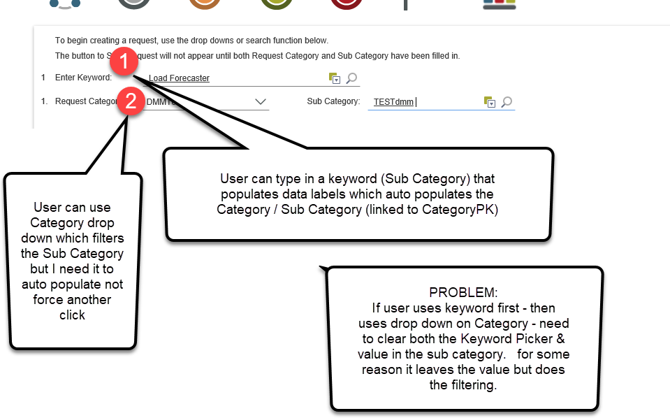
Users can either use a 'Search by Keyword'  (Picker Control)  -- that auto populates Category / Sub Category  OR
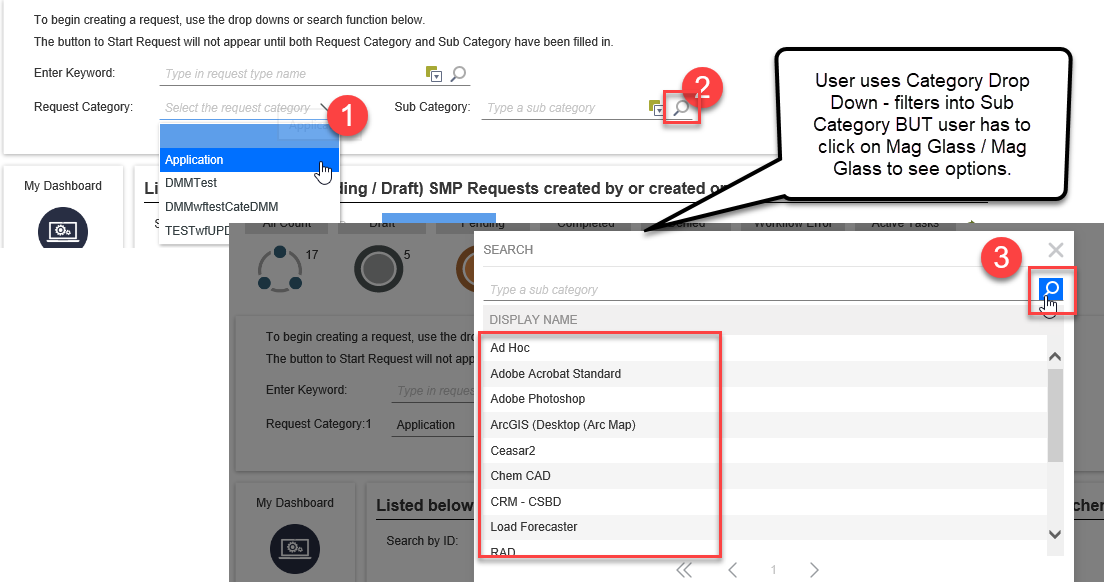
Use Drop down to select a category that would filter a Sub Category (Picker Control) by CategoryID OR
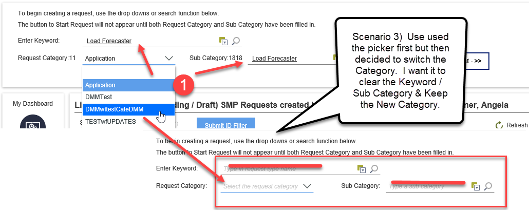
Change the Drop down for the category after already using the 'Keyword' which should clear out the pickers & start the new filter.

I do NOT want the Sub Category Picker to populate unless it's been populated by the KeyWord or Category Search.

My issues:
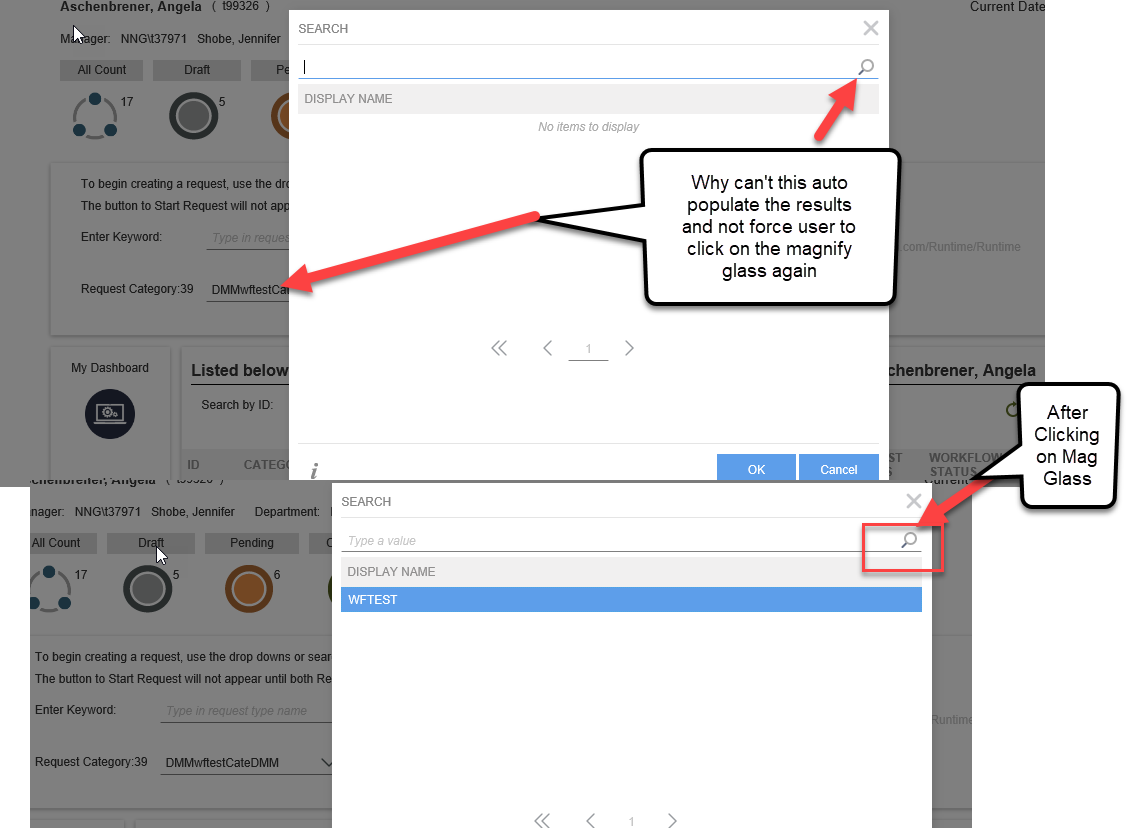
1)  If I Use the Category Drop Down -  it does filter the Sub Category but why can't it auto load the options. Why do users need to click on the magnify glass again when they get into the control.  

2) If I use the Keyword search and then want to instead use the Category Dropdown - how do I successfully clear out the pickers and keep the new category in the drop down.  

See Images...

I can't use dropdowns because there could be more than 200 Sub Categories.

But users will complain about having to click again on the magnify glass.


11729iBEB0D489DECF4C5B.png
12556i55A3CAAD2F951101.png

Hi AAschenbrener,

We have something that auto-populates, we call it the autocomplete control. You can adjust how many milliseconds it should wait before executing the SmartObject to retrieve the data.

The reason the picker control doesn't auto-populate is because of the performance impact it would have when doing this every time a user executes it. If it's on a large dataset (for example searching through a large set of records in a SQL table) then it could take a while.

Instead of clicking on the magnifying glass, why not just enter your query in the picker control then press enter? If there are multiple results, and the entry is underlined in red, you can click on the red underlined entry and it will show you all the results it found, and you can choose one. No need to open up the "secondary window" for the picker control.

After the picker control has finished executing and is populated with data, there's a rule for that which you can use to then populate the drop-down list and finally the subcategory list.

Regarding the drop-down lists somehow not clearing sounds like an issue with your Form and View rules, you might want to limit yourself to only using View rules in this case, and if you still can't get it to work I recommend opening a K2 support ticket.

Kind regards,
ChrisW

I don't think I'm explaining the scenario correctly.  Tried to take better screenshots but may end up putting in support ticket.   I need a better solution for my users that have 200+ options in a search capacity but have Cascading controls as well.   The AutoPopulate control isn't exactly what I was looking for.

Scenario 1) My user set has the option to search off 'keyword' in one picker which auto populates a Category drop down & Sub Category picker.  Works great no problem.  I could potentially change that to an AutoComplete (clean up the interface a bit)

Scenario 2) User has option to select a Category drop down which populates the pickers with the query set.  I had these setup as dropdowns but then user said 200 options in a drop down might be too much.  Hence why we switched to a picker.  Now, however, the user doesn't like clicking on the magnify glass / magnify glass again to see possible options they have to select from.  User may not know what they are looking for so figured a visual list would be helpful.

Scenario 3)  User could have already populated the Category drop down / Sub Category Picker from Scenario 1 -  when the user selects a new category it should clear out the Keyword Picker, Sub Category Picker & leave the selection in the drop down.    It's either not clearing any of the fields, or it clears all the fields and forces a user to select the category again. 

Could be something with the rule placement, but after spending 3 hours on it - I couldn't find a combination that worked.  Was hoping for solutions / suggestions on other options. 


Hi AAschenbrener,


Consider splitting your 3 scenarios into 3 different Views, and putting those Views onto a Form with different tabs, so users are able to search for certain things in a different manner. You could also put all three Views onto a Form in one tab, but collapse them.


Second, Scenario 2 sounds like you could use the Tree Control, to show users the main categories, then the sub categories below that and they can navigate the tree control to find what they are looking for. Alternatively, you're welcome to use the combination of a Picker Control and a Drop-Down Control, but then users should know what they are looking for. If they need to "Browse" all the options available first, then the probably a Popup Sub-View can do the trick, as a little List View (paged or not paged is up to you), or keep on using the Picker Control and put up with users complaining about using the magnifying glass. As already explained previously, you don't need to use the magnifying glass to search for something, you can just type something (for example "ra") and press Enter, then if it gets red underlined, it indicates there are multiple results, and you can click on the red underlined "ra" and choose from the available entries in the resulting list, for example "Radio" or "Radiation" or "Rasengan".


Lastly. Scenario 3 sounds like it should be possible to do with Rules, but if it isn't, then consider splitting this out into separate Views as well. You can also contact our Remote Mentoring team that can help you with this, or if you find a bug then you can open a Support Ticket (since they only deal with Product Support issues and will usually refer you to Remote Mentoring when it's a How To question). You're also welcome to create a new "idea" (feature request) here: https://ideas.k2.com - if it doesn't already exist on that site.


Other than the above, I'm not sure how else to solve your scenarios. Maybe someone else on the community site has some ideas.


Kind regards,


ChrisW


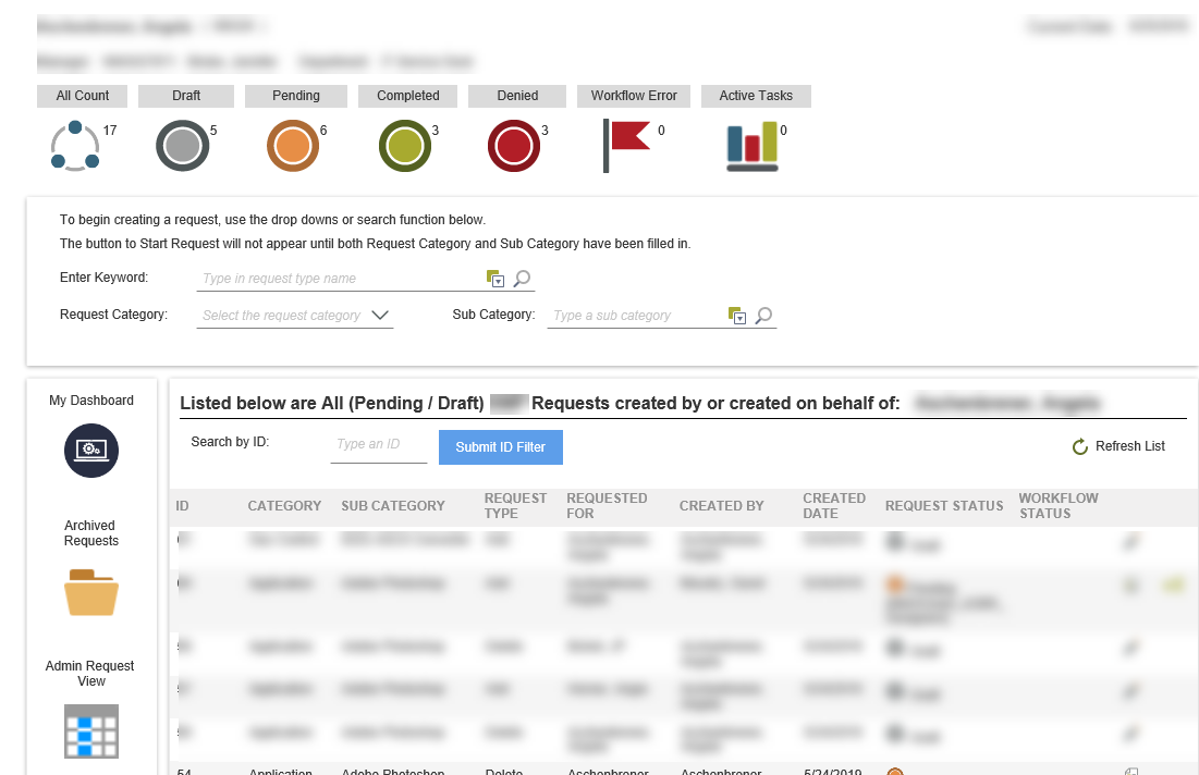
I greatly appreciate the ideas however I'm limited to our user base needs/skill level with online along with trying to keep mostly OOTB type functionality w a clean look that users can figure out easily without lots of clicks and flipping screens. .  Included screenshot of our Form Layout give you an idea.   We are using Icons on the form to give Count details / View with the form interaction / Menu Button View on left in one column / Request List on bottom right with results.  Eventually we'll have to figure out this all on Mobile too adding in additional complexity.

Three different views/tabs wouldn't work with our layout of the form. Even with attempting to do 'javascript' to move the tabs in between views, it slows the page load and makes things look uniformed & clunky. 

The tree would work if we didn't have 200+ sub categories, which for almost half of our Categories - the list is that long.

I'll continue to look into the rules & see if I can't some how make it work.  Creating Support Tickets / Remote mentoring are hard for me to do sometimes. (Contracted employee - no credits)

Again - appreciate the ideas... I'll keep plugging along and hope I find a good solution.


Reply