Sometimes you want extra clickable icons in your SmartForms using Font Awesome or Google Fonts and some simple JavaScript can give you this capability very easily.
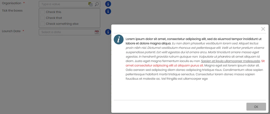
As an example we will use Font Awesome to add clickable help information icons to a picker control and Checkbox List Control. The help text will be dynamically shown in a Show Message dialog based on the icon clicked.
NOTE: You can achieve the same behaviour using Google Fonts but you cannot use Style Profiles and will need to inject the styles into a data label. e.g., <link href="https://fonts.googleapis.com/icon?family=Material+Icons" rel="stylesheet">

On click of a help icon a Show Message Box will show the help text for the specific control:

Steps
- Create a Font Awesome account to get a kit.
- Reference the Kit that you have created in the external files in Style Profiles. Alternatively you can add the reference via a Data Label and script injection in the Form Initialise event.
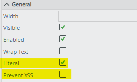
- Add a Data Label for the help icon. in the appropriate place on your form or view. You will then need to make the Data Label Literal and Uncheck Prevent XSS

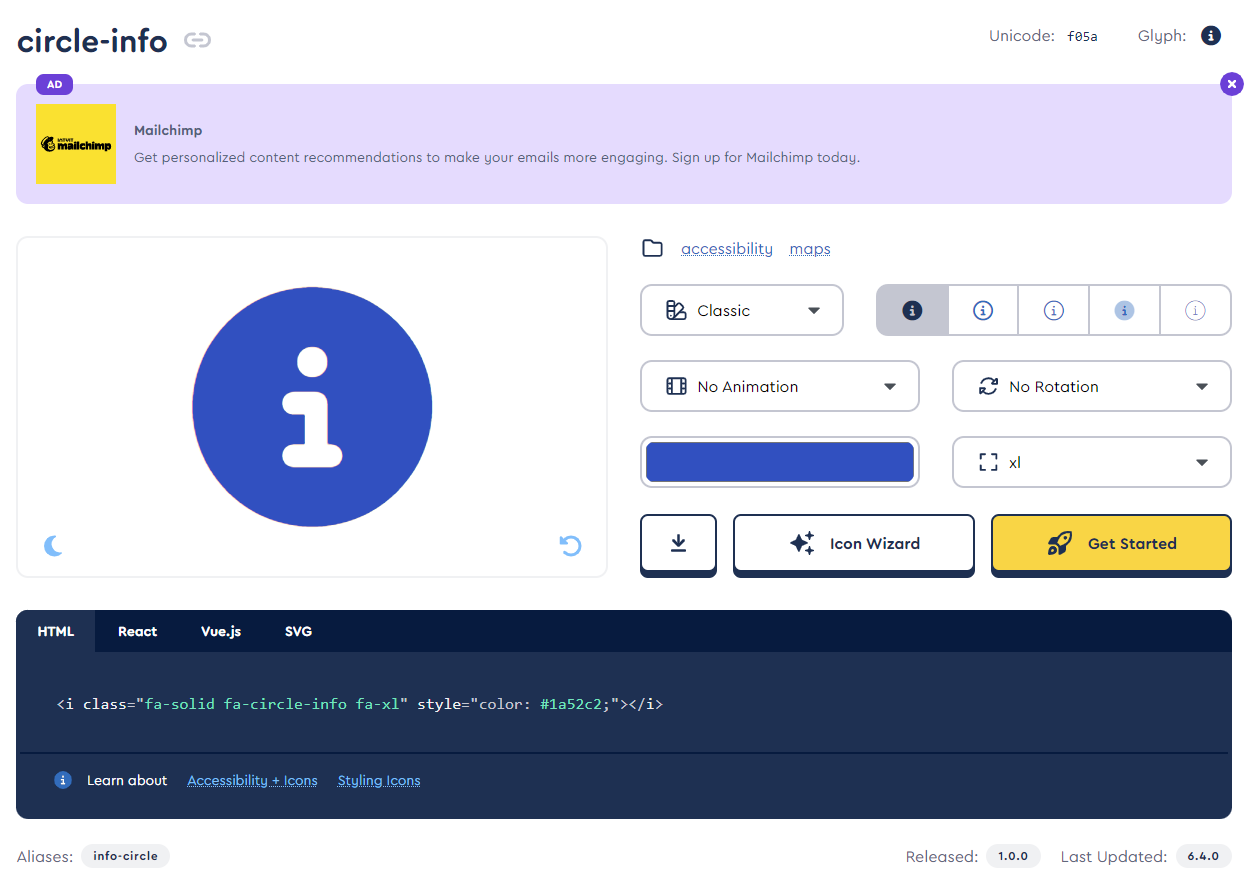
Set Literal and allow XSS - Go to the Font Awesome website and choose the icon that you want configuring the colours, size and behaviour. e.g.

Configure a Font Awesome Icon
Copy the generated html:
<i name="helpForXControl" class="fa-solid fa-circle-info fa-xl" style="color: #1a52c2;"></i>Add a name attribute to the i tag generated by Font Awesome which will allow you to target the specific tag using JQuery. e.g. name=”helpForXControl”
- Add a hidden Data Label named Data Label HelpKey to hold the key for the help text to load
- Add a hidden Data Label named Data Label HelpText to store the help text which will be loaded on click of a specific help icon.
- Add a hidden button Button Hidden Get HelpText to be clicked when the information Icon is clicked.
Clicking the hidden button will do the following:- Execute a SmartObject to retrieve the help text for the clicked icon based on the value stored in Data Label HelpTextToLoad
- Show a message box with the help text for the clicked icon.

Tip: Add a hidden table to your view or form that contains any hidden controls that are used.

- You will need to create and expression that is bound to each help icon Data Label that you create. The expression will do the following:
- add an anchor tag to wrapper the i tag to add a tool tip.
- add the Font Awesome i tag to the help icon Data Label
- add a click event to the <i name=”helpForXControl” ...> tag
- transfer the name of the i element to the Data Label HelpKey
- Click the Hidden Show Help Text button.
JavaScript Expression example bound to the help Icon Data Label
<script>
    //Bind a click function to the i tag
    $("ifname='helpForXControl']").on("click", function () {
            //Transfer the help key to the Data Label HelpKey
            $("spanename='Data Label HelpKey']").SFCLabel("option", "text", "helpForXControl");
            //Click the hidden button Button Show Help Text
            $("ahname='Button Show Help Text']").click(); });
</script>
<!--Wrapper the i tag in an anchor tag to display a tool tip-->
<a href="#" title="Click for help">
    <!--Add the Font Awesome i tag inside the anchor-->
    <i name="helpForXControl" data-icon="" class="icon fa fa-info-circle fa-2x"
        style="color: rgb(26, 82, 194);">
    </i>
</a>
Tip: When testing your JavaScript make use of the F12 Developer Toolbar Console tab.
Notes:
- This article applies to both K2 Cloud and Automation On-Prem (K2 Five)
- Similar behaviour can be achieved out of the box with a picture control and on-click event.
