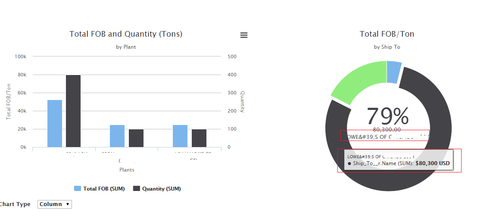
Notice that the series label is showing “&39;” (same for the hover over). This character is not in the actual data records.
Why does the largest series value show in the center by default even when the legend is off?
Notice that the label is cropped i.e. does not properly fit within the donut hole region.
Really don’t like seeing the developer API name in the hover popup e.g. Ship_To__r.Name.
Question
Superbank RC1: Chart series label not properly rendering
 +11
+11Enter your E-mail address. We'll send you an e-mail with instructions to reset your password.


