Nintex Community Menu Bar

Has anyone tackled this?

Is there a better idea?  I imagine I might need to create a custom component.

I tried including an external JS file, and a small script to load the visualization. No dice.

Jacob

We don’t use Google Charts, but we have used several other Javascript charting libraries like jChartFX and KendoUI that work very nicely within Skuid pages. In each case, we added the external JS file as a resource and used an inline snippet to call the initialisation function, which then renders the charts to html elements in Skuid templates. We haven’t had to resort to custom components.


Glenn, would you be willing to share any samples? This has been an important issue for us and taken hours of tinkering so far!


FYI to the Skuid Community: Glenn was incredibly helpful and was able to get us beautiful charting working in Skuid! He truly knows his stuff!


Thanks Chris. Very nice of you to say and fun working with you.


FYI Skuid Community, on this we used the Kendo UI DataViz library, which works really nicely with Skuid: http://demos.telerik.com/kendo-ui/dataviz/overview/index.html


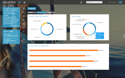
With it and a little Javascript, you can do a huge array of animated charts linked to Skuid models. They also work nicely with Skuid tables to allow filtering the table and charts simultaneously, or clicking through on a chart segment to get through to a table filtered to match the segment. You can do tooltips that call other models to allow drilling down to more information when you hover over part of the chart.


It’s a nice toolkit.


Very cool, guys! Glenn, great stuff as usual! 


I have to admit that a tutorial on this subject has been on my To Do list for about 3 months.  I really will get this done!  I promise!! 


Glenn, we are building dashboards and trying to do something similar since we do not want users accessing the SF UI unless its for admin / security reasons.  I followed everything above including the resource, inline snippet, etc… I noticed the examples at Kendo use hard code for examples.  Could you provide a few lines of code for an example that pulls data from a native object to have a better understanding of how to setup the code to pull actual data.  Any help would be much appreciated.  By the way awesome UI you have built!  


So here’s our approach from the ground up. Not sure it’s optimised, but it works well.


  1. Load up the Kendo library as a static resource.


  2. Reference it as a resource in your Skuid page (“CPVizK” in our case).


  1. Add a template component into your page. Put a DIV in there to hold the chart, e.g.:

4. Create an inline Javascript resource to initialise the chart ("dashInit" in our case) for that DIV element.


Need to choose what event to link the chart rendering to. We link ours to the jQuery “tabshow” of a tab called “dashPanel”.


skuid.$(function() { skuid.$('#dashPanel').on('tabshow', function(e, data){
var OverdueTasksModel = skuid.model.getModel('ChartOverdueTasksByTeamMember');
//Get the JSON data from the models and assign it to variables
var OverdueTasksData = OverdueTasksModel.data;
skuid.$("#kvizbar01").kendoChart({
theme: "blueopal",
chartArea: {
background: "#fff"
},
plotArea: {
background: "#fff"
},
dataSource: {
data: OverdueTasksData
},
title: {
align: "left",
text: "Overdue Tasks by Team Member",
font: "14px Open Sans",
color: "#3cb2e1"
},
legend: {
visible: false
},
series: {
type: "donut",
size: 10,
holeSize: 65,
field: "OverdueTasks",
categoryField: "ownerId",
color: "#3cb2e1",
overlay: {
gradient: "none"
},
border: {
width: 0
},
labels: {
visible: true,
position: "outsideEnd",
template: "#= value# #= dataItem.TeamMember#",
font: "11px Open Sans",
color: "#666",
background: "#fff"
},
}],
tooltip: {
visible: true,
font: "11px Open Sans",
color: "#fff",
padding: {
left: 10
},
template: "
#=kviz01tip(category, dataItem.TeamMember)#
"
}
});
});
});
We get the relevant Skuid model, then we get its data (which is in JSON form), then we simply pass that into the chart's datasource.
  1. Save the page, run it, watch the animated chart fun. 🙂


Glenn, 

Thank you! I appreciate the detail you provided this really helps, I will give it a go today and let you know how it goes. 


Reply