Nintex Community Menu Bar

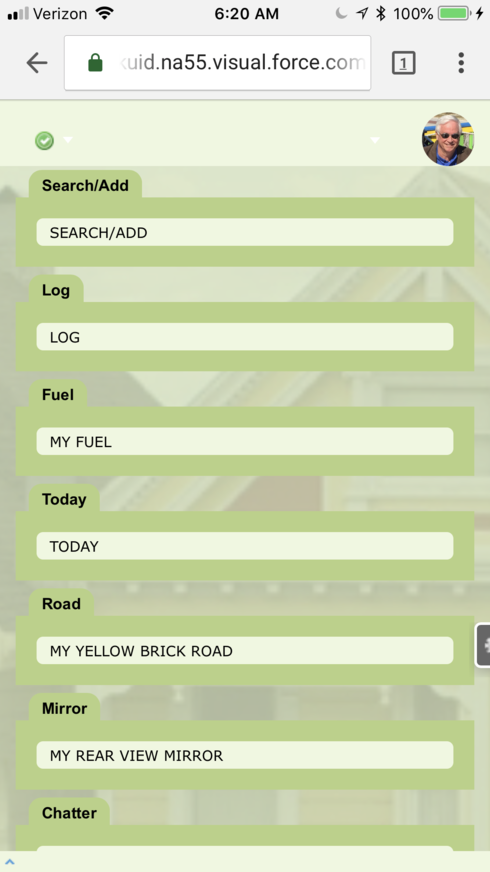
To be clear, this is not in the Skuid mobile app. This happens on a responsive page on mobile devices when the “Feedback” button is enabled. It looks the same when choosing left, right or bottom. This is what it should look like:


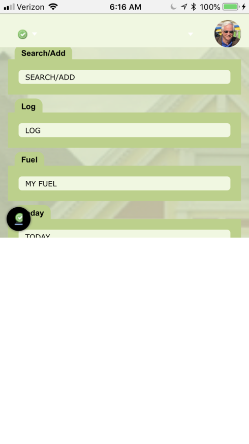
The bottom half on my page is cut off.

This is what it looks like with “Feedback” button enabled


Is not usable if mobile devices are being used.

Thanks for posting Bill. Hope we can get this resolved for you.

Have you done something to open the keyboard? From the picture it looks like maybe that is what the white space is. Can you give any more detail into how you’re seeing the second picture? Do you see it on page load or are there steps to see what you’re seeing?


It looks like that on all pages on the mobile device.


Do you see it on page load or are there steps to see what you’re seeing?


It behaves like this after I sign on to salesforce.  


Reply