Nintex Community Menu Bar

Is there anyway to bring custom icons in to a tab set? The out of the box icons completely clash with the UI design we are aiming for. 

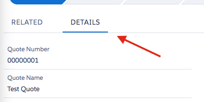
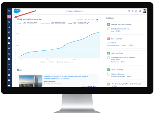
Ultimately we would like for the Icon to be the tab selector. Exactly like Salesforce Lightning. 

Hi, Josef,

As of now, I don’t think there’s a way to bring in custom icons declaratively in Skuid.


By the “tab selector” in SF Lightning, are you referring to the dark underline when a tab is selected?


If so, you should be able to accomplish this style through a Theme (Tab Set properties), and simply leave the Icon property on your tabs blank.


Also, note that the Tabset component does (unofficially) support HTML in the Tab Label property, so you may be able to include some custom icons you’ve imported through HTML/CSS.


Hope this helps,

Emily


Hi Emily,


Something more along the lines of this:


Josef,

I see what you’re saying. In that case, I think you have a couple options:


Option 1:

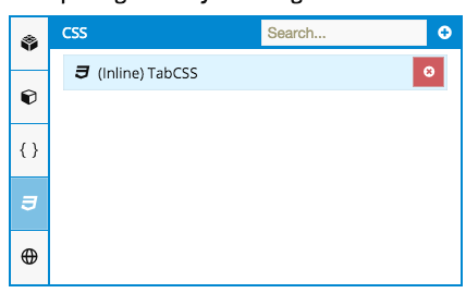
Using the tab set component, you would need custom CSS to make that styling happen. First, set the Tab Navigation property to “Left Tab Bar”. For each tab, leave the Tab Label property blank, and select an icon. Then, add some CSS to update the styling of these tabs. In this app composer, this would be included in the “CSS” tab on the Elements pane.


I’ve started some example CSS below.


.nx-lefttabs\>.ui-tabs-nav { background: #2a4071; height: 100vh; width: 60px;}.nx-lefttabs\>.ui-tabs-nav li { background: #2a4071;}.nx-lefttabs\>.ui-tabs-nav li a { color: white;}.nx-lefttabs\>.ui-tabs-nav li.ui-tabs-active { background: #c8d5f5;}

Option 2:

Instead of using a tab set, use the Navigation component with Master-Child pages. This component’s styling is a little more cut out for what you’d want to do. To achieve this, you would need to create a master page a Panel Set. The left panel would contain your Navigation component, and the right panel would contain the body for the child pages. Each Navigation option would have an action to redirect to the URL of a child page. The only issue is, with Skuid’s current capability, you may not be able to highlight the “selected” item in the nav component without some custom JS/CSS.


I hope that gets your further! Please reach out if you have more questions.

Emily


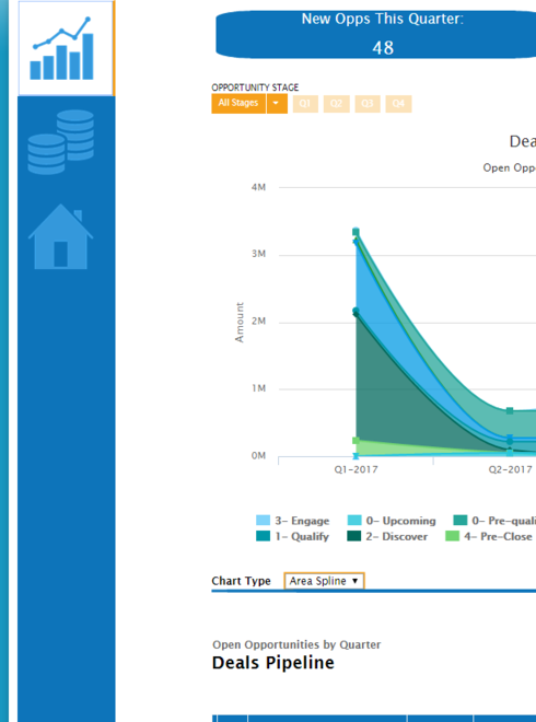
Thanks so much for the assistance! With a bit of tweaking and digging I was able to achieve what I needed with a tab set! The end result is perfect!


This can be used for any icons within skuid.


For anyone wondering how I did this with a tab set, here you go:

Create In-Line CSS (Name it whatever you’d like):
.nx-lefttabs>.ui-tabs-nav {        height: 100vh;  
    background: #0D74BA;
    width: 112px;
}
.sk-icon-help { 
background-image: url(/resource/1487965249000/SkuidIcon_Chart) !important; 
width:75px; 
height:75px; 
background-position: center; 
padding-top:25px;
}

.sk-icon-activities { 
background-image: url(/resource/1487963692000/SkuidIcon_Coins) !important; 
width:75px; 
height:75px; 
background-position: center; 
padding-top:25px;
}

.sk-icon-account-profile { 
background-image: url(/resource/1487965457000/SkuidIcon_Account) !important; 
width:75px; 
height:75px; 
background-position: center; 
padding-top:25px;
}

  • Replace the underlined/bold text with a static resource URL containing your Icon of choice. The icons used in my screen were 75x75.

  • Icon sets can be found here: https://icons8.com/web-app/for/all/transparent

  • Download and Save as PNG

  • Upload as a static resource. 

Create your tab set and add in standard Silk icons to every one of your tabs. From here you’ll just need to add in the icon name as I did above and it will be overridden with your static resource image. 

Enjoy 🙂


Josef,
That looks great!! Thanks so much for sharing your end result for others to see.
Emily


How to accomplish in v2:


  1. Enable HTML in tab labels.


  2. Include your or definition in the tab label.


Happy building!