Nintex Community Menu Bar

I am having trouble figuring out how to change the axis labels on charts.


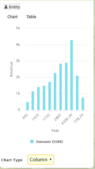
I’ve gotten my model grouped by “CALENDAR_YEAR” and my category axis using the same model field. So my chart looks great, except it shows the total each year instead of the year.


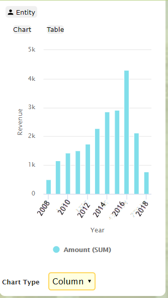
I would like it to look like this:

Bill,


I think you need to set the category for your x-axis to the Calendar Year grouping.


Click on your chart in the page builder to view the properties.  Then click on the Axes tab and click on the categories option.  Change the Category Field to your Calendar Year grouping.


Thanks,


Bill


Thank you bill


Reply