The buttons in Spark take their usefulness to a whole new level. I really like the direction of flexibility in their styling to become more central design components on the page. The ability to display a picklist as a button group is pretty slick.
With this said there are some adjustments that would move the needle to make them useful at this level. First, when using the button group as the display type for a picklist field in edit mode, I’d like to be able to set the type to detached to leverage the styling in the DSS, which I was able to setup with the style I’m after. Currently the button group defaults to attached and there no way to change it.
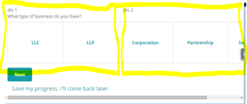
The second issue is that neither button groups or buttons themselves wrap appropriately on smaller viewports. Button groups display in a row and overflow past responsive grid divs. A single button does this and where these are being used for explanatory links, they scroll off the side of the screen rather than word wrapping. This also causes colliding with content in other divisions on different viewports.
Buttons are really powerful, particularly with regards to hooks into models and the action framework. I like the direction on this, but the issues with responsiveness are a problem.


