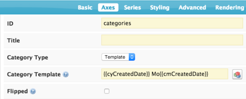
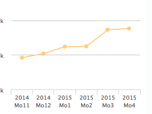
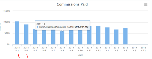
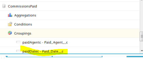
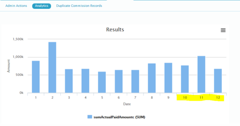
I’ve built my first aggregate model to deal with charting tons of records. I have a custom object that has commission payments by month, so my model is just a sum of payments grouped by Date and Sales Agent. It doesn’t seem like the chart understands that the X axis is a date field type, and when I change the function to a Calendar Month or Fiscal month I only get 1, 2, 3… as labels and none of my users will know what that means. On a regular model, they see ‘Jan 2015’ and we can do the additional date Granularities which is great. Any way to adjust this formatting? 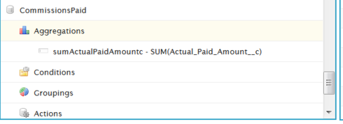
Question
Aggregate Model and Chart Date Axis
 +11
+11This topic has been closed for replies.
Enter your E-mail address. We'll send you an e-mail with instructions to reset your password.


