Hi team,
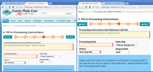
I’m trying to save some load time and screen real estate by removing SF header/sidebar on my Skuid page. On the left I have the page with header, loading the design and layout as expected.
On the right you see the same page without modifications, just with the “Show Header” box unticked. All text and many design elements are magnified and it seems that some different styling is applied as well (or not applied?).  https://dl.dropboxusercontent.com/u/7448865/SFheaderCSS.png
Is this usual behaviour? Is there a fix for this? Do I have to include or reference some additional CSS in my Skuid page for the layout to be preserved?
Thank you in advance!
Regards,
Robin
Hi Robin,
I’ve noticed similar results when the Salesforce header is hidden. It could be that the header component injects JS/CSS that when absent results in the “wonky” appearance.
Did you search the community? Would not be surprised if this question has already been asked.
Regards,
Irvin
Hi Irwin,
Thanks for your reply! I did my research and was surprised to not find the answer for this since I also expect it would be a common scenario. Not saying it is not posted here, just that unfortunately I so far have been unsuccessful tracking it down 
Robin
I bet the Skuid team has run into this before.
Here’s the reason it looks weird, then we’ll give the fix:
Salesforce’s standard header styles, which are added to the page when you have Show Header turned ON, add the following lines of CSS to the page, which make the page not look “wonky”:
body {
font-size: 75%;
}
a {
color: #333435;
}
So if you add this CSS into your pages where you have Show Header OFF, they should look more normal.
Hi Zach, Fantastic, that did the trick! Thanks for the explanation and for the fix. Much appreciated  Keep on squiddin’
Enter your E-mail address. We'll send you an e-mail with instructions to reset your password.

