I am starting to build an application form for our hospice charity using SKUID using the wizard component, rendering and the action framework. I plan on displaying only one or two fields at a time in a step to hand-hold the applicant through the application. I will have a ton of white space with only a few fields and would like to super-size the field label and field itself. The concept would be similar to Esurance or TurboTax where each step or screen is only asking for one piece of information with a large entry field. I am not asking for all the styling, just example CSS to expand the field label and field to get me started. 
You can customize the CSS of a single field editor!
The Field editor has a property where you can give it a specific class name. I wanted some summary fields at the top of my detail page to really pop. Here is what I did.
Dragged a field editor onto the page and in the advanced tab gave it a specifiic CSS class (Look in the advanced tab of the Field Editor Properties)

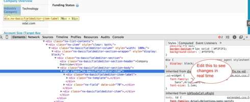
Use the developer console to inspect the CSS being used in the standard page. You can make adjustments to the Sytles in line until you get the effect you are looking for.

The CSS I ended up using looked like this.
/* Adjust text size in top field editor */.BigTextFieldEditor .nx-fieldtext {
font-size: 1.2em;
}
This affected the text size, but the same principle should be used for the lable size and any other customization you would want.
Reply
Enter your E-mail address. We'll send you an e-mail with instructions to reset your password.

