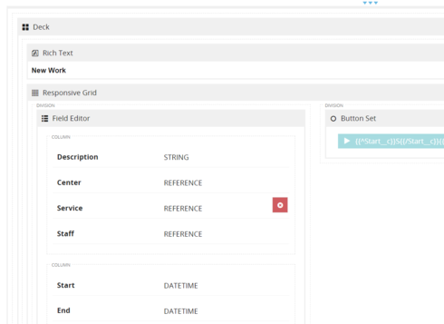
I have a field editor inside a grid inside a deck, like so:


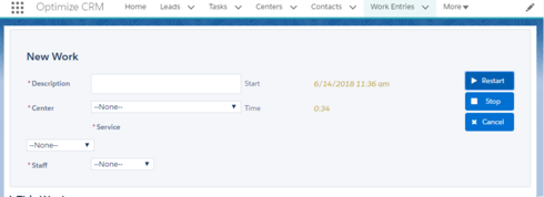
In runtime, it looks like this:


This is the lightning theme, skuid 10.0.25, themes updated.

As you can see, the label of the “Service” field is where the field ought to be, and the field gets bumped down.


Here’s the only custom css I have on the page:


#NewWorkDeck .nx-list-footer {
display:none
}

.block-buttons .sk-buttonset-group\>.sk-button-action\>.ui-button {
display:block!important;
}

These comonents are inside the #NewWorkDeck.


It’s really strange. Those three reference fields I’m all rendering as picklists based on models, if that matters?


Also, no matter how I reorder those three reference fields, it’s always the second one that has this issue.


There is a second column on the field editor, which is not rendered on page load. When I do render it, it just squishes the brokenness in the first column, like so:

Any ideas?

Ah, another development:

The strangeness is happening only when I’m running this page as a lightning bundle component. If I preview the page on its own, it works fine. This seems to indicate that there’s something odd about the way the lightning css and skuid lighning theme css are interacting?


Looks like this is the offending salesforce code:


.forceStyle .required&nbsp;{<br>float:&nbsp;left;<br>padding-right:&nbsp;2px;<br>color:&nbsp;rgb(194, 57, 52)<br>font-weight:&nbsp;700<br>} 

I fixed it with this:


.forceStyle #NewWorkDeck .required {<br>&nbsp; &nbsp; float: none;<br>}

You might want to look into a universal fix for the theme if that is going to be a consistent problem for people.


Hi Matt, Skuid has updated the Lightning Design theme as of 11.2.x, and I believe this issue was addressed as part of that larger update. I know you have a workaround (and thanks for sharing for those who aren’t ready for a move to 11.2!), but I wanted to mention that we had seen this recently, and it should be resolved in 11.2. 


Are you not still supporting 10.0+ ??


Matt, sorry I wasn’t more clear. The Lightning Design theme update was a larger-scale effort that isn’t suitable for a maintenance release, so it’s part of the 11.2 point release, and can’t be backfilled into earlier releases. 

I have tried to reproduce this in 11.1.18, and 10.0.25, and I currently cannot get this spacing issue to occur. I did see it happen in the recent past though, and I think you’re right in suspecting the CSS you mentioned. I think there’s something of a conflict between Lightning’s CSS and Skuid’s theme CSS. Today, the same test page that was misbehaving for me is now aligned correctly.

To recap, I tried setting my Skuid page similarly to yours, with a Field editor inside a Responsive Grid, which itself is in a Deck. I brought that Skuid page into a custom Lightning component, which I deployed into a Lightning page. I made sure all my themes were up to date as well, and the alignment issue isn’t occurring, with the information we have in this thread. 

I’ve been working on Chrome / macOS. Which environment are you in? Also, the org I’m working in is on Salesforce instance CS66, which is running Summer '18 Patch 9.8. That may not be relevant, but there are times when the underlying Salesforce framework changes and affects other things.


Ah, thanks Mark. I misunderstood the nature of the update. I’m fine with the workaround, just wanted to put it on your radar that it might still be an issue for others on 10.0. I’m running Chrome with Windows 10 on na42 Summer '18 Patch 9.8.


Reply